2. Research. I researched well known indie bands, such as The Killers, to help inspire me to achieve the stereotypical mature, and almost sophisticated, styles of indie bands. The neutral autumnal colours of the forest represent the calm side of the music, which contrasts with the edginess of the tree’s and bark, which could represent their heavier, edgy side. These two artists have been edited to either black and white or to have a very low saturation. The affect given is simple and sophisticated. Both represent the casual attitude towards their music.
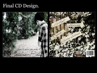
3. Front design. After my research I decided on a forest-based photo shoot. The ambience and atmosphere created is calm and relaxed, which reflects the indie/acoustic genre of this music. The artist I have made black and white to help represent the casual attitude towards his music. It also has a feel of sophistication and simplicity, which will appeal to the target audience of late adolescent to early 20’s. The type face chosen has a ‘hand written’ look to it. It flows from one letter to the next, this represents the easy movement of this artists music. The only colour in this image is the deep evergreen. A neutral colour which represents the calm neutral mood created by the music.
4. Back design. For the back design, I decided on a simple shot of deep green foliage. The neutral colours, again, give across a calm feel. My use of a masking tape style image, made slightly transparent, suggests the music isn’t perfect; it has it’s ripped and torn edginess.