SlideShare a Scribd company logo
1 of 37
Download to read offline
Building a Website: From Planning, to Photoshop Mockup to HTML/CSS
Planning:
Notes	
  from	
  Client	
  Mee/ng	
  
Wireframe	
  &	
  Site	
  Planning	
  Phase:	
  Explana/ons	
  of	
  Pages	
  &	
  their	
  Content	
  
Mockup	
  Versions	


First	
  Mockup	
                              Second	
  Mockup	
  
Mood	
  Board	
  created	
  aBer	
  another	
  client	
  mee/ng:	
  
Start by creating a folder for your images:
It is important to keep your layers organized so when you are ready to slice your site you
can isolate each area. Here is just the blank content area and the background.
And here is the background, the <body> of our website:
Start with the bottom layer of your background, and work up.
Because the graph paper repeats the entire height and width of the background, we
can create a tile, and have this repeat.


                                               Once you select the area you want
                                               hit
                                               Shift + Command + C
                                               This copies the contents of all visible
                                               layers into clipboard – that way if
                                               your background is made up of more
                                               than one layer, or if you aren’t on the
                                               right layer in Photoshop, it doesn’t
                                               matter.


                                               PC: Control + Shift + C
                                               Or Edit > Copy Merged in the
                                               Photoshop toolbar
Then create a new Photoshop document, by default it will create a document that is
the exact size of the image that is now on your clipboard. Hit ok and then paste the
image onto the new document.
Then save your image by going to
File > Save for Web & Devices…

This image is very simple so GIF is the most appropriate
format to save this image as.
Be sure to save the file in
the folder you created for
your images and name it
something that is simple &
makes sense. Do not use
spaces in your filename. If
you must use spaces use
the underscore.
Example: grid_bkg.gif
I want to save the Post-Its as one image. I turn off the background layers so that I
have a transparent background. This is the perfect time to use Shift + Command +
C because these Post-It notes and the scribbling on them are all in separate layers.
Also Shift + Command + C will keep the transparent background.
By default, Photoshop will give the first layer a white background. Turn off the
layer’s visibility if you want to save your image with a transparent background.
Since I want to keep the background transparent, and I also want to keep the
dropshadows on the Post-Its to look smooth, PNG-24 is the best format to save this
image as.
Once you have all your images together, it’s time to start building the website.
When you open Komodo remember to use File > New > File from template…
and choose HTML. Remember to save your file to the directory you created for your website.


                                                           Site Directory


                                                                               Remember to
                                                                               keep your image
                                                                               folder inside your
                                                                               site directory!
Then create a style sheet (.css file)
by going to File > New > File
from template… and selecting CSS
from the templates area.


                                        Don’t forget to link your
                                        HTML page to the style
                                        sheet!
First, I’m going to start with the very bottom of the background, the grid pattern. Notice that I
don’t have to specify background-repeat because by default the background image will repeat
x & y, starting from the top left corner (0,0).
The background can have multiple images. It works the opposite way you would imagine it
would – the first image listed is the topmost image, and the last image listed is the
bottommost.


body{
    background-image: url('img/postits.png'), url('img/gridbkg.gif');
    background-repeat: no-repeat, repeat;
}
body{
    background-image: url('img/banner.png'), url('img/postits.png'), url('img/gridbkg.gif');
    background-repeat: no-repeat, no-repeat, repeat;
    background-position: 50% 10%, 50% 290px, 0 0;
}
body{
    background-image: url('img/banner.png'), url('img/postits.png'), url('img/gridbkg.gif');


    background-repeat: no-repeat, no-repeat, repeat;


    background-position: 50% 10%, 50% 290px, 0 0;
}
Next I add a #content div to index.html and style my #content div in the CSS file.
Once I have my content div styled, I can then make adjustments to the background image
to make sure they are behaving correctly.
Added margin:auto; to ensure the
content div stays at the very top of the
page
But the design calls for a dropshadow on either side of the content
div… how do we solve this problem?


                                                              A CSS dropshadow isn’t
                                                              always cross-browser
                                                              compatible and doesn’t
                                                              have the nuance in
                                                              gradation and image has
                                                              so I’m going to create a
                                                              background image.
I’ll save the image for web as a PNG-24 to keep the transparency of the dropshadow.
#content{
    width: 1014px;
    background: url('img/contentbkg.png') repeat-y center;
    height: 1000px;
    margin: auto;
}
Breaking down the code:

#content{

    width: 1014px;

The actual content area is 960px but to account for the border (20px each side = 40px)
and the dropshadow, the width is expanded to 1014px;

    background: url('img/contentbkg.png') repeat-y center;

Here I am using the background property that is a shorthand property. Because I’m only
working with one background, I have my link to the image, repeat-y because the
background is only repeating vertically and center so that the background image is
centered within the div.

    height: 1000px;

For now this height is an arbitrary height, it is just giving me an idea of how the
content div will behave once I fill it with content. Without this height, it would be
too small to give a sense of how the page will look. Usually you don’t put a height on
your content area because you want the content to fill the area and allow for the
flexibility of pages with a lot of content or pages that have little content.

    margin: auto;

This ensures that the content div is in the center of the page.
}
Now	
  I’m	
  star/ng	
  to	
  put	
  all	
  the	
  pieces	
  
into	
  the	
  website.	
  I	
  always	
  start	
  with	
  the	
  
logo	
  aBer	
  I	
  finish	
  the	
  background.	
  
Generally	
  you	
  want	
  to	
  start	
  from	
  the	
  
boKom	
  up	
  and	
  from	
  the	
  top	
  down.	
  You	
  
can	
  add	
  thing	
  as	
  you	
  want,	
  but	
  it	
  does	
  
make	
  it	
  easier	
  to	
  keep	
  track	
  of	
  your	
  
code	
  and	
  where	
  you	
  are	
  placing	
  things.	


No/ce	
  I	
  added	
  the	
  “ALT”	
  for	
  the	
  image	
  
so	
  that	
  screen	
  readers	
  would	
  read	
  “INI	
  
Logo”	
  –	
  it	
  also	
  helps	
  for	
  search	
  
op/miza/on	
  that	
  you	
  label	
  all	
  the	
  
images	
  with	
  an	
  alt.	
  
To	
  make	
  the	
  logo	
  into	
  a	
  link,	
  simply	
  nest	
  the	
  <img>	
  tag	
  in	
  a	
  <a>	
  tag.	
  

<div id="logo">
<a href="index.html"><img src="img/ini_logo.png" alt="INI Logo" border="0"></a>
</div>


Images	
  that	
  have	
  a	
  link	
  around	
  them	
  will	
  some/mes	
  appear	
  with	
  a	
  default	
  blue	
  border	
  
there	
  are	
  a	
  few	
  ways	
  to	
  fix	
  this,	
  but	
  I	
  generally	
  use	
  border=“0”	
  in	
  my	
  img	
  tag.	
  
To	
  make	
  the	
  logo	
  appear	
  like	
  it	
  is	
  
in	
  the	
  mockup	
  –	
  with	
  it	
  seeming	
  to	
  
be	
  up	
  past	
  the	
  edge	
  of	
  the	
  page,	
  I	
  
use	
  posi%on:	
  absolute;	


Remember,	
  in	
  order	
  for	
  it	
  to	
  
posi/on	
  rela/ve	
  to	
  the	
  content	
  
area,	
  you	
  must	
  add	
  	
  
posi%on:	
  rela%ve;	
  to	
  the	
  the	
  
#content	
  div.	


If	
  you	
  didn’t	
  add	
  posi/on:rela/ve;	
  
to	
  the	
  content	
  div,	
  the	
  logo	
  would	
  
posi/on	
  rela/ve	
  to	
  the	
  <body>	
  
and	
  it	
  would	
  appear	
  to	
  “fly	
  off”	
  the	
  
content	
  area.	


Using	
  nega/ve	
  values	
  in	
  your	
  
posi/oning	
  helps	
  to	
  get	
  elements	
  
past	
  the	
  boundary	
  of	
  the	
  div	
  its	
  
within.	
  
I	
  start	
  to	
  add	
  in	
  and	
  style	
  my	
  #nav	
  div	
  –	
  but	
  it	
  looks	
  like	
  a	
  mess!	
  
How	
  do	
  I	
  fix	
  this?	
  
The	
  answer:	
  MATH	
  
The	
  design	
  has	
  a	
  margin	
  of	
  20px	
  between	
  the	
  yellow	
  border	
  and	
  the	
  content	
  within	
  the	
  page.	
  So	
  we	
  
need	
  to	
  put	
  in	
  some	
  padding	
  on	
  our	
  #content	
  div	
  –	
  but	
  that	
  effects	
  the	
  width	
  of	
  our	
  content	
  div.	
  
Time	
  to	
  pull	
  out	
  the	
  calculator…	
  
#content{
    width: 924px;
    background: url('img/contentbkg.png') repeat-y center;
    height: 1000px;
    margin: auto;
    position: relative;
    padding-left: 45px;
    padding-right: 45px;
}


To	
  account	
  for	
  the	
  dropshadow	
  +	
  the	
  border	
  on	
  the	
  background	
  image	
  of	
  the	
  content	
  div	
  we	
  need	
  a	
  
padding	
  of	
  45px	
  to	
  create	
  the	
  illusion	
  of	
  a	
  20px	
  padding	
  in	
  the	
  content	
  area.	


Then	
  to	
  account	
  for	
  the	
  90px	
  of	
  padding	
  we	
  need	
  to	
  take	
  subtract	
  90	
  from	
  the	
  1014px	
  width.	


Resul/ng	
  in	
  a	
  new	
  width	
  of	
  924px.	
  
To	
  get	
  the	
  font	
  that	
  I	
  used	
  for	
  the	
  naviga/on	
  I	
  used	
  hKp://www.fontsquirrel.com	
  
To	
  style	
  the	
  naviga/on	
  I	
  used	
  similar	
  to	
  the	
  code	
  I	
  used	
  for	
  our	
  dropsite	
  tutorial.	


#nav ul {
    float: right;
    margin-top: 8px;
    padding-right: 20px;
}

#nav li.menu {
    display: block;
    float: left;
    font-family: 'bignoodletitlingregular';
    font-weight: 100;
    font-size: 30px;
    padding-bottom: 10px;
}

#nav li.menu a{
    text-decoration: none;
    padding-left: 30px;
}

#nav li.menu a:link, #nav li.menu a:visited{
    color: #fff;
}

#nav li.menu a:active, #nav li.menu a:hover, #nav li.menu a:hover{
    color: #E6D41B;
}
Building a Website from Planning to Photoshop Mockup to HTML/CSS

More Related Content

What's hot

Html 5 and CSS - Image Element
Html 5 and CSS - Image ElementHtml 5 and CSS - Image Element
Html 5 and CSS - Image ElementKempy7000
 
Web Design 101
Web Design 101Web Design 101
Web Design 101T.S. Lim
 
Web Design Primer Sample - HTML CSS JS
Web Design Primer Sample - HTML CSS JSWeb Design Primer Sample - HTML CSS JS
Web Design Primer Sample - HTML CSS JSBootstrap Creative
 
FYBSC IT Web Programming Unit II Html Page Layout & Navigation
FYBSC IT Web Programming Unit II Html Page Layout & NavigationFYBSC IT Web Programming Unit II Html Page Layout & Navigation
FYBSC IT Web Programming Unit II Html Page Layout & NavigationArti Parab Academics
 
WordPress HTML, CSS & Child Themes
WordPress HTML, CSS & Child ThemesWordPress HTML, CSS & Child Themes
WordPress HTML, CSS & Child ThemesMichelle Ames
 
BEM Methodology — @Frontenders Ticino —17/09/2014
BEM Methodology — @Frontenders Ticino —17/09/2014BEM Methodology — @Frontenders Ticino —17/09/2014
BEM Methodology — @Frontenders Ticino —17/09/2014vzaccaria
 
Promote Education Web Design Things To Consider When Designing A Website
Promote Education Web Design Things To Consider When Designing A WebsitePromote Education Web Design Things To Consider When Designing A Website
Promote Education Web Design Things To Consider When Designing A WebsiteZoaib Mirza
 
Making your site printable: WordCamp Buffalo 2013
Making your site printable: WordCamp Buffalo 2013Making your site printable: WordCamp Buffalo 2013
Making your site printable: WordCamp Buffalo 2013Adrian Roselli
 
Resnick webconversion2
Resnick webconversion2Resnick webconversion2
Resnick webconversion2comedyjant
 
Joomla!Day 2013 Nürnberg; Vortrag von Johannes Hock
Joomla!Day 2013 Nürnberg; Vortrag von Johannes HockJoomla!Day 2013 Nürnberg; Vortrag von Johannes Hock
Joomla!Day 2013 Nürnberg; Vortrag von Johannes HockadhocgraFX
 
ViA Bootstrap 4
ViA Bootstrap 4ViA Bootstrap 4
ViA Bootstrap 4imdurgesh
 
Beyond Responsive Web Design
Beyond Responsive Web DesignBeyond Responsive Web Design
Beyond Responsive Web Designarborwebsolutions
 
BEM It! for Brandwatch
BEM It! for BrandwatchBEM It! for Brandwatch
BEM It! for BrandwatchMax Shirshin
 
BEM it! Introduction to BEM methodology
BEM it! Introduction to BEM methodologyBEM it! Introduction to BEM methodology
BEM it! Introduction to BEM methodologyVarya Stepanova
 
Designing for WordPress and Web Design: Bridging the Gap Between Design and D...
Designing for WordPress and Web Design: Bridging the Gap Between Design and D...Designing for WordPress and Web Design: Bridging the Gap Between Design and D...
Designing for WordPress and Web Design: Bridging the Gap Between Design and D...Ngaire Ackerley
 

What's hot (20)

Html 5 and CSS - Image Element
Html 5 and CSS - Image ElementHtml 5 and CSS - Image Element
Html 5 and CSS - Image Element
 
Web Design 101
Web Design 101Web Design 101
Web Design 101
 
Web Design Primer Sample - HTML CSS JS
Web Design Primer Sample - HTML CSS JSWeb Design Primer Sample - HTML CSS JS
Web Design Primer Sample - HTML CSS JS
 
FYBSC IT Web Programming Unit II Html Page Layout & Navigation
FYBSC IT Web Programming Unit II Html Page Layout & NavigationFYBSC IT Web Programming Unit II Html Page Layout & Navigation
FYBSC IT Web Programming Unit II Html Page Layout & Navigation
 
WordPress HTML, CSS & Child Themes
WordPress HTML, CSS & Child ThemesWordPress HTML, CSS & Child Themes
WordPress HTML, CSS & Child Themes
 
BEM Methodology — @Frontenders Ticino —17/09/2014
BEM Methodology — @Frontenders Ticino —17/09/2014BEM Methodology — @Frontenders Ticino —17/09/2014
BEM Methodology — @Frontenders Ticino —17/09/2014
 
Promote Education Web Design Things To Consider When Designing A Website
Promote Education Web Design Things To Consider When Designing A WebsitePromote Education Web Design Things To Consider When Designing A Website
Promote Education Web Design Things To Consider When Designing A Website
 
Web designing
Web designingWeb designing
Web designing
 
Roadmap 01
Roadmap 01Roadmap 01
Roadmap 01
 
Making your site printable: WordCamp Buffalo 2013
Making your site printable: WordCamp Buffalo 2013Making your site printable: WordCamp Buffalo 2013
Making your site printable: WordCamp Buffalo 2013
 
Resnick webconversion2
Resnick webconversion2Resnick webconversion2
Resnick webconversion2
 
Joomla!Day 2013 Nürnberg; Vortrag von Johannes Hock
Joomla!Day 2013 Nürnberg; Vortrag von Johannes HockJoomla!Day 2013 Nürnberg; Vortrag von Johannes Hock
Joomla!Day 2013 Nürnberg; Vortrag von Johannes Hock
 
ViA Bootstrap 4
ViA Bootstrap 4ViA Bootstrap 4
ViA Bootstrap 4
 
Beyond Responsive Web Design
Beyond Responsive Web DesignBeyond Responsive Web Design
Beyond Responsive Web Design
 
BEM It! for Brandwatch
BEM It! for BrandwatchBEM It! for Brandwatch
BEM It! for Brandwatch
 
WEB DESIGNING
WEB DESIGNINGWEB DESIGNING
WEB DESIGNING
 
IA workshop
IA workshopIA workshop
IA workshop
 
Web design 3
Web design 3Web design 3
Web design 3
 
BEM it! Introduction to BEM methodology
BEM it! Introduction to BEM methodologyBEM it! Introduction to BEM methodology
BEM it! Introduction to BEM methodology
 
Designing for WordPress and Web Design: Bridging the Gap Between Design and D...
Designing for WordPress and Web Design: Bridging the Gap Between Design and D...Designing for WordPress and Web Design: Bridging the Gap Between Design and D...
Designing for WordPress and Web Design: Bridging the Gap Between Design and D...
 

Viewers also liked

Butterflies
ButterfliesButterflies
Butterfliesmuhgene
 
Возможности Казахстана на урановом рынке
Возможности Казахстана на урановом рынкеВозможности Казахстана на урановом рынке
Возможности Казахстана на урановом рынкеАО "Самрук-Казына"
 
JMS PowerPoint for our Epals
JMS PowerPoint for our EpalsJMS PowerPoint for our Epals
JMS PowerPoint for our EpalsLisa Berkery
 
Scegli me slide_santarelli_9pag
Scegli me slide_santarelli_9pagScegli me slide_santarelli_9pag
Scegli me slide_santarelli_9pagTropico del Libro
 
9/11 Lore Nata Maria Ale
9/11 Lore Nata Maria Ale9/11 Lore Nata Maria Ale
9/11 Lore Nata Maria AleLorena Pga
 
Company Profile
Company ProfileCompany Profile
Company Profilesach_76
 
Ancillary magazine making
Ancillary magazine makingAncillary magazine making
Ancillary magazine makingaq101824
 
Longfellow & Holmes
Longfellow & HolmesLongfellow & Holmes
Longfellow & Holmesms_faris
 
如何掌控自己的时间和生活(完整版)By louiechot
如何掌控自己的时间和生活(完整版)By louiechot如何掌控自己的时间和生活(完整版)By louiechot
如何掌控自己的时间和生活(完整版)By louiechotliaohuanzhuo
 
Identityofthings amitjasuj av10
Identityofthings amitjasuj av10Identityofthings amitjasuj av10
Identityofthings amitjasuj av10OracleIDM
 
8/13 Mediakey /// Tunnel, vince il 14° Interactive Key Award con Buondì
8/13 Mediakey /// Tunnel, vince il 14° Interactive Key Award con Buondì8/13 Mediakey /// Tunnel, vince il 14° Interactive Key Award con Buondì
8/13 Mediakey /// Tunnel, vince il 14° Interactive Key Award con BuondìTunnel Studios
 
BP Energy Outlook 2035
BP Energy Outlook 2035BP Energy Outlook 2035
BP Energy Outlook 2035Miguel Rosario
 
Infographic - CopperEgg and Chef Integration
Infographic - CopperEgg and Chef IntegrationInfographic - CopperEgg and Chef Integration
Infographic - CopperEgg and Chef IntegrationCopperEgg
 

Viewers also liked (20)

Butterflies
ButterfliesButterflies
Butterflies
 
SMDMS'13
SMDMS'13SMDMS'13
SMDMS'13
 
Возможности Казахстана на урановом рынке
Возможности Казахстана на урановом рынкеВозможности Казахстана на урановом рынке
Возможности Казахстана на урановом рынке
 
JMS PowerPoint for our Epals
JMS PowerPoint for our EpalsJMS PowerPoint for our Epals
JMS PowerPoint for our Epals
 
Scegli me slide_santarelli_9pag
Scegli me slide_santarelli_9pagScegli me slide_santarelli_9pag
Scegli me slide_santarelli_9pag
 
Hp allinone
Hp allinoneHp allinone
Hp allinone
 
9/11 Lore Nata Maria Ale
9/11 Lore Nata Maria Ale9/11 Lore Nata Maria Ale
9/11 Lore Nata Maria Ale
 
1 18
1 181 18
1 18
 
Company Profile
Company ProfileCompany Profile
Company Profile
 
Mummys
MummysMummys
Mummys
 
affTA00 - 10 Daftar Isi
affTA00 - 10 Daftar IsiaffTA00 - 10 Daftar Isi
affTA00 - 10 Daftar Isi
 
Ancillary magazine making
Ancillary magazine makingAncillary magazine making
Ancillary magazine making
 
Longfellow & Holmes
Longfellow & HolmesLongfellow & Holmes
Longfellow & Holmes
 
如何掌控自己的时间和生活(完整版)By louiechot
如何掌控自己的时间和生活(完整版)By louiechot如何掌控自己的时间和生活(完整版)By louiechot
如何掌控自己的时间和生活(完整版)By louiechot
 
Presentacion talleres y circulos de crecimiento
Presentacion talleres y circulos de crecimientoPresentacion talleres y circulos de crecimiento
Presentacion talleres y circulos de crecimiento
 
Identityofthings amitjasuj av10
Identityofthings amitjasuj av10Identityofthings amitjasuj av10
Identityofthings amitjasuj av10
 
8/13 Mediakey /// Tunnel, vince il 14° Interactive Key Award con Buondì
8/13 Mediakey /// Tunnel, vince il 14° Interactive Key Award con Buondì8/13 Mediakey /// Tunnel, vince il 14° Interactive Key Award con Buondì
8/13 Mediakey /// Tunnel, vince il 14° Interactive Key Award con Buondì
 
BP Energy Outlook 2035
BP Energy Outlook 2035BP Energy Outlook 2035
BP Energy Outlook 2035
 
Infographic - CopperEgg and Chef Integration
Infographic - CopperEgg and Chef IntegrationInfographic - CopperEgg and Chef Integration
Infographic - CopperEgg and Chef Integration
 
Mark locations
Mark locationsMark locations
Mark locations
 

Similar to Building a Website from Planning to Photoshop Mockup to HTML/CSS

Responsive Web Design tips and tricks.
Responsive Web Design tips and tricks.Responsive Web Design tips and tricks.
Responsive Web Design tips and tricks.GaziAhsan
 
Girl Develop It Cincinnati: Intro to HTML/CSS Class 4
Girl Develop It Cincinnati: Intro to HTML/CSS Class 4Girl Develop It Cincinnati: Intro to HTML/CSS Class 4
Girl Develop It Cincinnati: Intro to HTML/CSS Class 4Erin M. Kidwell
 
Joomla! Day UK 2009 Basic Templates
Joomla! Day UK 2009 Basic TemplatesJoomla! Day UK 2009 Basic Templates
Joomla! Day UK 2009 Basic TemplatesAndy Wallace
 
Joomla Day UK 2009 Basic Templates
Joomla Day UK 2009 Basic TemplatesJoomla Day UK 2009 Basic Templates
Joomla Day UK 2009 Basic TemplatesChris Davenport
 
Blog HTML example for IML 295
Blog HTML example for IML 295Blog HTML example for IML 295
Blog HTML example for IML 295Evan Hughes
 
HTML5 - Insert images and Apply page backgrounds
HTML5 - Insert images and Apply page backgroundsHTML5 - Insert images and Apply page backgrounds
HTML5 - Insert images and Apply page backgroundsGrayzon Gonzales, LPT
 
HTML/CSS Web Blog Example
HTML/CSS Web Blog ExampleHTML/CSS Web Blog Example
HTML/CSS Web Blog ExampleMichael Bodie
 
CrowdFusion: The Front-End Edition, Part I: Presentation Layer
CrowdFusion: The Front-End Edition, Part I: Presentation LayerCrowdFusion: The Front-End Edition, Part I: Presentation Layer
CrowdFusion: The Front-End Edition, Part I: Presentation Layergraybill
 
Organize Your Website With Advanced CSS Tricks
Organize Your Website With Advanced CSS TricksOrganize Your Website With Advanced CSS Tricks
Organize Your Website With Advanced CSS TricksAndolasoft Inc
 
Tutorial1 - Part 2
Tutorial1 - Part 2Tutorial1 - Part 2
Tutorial1 - Part 2hstryk
 
Learn CSS From Scratch
Learn CSS From ScratchLearn CSS From Scratch
Learn CSS From Scratchecobold
 
CSS Layout Tutorial
CSS Layout TutorialCSS Layout Tutorial
CSS Layout Tutorialhstryk
 
PSD to HTML Conversion
PSD to HTML ConversionPSD to HTML Conversion
PSD to HTML ConversionDarryl Sherman
 
Installing And Configuration for your Wordpress blog
Installing And Configuration for your Wordpress blogInstalling And Configuration for your Wordpress blog
Installing And Configuration for your Wordpress blogigorgentry
 
Drupal For Dummies
Drupal For DummiesDrupal For Dummies
Drupal For DummiesKoen Delvaux
 

Similar to Building a Website from Planning to Photoshop Mockup to HTML/CSS (20)

HTML CSS & Javascript
HTML CSS & JavascriptHTML CSS & Javascript
HTML CSS & Javascript
 
Responsive Web Design tips and tricks.
Responsive Web Design tips and tricks.Responsive Web Design tips and tricks.
Responsive Web Design tips and tricks.
 
Rwd slidedeck
Rwd slidedeckRwd slidedeck
Rwd slidedeck
 
Girl Develop It Cincinnati: Intro to HTML/CSS Class 4
Girl Develop It Cincinnati: Intro to HTML/CSS Class 4Girl Develop It Cincinnati: Intro to HTML/CSS Class 4
Girl Develop It Cincinnati: Intro to HTML/CSS Class 4
 
Joomla! Day UK 2009 Basic Templates
Joomla! Day UK 2009 Basic TemplatesJoomla! Day UK 2009 Basic Templates
Joomla! Day UK 2009 Basic Templates
 
Joomla Day UK 2009 Basic Templates
Joomla Day UK 2009 Basic TemplatesJoomla Day UK 2009 Basic Templates
Joomla Day UK 2009 Basic Templates
 
Blog HTML example for IML 295
Blog HTML example for IML 295Blog HTML example for IML 295
Blog HTML example for IML 295
 
Cut psd to xthml
Cut psd to xthmlCut psd to xthml
Cut psd to xthml
 
HTML5 - Insert images and Apply page backgrounds
HTML5 - Insert images and Apply page backgroundsHTML5 - Insert images and Apply page backgrounds
HTML5 - Insert images and Apply page backgrounds
 
HTML/CSS Web Blog Example
HTML/CSS Web Blog ExampleHTML/CSS Web Blog Example
HTML/CSS Web Blog Example
 
CrowdFusion: The Front-End Edition, Part I: Presentation Layer
CrowdFusion: The Front-End Edition, Part I: Presentation LayerCrowdFusion: The Front-End Edition, Part I: Presentation Layer
CrowdFusion: The Front-End Edition, Part I: Presentation Layer
 
Organize Your Website With Advanced CSS Tricks
Organize Your Website With Advanced CSS TricksOrganize Your Website With Advanced CSS Tricks
Organize Your Website With Advanced CSS Tricks
 
Photoshop by Shannon
Photoshop by ShannonPhotoshop by Shannon
Photoshop by Shannon
 
Html5
Html5Html5
Html5
 
Tutorial1 - Part 2
Tutorial1 - Part 2Tutorial1 - Part 2
Tutorial1 - Part 2
 
Learn CSS From Scratch
Learn CSS From ScratchLearn CSS From Scratch
Learn CSS From Scratch
 
CSS Layout Tutorial
CSS Layout TutorialCSS Layout Tutorial
CSS Layout Tutorial
 
PSD to HTML Conversion
PSD to HTML ConversionPSD to HTML Conversion
PSD to HTML Conversion
 
Installing And Configuration for your Wordpress blog
Installing And Configuration for your Wordpress blogInstalling And Configuration for your Wordpress blog
Installing And Configuration for your Wordpress blog
 
Drupal For Dummies
Drupal For DummiesDrupal For Dummies
Drupal For Dummies
 

More from hstryk

CSS - Text Properties
CSS - Text PropertiesCSS - Text Properties
CSS - Text Propertieshstryk
 
Lesson 3 - HTML & CSS Part 2
Lesson 3 - HTML & CSS Part 2Lesson 3 - HTML & CSS Part 2
Lesson 3 - HTML & CSS Part 2hstryk
 
Lesson1 - Fall 2013
Lesson1 - Fall 2013Lesson1 - Fall 2013
Lesson1 - Fall 2013hstryk
 
Lesson2
Lesson2Lesson2
Lesson2hstryk
 
CSS3 Transitions
CSS3 TransitionsCSS3 Transitions
CSS3 Transitionshstryk
 
Introduction to CSS3
Introduction to CSS3Introduction to CSS3
Introduction to CSS3hstryk
 
Sprites rollovers
Sprites rolloversSprites rollovers
Sprites rollovershstryk
 
Tutorial1
Tutorial1Tutorial1
Tutorial1hstryk
 
Project1
Project1Project1
Project1hstryk
 
Lesson 3
Lesson 3Lesson 3
Lesson 3hstryk
 
Lesson2
Lesson2Lesson2
Lesson2hstryk
 
Lesson1
Lesson1Lesson1
Lesson1hstryk
 
Heather Strycharz - Resume
Heather Strycharz - ResumeHeather Strycharz - Resume
Heather Strycharz - Resumehstryk
 

More from hstryk (13)

CSS - Text Properties
CSS - Text PropertiesCSS - Text Properties
CSS - Text Properties
 
Lesson 3 - HTML & CSS Part 2
Lesson 3 - HTML & CSS Part 2Lesson 3 - HTML & CSS Part 2
Lesson 3 - HTML & CSS Part 2
 
Lesson1 - Fall 2013
Lesson1 - Fall 2013Lesson1 - Fall 2013
Lesson1 - Fall 2013
 
Lesson2
Lesson2Lesson2
Lesson2
 
CSS3 Transitions
CSS3 TransitionsCSS3 Transitions
CSS3 Transitions
 
Introduction to CSS3
Introduction to CSS3Introduction to CSS3
Introduction to CSS3
 
Sprites rollovers
Sprites rolloversSprites rollovers
Sprites rollovers
 
Tutorial1
Tutorial1Tutorial1
Tutorial1
 
Project1
Project1Project1
Project1
 
Lesson 3
Lesson 3Lesson 3
Lesson 3
 
Lesson2
Lesson2Lesson2
Lesson2
 
Lesson1
Lesson1Lesson1
Lesson1
 
Heather Strycharz - Resume
Heather Strycharz - ResumeHeather Strycharz - Resume
Heather Strycharz - Resume
 

Recently uploaded

FiveHypotheses_UIDMasterclass_18April2024.pdf
FiveHypotheses_UIDMasterclass_18April2024.pdfFiveHypotheses_UIDMasterclass_18April2024.pdf
FiveHypotheses_UIDMasterclass_18April2024.pdfShivakumar Viswanathan
 
(办理学位证)埃迪斯科文大学毕业证成绩单原版一比一
(办理学位证)埃迪斯科文大学毕业证成绩单原版一比一(办理学位证)埃迪斯科文大学毕业证成绩单原版一比一
(办理学位证)埃迪斯科文大学毕业证成绩单原版一比一Fi sss
 
306MTAMount UCLA University Bachelor's Diploma in Social Media
306MTAMount UCLA University Bachelor's Diploma in Social Media306MTAMount UCLA University Bachelor's Diploma in Social Media
306MTAMount UCLA University Bachelor's Diploma in Social MediaD SSS
 
原版1:1定制堪培拉大学毕业证(UC毕业证)#文凭成绩单#真实留信学历认证永久存档
原版1:1定制堪培拉大学毕业证(UC毕业证)#文凭成绩单#真实留信学历认证永久存档原版1:1定制堪培拉大学毕业证(UC毕业证)#文凭成绩单#真实留信学历认证永久存档
原版1:1定制堪培拉大学毕业证(UC毕业证)#文凭成绩单#真实留信学历认证永久存档208367051
 
ARt app | UX Case Study
ARt app | UX Case StudyARt app | UX Case Study
ARt app | UX Case StudySophia Viganò
 
办理(UC毕业证书)查尔斯顿大学毕业证成绩单原版一比一
办理(UC毕业证书)查尔斯顿大学毕业证成绩单原版一比一办理(UC毕业证书)查尔斯顿大学毕业证成绩单原版一比一
办理(UC毕业证书)查尔斯顿大学毕业证成绩单原版一比一z xss
 
Call Girls Aslali 7397865700 Ridhima Hire Me Full Night
Call Girls Aslali 7397865700 Ridhima Hire Me Full NightCall Girls Aslali 7397865700 Ridhima Hire Me Full Night
Call Girls Aslali 7397865700 Ridhima Hire Me Full Nightssuser7cb4ff
 
原版美国亚利桑那州立大学毕业证成绩单pdf电子版制作修改#毕业文凭制作#回国入职#diploma#degree
原版美国亚利桑那州立大学毕业证成绩单pdf电子版制作修改#毕业文凭制作#回国入职#diploma#degree原版美国亚利桑那州立大学毕业证成绩单pdf电子版制作修改#毕业文凭制作#回国入职#diploma#degree
原版美国亚利桑那州立大学毕业证成绩单pdf电子版制作修改#毕业文凭制作#回国入职#diploma#degreeyuu sss
 
Mookuthi is an artisanal nose ornament brand based in Madras.
Mookuthi is an artisanal nose ornament brand based in Madras.Mookuthi is an artisanal nose ornament brand based in Madras.
Mookuthi is an artisanal nose ornament brand based in Madras.Mookuthi
 
Call Us ✡️97111⇛47426⇛Call In girls Vasant Vihar༒(Delhi)
Call Us ✡️97111⇛47426⇛Call In girls Vasant Vihar༒(Delhi)Call Us ✡️97111⇛47426⇛Call In girls Vasant Vihar༒(Delhi)
Call Us ✡️97111⇛47426⇛Call In girls Vasant Vihar༒(Delhi)jennyeacort
 
Top 10 Modern Web Design Trends for 2025
Top 10 Modern Web Design Trends for 2025Top 10 Modern Web Design Trends for 2025
Top 10 Modern Web Design Trends for 2025Rndexperts
 
Passbook project document_april_21__.pdf
Passbook project document_april_21__.pdfPassbook project document_april_21__.pdf
Passbook project document_april_21__.pdfvaibhavkanaujia
 
How to Be Famous in your Field just visit our Site
How to Be Famous in your Field just visit our SiteHow to Be Famous in your Field just visit our Site
How to Be Famous in your Field just visit our Sitegalleryaagency
 
在线办理ohio毕业证俄亥俄大学毕业证成绩单留信学历认证
在线办理ohio毕业证俄亥俄大学毕业证成绩单留信学历认证在线办理ohio毕业证俄亥俄大学毕业证成绩单留信学历认证
在线办理ohio毕业证俄亥俄大学毕业证成绩单留信学历认证nhjeo1gg
 
8377877756 Full Enjoy @24/7 Call Girls in Nirman Vihar Delhi NCR
8377877756 Full Enjoy @24/7 Call Girls in Nirman Vihar Delhi NCR8377877756 Full Enjoy @24/7 Call Girls in Nirman Vihar Delhi NCR
8377877756 Full Enjoy @24/7 Call Girls in Nirman Vihar Delhi NCRdollysharma2066
 
'CASE STUDY OF INDIRA PARYAVARAN BHAVAN DELHI ,
'CASE STUDY OF INDIRA PARYAVARAN BHAVAN DELHI ,'CASE STUDY OF INDIRA PARYAVARAN BHAVAN DELHI ,
'CASE STUDY OF INDIRA PARYAVARAN BHAVAN DELHI ,Aginakm1
 
PORTAFOLIO 2024_ ANASTASIYA KUDINOVA
PORTAFOLIO   2024_  ANASTASIYA  KUDINOVAPORTAFOLIO   2024_  ANASTASIYA  KUDINOVA
PORTAFOLIO 2024_ ANASTASIYA KUDINOVAAnastasiya Kudinova
 
韩国SKKU学位证,成均馆大学毕业证书1:1制作
韩国SKKU学位证,成均馆大学毕业证书1:1制作韩国SKKU学位证,成均馆大学毕业证书1:1制作
韩国SKKU学位证,成均馆大学毕业证书1:1制作7tz4rjpd
 
Design Portfolio - 2024 - William Vickery
Design Portfolio - 2024 - William VickeryDesign Portfolio - 2024 - William Vickery
Design Portfolio - 2024 - William VickeryWilliamVickery6
 
专业一比一美国亚利桑那大学毕业证成绩单pdf电子版制作修改#真实工艺展示#真实防伪#diploma#degree
专业一比一美国亚利桑那大学毕业证成绩单pdf电子版制作修改#真实工艺展示#真实防伪#diploma#degree专业一比一美国亚利桑那大学毕业证成绩单pdf电子版制作修改#真实工艺展示#真实防伪#diploma#degree
专业一比一美国亚利桑那大学毕业证成绩单pdf电子版制作修改#真实工艺展示#真实防伪#diploma#degreeyuu sss
 

Recently uploaded (20)

FiveHypotheses_UIDMasterclass_18April2024.pdf
FiveHypotheses_UIDMasterclass_18April2024.pdfFiveHypotheses_UIDMasterclass_18April2024.pdf
FiveHypotheses_UIDMasterclass_18April2024.pdf
 
(办理学位证)埃迪斯科文大学毕业证成绩单原版一比一
(办理学位证)埃迪斯科文大学毕业证成绩单原版一比一(办理学位证)埃迪斯科文大学毕业证成绩单原版一比一
(办理学位证)埃迪斯科文大学毕业证成绩单原版一比一
 
306MTAMount UCLA University Bachelor's Diploma in Social Media
306MTAMount UCLA University Bachelor's Diploma in Social Media306MTAMount UCLA University Bachelor's Diploma in Social Media
306MTAMount UCLA University Bachelor's Diploma in Social Media
 
原版1:1定制堪培拉大学毕业证(UC毕业证)#文凭成绩单#真实留信学历认证永久存档
原版1:1定制堪培拉大学毕业证(UC毕业证)#文凭成绩单#真实留信学历认证永久存档原版1:1定制堪培拉大学毕业证(UC毕业证)#文凭成绩单#真实留信学历认证永久存档
原版1:1定制堪培拉大学毕业证(UC毕业证)#文凭成绩单#真实留信学历认证永久存档
 
ARt app | UX Case Study
ARt app | UX Case StudyARt app | UX Case Study
ARt app | UX Case Study
 
办理(UC毕业证书)查尔斯顿大学毕业证成绩单原版一比一
办理(UC毕业证书)查尔斯顿大学毕业证成绩单原版一比一办理(UC毕业证书)查尔斯顿大学毕业证成绩单原版一比一
办理(UC毕业证书)查尔斯顿大学毕业证成绩单原版一比一
 
Call Girls Aslali 7397865700 Ridhima Hire Me Full Night
Call Girls Aslali 7397865700 Ridhima Hire Me Full NightCall Girls Aslali 7397865700 Ridhima Hire Me Full Night
Call Girls Aslali 7397865700 Ridhima Hire Me Full Night
 
原版美国亚利桑那州立大学毕业证成绩单pdf电子版制作修改#毕业文凭制作#回国入职#diploma#degree
原版美国亚利桑那州立大学毕业证成绩单pdf电子版制作修改#毕业文凭制作#回国入职#diploma#degree原版美国亚利桑那州立大学毕业证成绩单pdf电子版制作修改#毕业文凭制作#回国入职#diploma#degree
原版美国亚利桑那州立大学毕业证成绩单pdf电子版制作修改#毕业文凭制作#回国入职#diploma#degree
 
Mookuthi is an artisanal nose ornament brand based in Madras.
Mookuthi is an artisanal nose ornament brand based in Madras.Mookuthi is an artisanal nose ornament brand based in Madras.
Mookuthi is an artisanal nose ornament brand based in Madras.
 
Call Us ✡️97111⇛47426⇛Call In girls Vasant Vihar༒(Delhi)
Call Us ✡️97111⇛47426⇛Call In girls Vasant Vihar༒(Delhi)Call Us ✡️97111⇛47426⇛Call In girls Vasant Vihar༒(Delhi)
Call Us ✡️97111⇛47426⇛Call In girls Vasant Vihar༒(Delhi)
 
Top 10 Modern Web Design Trends for 2025
Top 10 Modern Web Design Trends for 2025Top 10 Modern Web Design Trends for 2025
Top 10 Modern Web Design Trends for 2025
 
Passbook project document_april_21__.pdf
Passbook project document_april_21__.pdfPassbook project document_april_21__.pdf
Passbook project document_april_21__.pdf
 
How to Be Famous in your Field just visit our Site
How to Be Famous in your Field just visit our SiteHow to Be Famous in your Field just visit our Site
How to Be Famous in your Field just visit our Site
 
在线办理ohio毕业证俄亥俄大学毕业证成绩单留信学历认证
在线办理ohio毕业证俄亥俄大学毕业证成绩单留信学历认证在线办理ohio毕业证俄亥俄大学毕业证成绩单留信学历认证
在线办理ohio毕业证俄亥俄大学毕业证成绩单留信学历认证
 
8377877756 Full Enjoy @24/7 Call Girls in Nirman Vihar Delhi NCR
8377877756 Full Enjoy @24/7 Call Girls in Nirman Vihar Delhi NCR8377877756 Full Enjoy @24/7 Call Girls in Nirman Vihar Delhi NCR
8377877756 Full Enjoy @24/7 Call Girls in Nirman Vihar Delhi NCR
 
'CASE STUDY OF INDIRA PARYAVARAN BHAVAN DELHI ,
'CASE STUDY OF INDIRA PARYAVARAN BHAVAN DELHI ,'CASE STUDY OF INDIRA PARYAVARAN BHAVAN DELHI ,
'CASE STUDY OF INDIRA PARYAVARAN BHAVAN DELHI ,
 
PORTAFOLIO 2024_ ANASTASIYA KUDINOVA
PORTAFOLIO   2024_  ANASTASIYA  KUDINOVAPORTAFOLIO   2024_  ANASTASIYA  KUDINOVA
PORTAFOLIO 2024_ ANASTASIYA KUDINOVA
 
韩国SKKU学位证,成均馆大学毕业证书1:1制作
韩国SKKU学位证,成均馆大学毕业证书1:1制作韩国SKKU学位证,成均馆大学毕业证书1:1制作
韩国SKKU学位证,成均馆大学毕业证书1:1制作
 
Design Portfolio - 2024 - William Vickery
Design Portfolio - 2024 - William VickeryDesign Portfolio - 2024 - William Vickery
Design Portfolio - 2024 - William Vickery
 
专业一比一美国亚利桑那大学毕业证成绩单pdf电子版制作修改#真实工艺展示#真实防伪#diploma#degree
专业一比一美国亚利桑那大学毕业证成绩单pdf电子版制作修改#真实工艺展示#真实防伪#diploma#degree专业一比一美国亚利桑那大学毕业证成绩单pdf电子版制作修改#真实工艺展示#真实防伪#diploma#degree
专业一比一美国亚利桑那大学毕业证成绩单pdf电子版制作修改#真实工艺展示#真实防伪#diploma#degree
 

Building a Website from Planning to Photoshop Mockup to HTML/CSS

  • 1. Building a Website: From Planning, to Photoshop Mockup to HTML/CSS
  • 3. Wireframe  &  Site  Planning  Phase:  Explana/ons  of  Pages  &  their  Content  
  • 4. Mockup  Versions   First  Mockup   Second  Mockup  
  • 5. Mood  Board  created  aBer  another  client  mee/ng:  
  • 6.
  • 7. Start by creating a folder for your images:
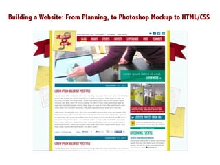
  • 8. It is important to keep your layers organized so when you are ready to slice your site you can isolate each area. Here is just the blank content area and the background.
  • 9. And here is the background, the <body> of our website:
  • 10. Start with the bottom layer of your background, and work up. Because the graph paper repeats the entire height and width of the background, we can create a tile, and have this repeat. Once you select the area you want hit Shift + Command + C This copies the contents of all visible layers into clipboard – that way if your background is made up of more than one layer, or if you aren’t on the right layer in Photoshop, it doesn’t matter. PC: Control + Shift + C Or Edit > Copy Merged in the Photoshop toolbar
  • 11. Then create a new Photoshop document, by default it will create a document that is the exact size of the image that is now on your clipboard. Hit ok and then paste the image onto the new document.
  • 12. Then save your image by going to File > Save for Web & Devices… This image is very simple so GIF is the most appropriate format to save this image as.
  • 13. Be sure to save the file in the folder you created for your images and name it something that is simple & makes sense. Do not use spaces in your filename. If you must use spaces use the underscore. Example: grid_bkg.gif
  • 14. I want to save the Post-Its as one image. I turn off the background layers so that I have a transparent background. This is the perfect time to use Shift + Command + C because these Post-It notes and the scribbling on them are all in separate layers. Also Shift + Command + C will keep the transparent background.
  • 15. By default, Photoshop will give the first layer a white background. Turn off the layer’s visibility if you want to save your image with a transparent background.
  • 16. Since I want to keep the background transparent, and I also want to keep the dropshadows on the Post-Its to look smooth, PNG-24 is the best format to save this image as.
  • 17. Once you have all your images together, it’s time to start building the website. When you open Komodo remember to use File > New > File from template… and choose HTML. Remember to save your file to the directory you created for your website. Site Directory Remember to keep your image folder inside your site directory!
  • 18. Then create a style sheet (.css file) by going to File > New > File from template… and selecting CSS from the templates area. Don’t forget to link your HTML page to the style sheet!
  • 19. First, I’m going to start with the very bottom of the background, the grid pattern. Notice that I don’t have to specify background-repeat because by default the background image will repeat x & y, starting from the top left corner (0,0).
  • 20. The background can have multiple images. It works the opposite way you would imagine it would – the first image listed is the topmost image, and the last image listed is the bottommost. body{ background-image: url('img/postits.png'), url('img/gridbkg.gif'); background-repeat: no-repeat, repeat; }
  • 21. body{ background-image: url('img/banner.png'), url('img/postits.png'), url('img/gridbkg.gif'); background-repeat: no-repeat, no-repeat, repeat; background-position: 50% 10%, 50% 290px, 0 0; }
  • 22. body{ background-image: url('img/banner.png'), url('img/postits.png'), url('img/gridbkg.gif'); background-repeat: no-repeat, no-repeat, repeat; background-position: 50% 10%, 50% 290px, 0 0; }
  • 23. Next I add a #content div to index.html and style my #content div in the CSS file. Once I have my content div styled, I can then make adjustments to the background image to make sure they are behaving correctly.
  • 24. Added margin:auto; to ensure the content div stays at the very top of the page
  • 25. But the design calls for a dropshadow on either side of the content div… how do we solve this problem? A CSS dropshadow isn’t always cross-browser compatible and doesn’t have the nuance in gradation and image has so I’m going to create a background image.
  • 26. I’ll save the image for web as a PNG-24 to keep the transparency of the dropshadow.
  • 27. #content{ width: 1014px; background: url('img/contentbkg.png') repeat-y center; height: 1000px; margin: auto; }
  • 28. Breaking down the code: #content{ width: 1014px; The actual content area is 960px but to account for the border (20px each side = 40px) and the dropshadow, the width is expanded to 1014px; background: url('img/contentbkg.png') repeat-y center; Here I am using the background property that is a shorthand property. Because I’m only working with one background, I have my link to the image, repeat-y because the background is only repeating vertically and center so that the background image is centered within the div. height: 1000px; For now this height is an arbitrary height, it is just giving me an idea of how the content div will behave once I fill it with content. Without this height, it would be too small to give a sense of how the page will look. Usually you don’t put a height on your content area because you want the content to fill the area and allow for the flexibility of pages with a lot of content or pages that have little content. margin: auto; This ensures that the content div is in the center of the page. }
  • 29. Now  I’m  star/ng  to  put  all  the  pieces   into  the  website.  I  always  start  with  the   logo  aBer  I  finish  the  background.   Generally  you  want  to  start  from  the   boKom  up  and  from  the  top  down.  You   can  add  thing  as  you  want,  but  it  does   make  it  easier  to  keep  track  of  your   code  and  where  you  are  placing  things.     No/ce  I  added  the  “ALT”  for  the  image   so  that  screen  readers  would  read  “INI   Logo”  –  it  also  helps  for  search   op/miza/on  that  you  label  all  the   images  with  an  alt.  
  • 30. To  make  the  logo  into  a  link,  simply  nest  the  <img>  tag  in  a  <a>  tag.   <div id="logo"> <a href="index.html"><img src="img/ini_logo.png" alt="INI Logo" border="0"></a> </div> Images  that  have  a  link  around  them  will  some/mes  appear  with  a  default  blue  border   there  are  a  few  ways  to  fix  this,  but  I  generally  use  border=“0”  in  my  img  tag.  
  • 31. To  make  the  logo  appear  like  it  is   in  the  mockup  –  with  it  seeming  to   be  up  past  the  edge  of  the  page,  I   use  posi%on:  absolute;     Remember,  in  order  for  it  to   posi/on  rela/ve  to  the  content   area,  you  must  add     posi%on:  rela%ve;  to  the  the   #content  div.     If  you  didn’t  add  posi/on:rela/ve;   to  the  content  div,  the  logo  would   posi/on  rela/ve  to  the  <body>   and  it  would  appear  to  “fly  off”  the   content  area.     Using  nega/ve  values  in  your   posi/oning  helps  to  get  elements   past  the  boundary  of  the  div  its   within.  
  • 32. I  start  to  add  in  and  style  my  #nav  div  –  but  it  looks  like  a  mess!   How  do  I  fix  this?   The  answer:  MATH  
  • 33. The  design  has  a  margin  of  20px  between  the  yellow  border  and  the  content  within  the  page.  So  we   need  to  put  in  some  padding  on  our  #content  div  –  but  that  effects  the  width  of  our  content  div.   Time  to  pull  out  the  calculator…  
  • 34. #content{ width: 924px; background: url('img/contentbkg.png') repeat-y center; height: 1000px; margin: auto; position: relative; padding-left: 45px; padding-right: 45px; } To  account  for  the  dropshadow  +  the  border  on  the  background  image  of  the  content  div  we  need  a   padding  of  45px  to  create  the  illusion  of  a  20px  padding  in  the  content  area.     Then  to  account  for  the  90px  of  padding  we  need  to  take  subtract  90  from  the  1014px  width.       Resul/ng  in  a  new  width  of  924px.  
  • 35. To  get  the  font  that  I  used  for  the  naviga/on  I  used  hKp://www.fontsquirrel.com  
  • 36. To  style  the  naviga/on  I  used  similar  to  the  code  I  used  for  our  dropsite  tutorial.   #nav ul { float: right; margin-top: 8px; padding-right: 20px; } #nav li.menu { display: block; float: left; font-family: 'bignoodletitlingregular'; font-weight: 100; font-size: 30px; padding-bottom: 10px; } #nav li.menu a{ text-decoration: none; padding-left: 30px; } #nav li.menu a:link, #nav li.menu a:visited{ color: #fff; } #nav li.menu a:active, #nav li.menu a:hover, #nav li.menu a:hover{ color: #E6D41B; }