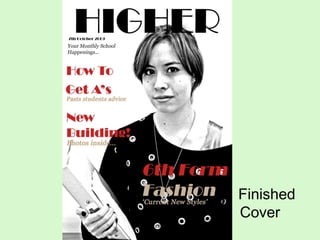
5. 5. How did you attract/address your audience? Bold text, placed from one side to the other, dominating my front cover. By having a black and white colour scheme followed by splashes of red for the cover lines it stands out a lot more, successfully attracting my potential readers. The cover is also simple and kept clear, making it easy for them to read, which then the reader will get the idea that the layout of the magazine is kept simple throughout. Monochrome colour scheme is unusual, which may immediately intrigue my potential readers.
![1. In what ways does your media product use, develop or challenge the forms & conventions of real media products? ,[object Object],[object Object],[object Object],[object Object],[object Object],[object Object],Masthead Cover Lines](data:image/gif;base64,R0lGODlhAQABAIAAAAAAAP///yH5BAEAAAAALAAAAAABAAEAAAIBRAA7)