
Recommended
More Related Content
Viewers also liked
Viewers also liked (9)
Recently uploaded
Recently uploaded (20)
Art Business Today: Caught on film - movie poster framing
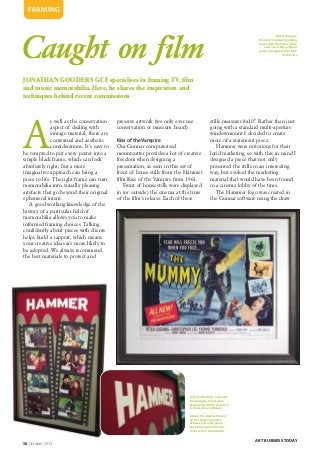
- 1. 58 October 2014 ART BUSINESS TODAY FRAMING Caught on film JONATHAN GOODERS GCF specialises in framing TV, film and music memorabilia. Here, he shares the inspiration and techniques behind recent commissions A s well as the conservation aspect of dealing with vintage material, there are contextual and aesthetic considerations. It’s easy to be tempted to put every poster into a simple black frame, which can look absolutely right, but a more imaginative approach can bring a piece to life. The right frame can turn memorabilia into visually pleasing artefacts that go beyond their original ephemeral intent. A good working knowledge of the history of a particular field of memorabilia allows you to make informed framing choices. Talking confidently about pieces with clients helps build a rapport, which means your creative ideas are more likely to be adopted. We always recommend the best materials to protect and preserve artwork (we only ever use conservation or museum board). Kiss of the Vampire Our Gunnar computerised mountcutter provides a lot of creative freedom when designing a presentation, as seen in this set of front of house stills from the Hammer film Kiss of the Vampire from 1963. Front of house stills were displayed in (or outside) the cinema at the time of the film’s release. Each of these stills measures 8x10”. Rather than just going with a standard multi-aperture windowmount I decided to create more of a statement piece. Hammer were notorious for their lurid marketing, so with this in mind I designed a piece that not only presented the stills in an interesting way, but evoked the marketing material that would have been found in a cinema lobby of the time. The Hammer logo was created in the Gunnar software using the draw Left:The Hammer logo and the dripping blood were designed with the draw tool in the Gunnar software Above:The double mount on this Mummy poster utillises soft olive green board that pulls from the tones within the artwork Opposite page: Nielsen’s metalia moulding works with the tones in the artwork of this Le Mans poster to suggest the shine of the cars
- 2. ART BUSINESS TODAY October 2014 59 » FRAMING tool, each letter being cut individually using an inverse bevel. The dripping blood was also designed within the software; to lose the white bevel, the blood was reverse cut, which also produces a slight shadow that provides a 3D feel. The stills were hinged using reversible museum tape and presented in two ‘film strips’, which were raised with a small float. To give the whole thing more of a period feel, I opted for an Arqadia beaten metal frame and spacers were hand cut to fit the different layers. To ensure the stills remained fully protected I used UV protection glass. The Mummy This poster for The Mummy is another piece of Hammer memorabilia. Released in 1959, this was Hammer’s third gothic outing after the huge international success of The Curse of Frankenstein (1957) and Dracula (1958). This poster is a US half-sheet (22x28”), which tends to be on heavier paper stock than, for example, a British quad (30x40”), or a US one- sheet (27x41”). The poster was lightly hinged using cotton museum gummed paper tape. I wanted the frame to evoke a sense of history, not only referencing the time the film was released, but also the late 19th century, when the film is set. Posters of this period are very rare, so I used cotton museum board to ensure the ultimate level of protection, but also to introduce the soft, warm depth that only cotton boards can bring. I used a double mount, with a soft olive green colour accent to pull from the tones within Bill Wiggins’ original art, and to provide the poster with an edge. I selected a frame profile of a traditional shape, with a slight silver green shimmer that emulates the tones within the mummy’s bandages. Given the value of the piece, I used museum glass and pH neutral Corri-Cor backing to finish it off. Steve McQueen Posters for the Steve McQueen classic Le Mans are highly sought after. This Spanish one-sheet (39x27”) is printed on very thin paper; to bring out the
- 3. 60 October 2014 FRAMING » colours and lighten the slight discolouration, the piece was hinged with Hayaku archival gummed tape, and was mounted onto a slightly warm jumbo conservation board. The poster has some edge wear, which was concealed by the windowmount. There was slight paper loss in the image, which I disguised by applying colour matched pastel to the undermount behind the poster. Nielsen’s metalia moulding works with the tones in the artwork to suggest the shine of the cars, and to provide sufficient support for the UV glass. The Earth Dies Screaming This poster (a US insert 36x14”) harks back to the style of the classic Hollywood B movie posters of the 1950s. I wanted the framing to reflect and celebrate this. Using a triple mount, I incorporated two bright core boards to pull the black, green and orange from the poster. This creates a striking visual impact and emphasises the stepped edge that leads the eye into the artwork. The poster had suffered some discolouration and aging, so to reduce this I opted for Bainbridge light stone conservation board, which is a tone lighter than the poster, so makes it feel fresher. The poster was framed using UV protection glass and the moulding is Nielsen’s deep gloss palamino. This gives the presentation a 1950s Formica kitsch feel and introduces an element of fun. Doctor Who To mark the 50th anniversary in November 2013 of the longest running sci-fi series on TV, we decided to create a celebratory window display. It turned out to be quite a challenge. After designing the piece on paper, I had to deconstruct it into single components. This was especially difficult when it came to the TARDIS, as I wanted to create a relief model. Not only did this have to be scaled to the appropriate size, but each component had to be sized independently to provide the dimensions required to key into our Gunnar mountcutter. Some had to be reverse bevelled, some would have straight edges and some standard bevels, so a lot of head scratching was involved. The final TARDIS model is made up of 15 individual elements. Images of each doctor, along with the space-scape, were sourced from the web. The space background was dry mounted onto conservation board and spacers were cut to continue the image around the inside of the frame. The text and ‘TARDIS 50’ logo were created in the Gunnar software in a similar way to the Hammer logo for Kiss of the Vampire. Again, these were inverse bevelled and raised with foam centred board. The police box sign, St John’s ambulance emblem and telephone panel graphics were created in Photoshop and printed onto lustre paper. As a final flourish I added small ‘handles’ to the doors to complete the illusion. ART BUSINESS TODAY This poster shows signs of aging so mountboard a tone lighter than the paper provides a fresh light feel This Doctor Who piece was created to celebrate 50 years of the TV show
- 4. October 2014 61ART BUSINESS TODAY FRAMING David Bowie The idea of this piece was to create an overview of the client’s collection in a single frame. He had numerous press cuttings, which we arranged, photographed, and then manipulated in Photoshop to create a backdrop for the presentation. This was printed onto matt paper and dry mounted onto conservation board to create the mount. The record was floated off a warm grey to push it forward, and the cards were double mounted to provide a unified feel. As with the Doctor Who piece, the spacers were carefully hand cut to ensure they married up with the background image, to provide a wrap- around feel. The piece was framed in Nielsen’s matrix cube gloss profile with UV filtering glass. Santana Although this is an old concert poster with no commercial value, it holds particular personal significance for the client, so rather than displaying it in the conventional way, I wanted to create something that transformed the poster into an art object to reflect the importance it holds for my client. Working with the powerful graphics in the poster, I double mounted it using strong reds and blacks to emulate and extend the colours. The white bevel pulls from the white in the wording. Where the poster had been pinned up it has suffered corner damage, so to disguise this I opted for shaped corners. These not only cover the damage, but they bring an extra element to the overall design. The ‘in concert’ text at the top proved especially challenging as it is not centralised and is at a slight angle. A few trial and error tests on pulp board were required to ensure that the window aperture is spot on. We opted for a hand-finished frame, which was built up with multiple layers of gesso that were sanded back to provide a glass-like surface. This was further built up with black matt spray to give a tactile feel and depth of finish. To complete the presentation, I used a small red spacer to add extra depth. As there was so much black, and to avoid losing the detail behind reflections, I used museum glass, which also ensured the poster would be protected from fading. By working with your client and thinking outside the box, it’s possible to take even a humble poster of no value, and turn it into something of beauty in its own right. ■ Jonathan Gooders GCF owns Framers in south west London, framers.co.uk Top:The background of this David Bowie piece was created by scanning press cuttings and manipulating them in Photoshop Right: Jonathan Gooders GCF Below:This is an inexpensive poster, but the luxurious hand-finished frame reflects the emotional value it holds for its owner