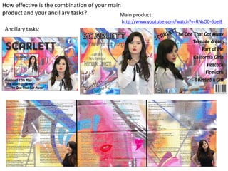
1. How effective is the combination of your main
product and your ancillary tasks?
http://www.youtube.com/watch?v=RNsO0-6oeiE
Main product:
Ancillary tasks:
2. Ancillary tasks
When researching existing digipacks from our genre we realised that the
majority of female artists use mid shots or close ups so that the
audience can recognise who it is. Their name is also clear, we wrote ours
in a font that suggests it’s in flashing lights and that she’s a star. We also
included her name at the bottom so that it looks like a signature, this
makes the album seem more personal for our audience. When making
our ancillary tasks me and the two other members of my group decided
to split it up and do different parts of it. I done the front of the digipak
and the magazine insert. We then used a fairly basic font for
information such as when it would be released and song names so that
it was readable and easier for our audience to understand.
3. I looked at Cheryl Cole and Katy
Perry’s digipaks. Cheryl Cole’s
includes the lyrics and Katy
Perry’s includes pictures of
herself. We incorporated both of
these into our own digipak by
including small images of
Scarlett throughout.
4. The backs of our digipaks are similar, we have a list of the songs that are included, the
writing down the bottom and the bar code is included. However our font is very different
and we have included our artists name on ours just to reinforce who’s album it is for the
audience buying it.
5. We tried to make ours similar to the magazine insert that we looked at of Katy Perry’s. We use
the graffiti background throughout our main products and ancillary tasks to keep up the theme.
We also included a picture of the front of the digipak on the magazine insert so the audience
knows that the album will look like and what to look out for. When making our main product
and ancillary task we considered our target audience and chose to film one of our locations at a
graffiti wall. We decided to do this because it is quite young and trendy and we think it would
appeal to a younger female audience which is what our target audience is. Our main product
includes performance shots of Scarlett performing against the graffiti wall and we also decided
to stick to that theme throughout the ancillary tasks. The background of the magazine insert is a
photo that we took of the same wall that we filmed on so that it all tied in and was clear to our
audience that they all linked in and were promoting the same song.
6. The image on the left is the outfit that Scarlett
was wearing when we were filming. Our
digipak and magazine insert include different
outfits. I think if we could improve this for next
time I would use the same outfit as the main
product for the digipak so it is more obvious
that the ancillary tasks tie in with the main
product. We tried to make the images quite
young fun and girly, by having Scarlett blow a
kiss etc. which we thought would appeal more
to our target audience.
7. Ancillary task 1:
Front of digipak, by Christie Back of digipak, by Mabel
Inside of the digipak, by Scarlett