Japan IT Week 2024 Brochure by 47Billion (English)
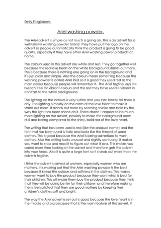
Advert For Ariel Washing Powder
1. Emily Fitzgibbons
Ariel washing powder.
The Ariel advert is simple as not much is going on. This is an advert for a
well known washing powder brand. They have put the logo on the
advert so people automatically think the product is going to be good
quality, especially if they have other Ariel washing power products at
home.
The colours used in this advert are white and red. They go together well
because the red love heart on the white background stands out more.
This is because there is nothing else going on in the background and
it’s just plain and simple. Also the colours mean something because the
washing powder is called Ariel Red so it is good they used red as the
main colour because people will remember it. The Ariel tagline says it is
bleach free for vibrant colours and the red they have used is vibrant in
contrast to the white background.
The lighting on the colours is very subtle and you can hardly tell there is
any. The lighting is mostly on the cloth of the love heart to make it
stand out more. It stands out more by seeming shinier and bold by the
way the light has been shone on it. There doesn’t appear to be much
more lighting on the advert, possibly to make the background seem
dull and boring compared to the shiny, bold red of the love heart.
The writing that has been used is red (like the product name) and the
font that has been used is italic and looks like the thread of some
clothes. This is good because the Ariel is being advertised to wash
clothes. Also the writing looks unusual and slightly confusing; it makes
you want to stop and read it to figure out what it says. This makes you
spend more time looking at the advert and therefore gets the advert
into your head. Also it is quite a large font so it stands out more than the
adverts tagline.
I think the advert is aimed at women, especially women who are
mothers. It is making out that the Ariel washing powder is the best
because it keeps the colours and softness in the clothes. This makes
women want to buy the product because they want what is best for
their children. This will make them buy the product because they think
that they will be doing better for their children and therefore making
them feel satisfied that they are good mothers by keeping their
children’s clothes soft and bright.
The way the Ariel advert is set out is good because the love heart is in
the middle and big because that is the main feature of this advert. If
2. the main feature was in the corner of the page and really small
nobody would look there. This is why the people who created the
advert would put it in the centre because it catches your attention.
Also the first thing that you see when you turn the page is Ariel logo in
the bottom right hand corner. They wanted you to see it but not in as
much detail as the main feature. When you see the logo you think that
the brand is popular and then you look at the centre feature and see
the love heart. The reader will put the well known brand name together
with the love heart picture and it will reassure them that the product
will work and be a success.
The advert makes the person who is reading it feel good about
themselves because the way that there is a heart in the photo means
that it will get into your heart and make people thing that it will always
be in their heart because the washing powder seems so good. It also
shows you the picture of the love heart being shiny; looks clean and
soft. It makes people want those clothes or for their clothes to look like
it. The only way she can get her clothes to look like this is if she buys the
Ariel washing powder. Some people would feel comforted by the fact
that their clothes could feel like that if they bought the product.