Design for Non-Designers: An Introduction to Design for Nonprofits

Do you feel like you're always outsourcing every little design project to a contract or even in-house designer? Do you wish you could dig in a bit more to create more engaging social media images, email marketing media, brochures, and powerpoints? Join us for a free Design for Non-Designers hands-on workshop. We'll have a presentation on basic fundamentals for good design as well as demonstrations of some easy tools to use. Then bring your laptop and create some images and graphics on the spot to get assistance and guidance from an experienced designer! Things you'll need: • Your laptop • A current graphic design project or an idea for one • If you have Photoshop, our speakers can help you create your graphics with that! If you don't have Photoshop, you can create a free account with Canva and use that to create graphics with our speakers. Our Speakers Dana Lu is a Vancouver based freelance graphic designer with over 11 years of experience. She specializes in designing printed marketing materials (like brochures and sell sheets) and food/product packaging (like bottle labels, pouches and boxes). See some of her projects at www.danalu.ca. Jesus Parlange, Organic Code Design Presented February 14 https://www.meetup.com/net2van/events/236669226/

Recommended
More Related Content
What's hot
What's hot (13)
Similar to Design for Non-Designers: An Introduction to Design for Nonprofits
Similar to Design for Non-Designers: An Introduction to Design for Nonprofits (20)
More from NetSquared Vancouver
More from NetSquared Vancouver (20)
Recently uploaded
Recently uploaded (20)
Design for Non-Designers: An Introduction to Design for Nonprofits
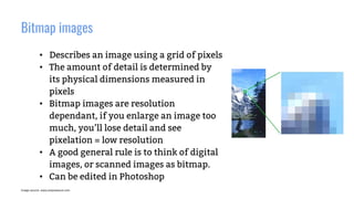
- 1. Bitmap images • Describes an image using a grid of pixels • The amount of detail is determined by its physical dimensions measured in pixels • Bitmap images are resolution dependant, if you enlarge an image too much, you’ll lose detail and see pixelation = low resolution • A good general rule is to think of digital images, or scanned images as bitmap. • Can be edited in Photoshop Image source: www.prepressure.com
- 2. Vector image • Describes an image based on geometric shapes and curves • Vector images can be resized infinitely and not lose detail like a bitmap image • Create vector images in Illustrator Image source: www.prepressure.com
- 3. Why it’s not ideal to design a business card in Photoshop Image source: www.liax.com
- 4. Colours modes and their uses Image source: www.negliadesign.com
- 5. Printing with CMYK Image source: http://leslieco.com
- 6. 100% Black vs Rich Black Image source: https://morningprint.wordpress.com/
- 7. 100% Black vs Rich Black Image source: https://en.graphic.jp/technical/check_ai/prt_black01.php
- 8. When/when not to use Rich Black Image source: http://i.imgur.com/cZIp3j8.jpg • Use rich black for large areas • Avoid using for type • The slightest shift when printing text with CMYK will be obvious. Use 100% black.
- 9. Focal point and hierarchy Undefined focal point Clear focal point
- 11. White space No white space White space helps you focus
- 12. Rough guideline for text sizing for print Business documents • Main body text: 9-11 pts • Fine print text: 5-7 pts Business cards • Main info text: 7-9 pts AVOID ALL CAPS for body text, it’s hard to read. Save them for headlines or for emphasis.
- 13. Image resolution for print Image resolution should optimally be 300 dpi at 100%. Trade secret: If you absolutely cannot get 300 dpi, there are times where you may go down as low as 200 dpi for printing if the original image is clear and in focus. The eye can really only tell up to 200 dpi.
- 14. Offset vs Digital Printing Offset Digital Method Printing press Laser printer Quality High image quality Image quality varies Price Prints high quantities at lower cost (typically 1000 min) Prints lower quantities at lower cost Turnaround At least a few days Quick! Sometimes even same day Colours CMYK and Pantone CMYK
- 15. BASIC WEB DESIGN GUIDELINES 1 - Simple is beautiful. 2 - Design is paramount. 3 - Consistency is key. 4 - Make your website responsive. 5 - Develop for multiple browsers. 6 - Check your website for errors 7 - Write your own code. 8 - Don't forget the content.
- 16. IMAGES SIZES File Dimensions and File Size Inspecting size of images Dimensions – Physical size File size For most ‘full page’ web images, you want the image to be 80Kb-400Kb at most. If the image is only part of a page (e.g. half the width of a blog post), then 20Kb-30Kb is usually fine. Image Preparation Tools Summary
- 17. EXTRA WEB DESIGN PRINCIPLES 1. How you group elements suggests their function 2. White space affects attention 3. Clashing colors make elements stand out 4. Consistency aids learnability 5. Each color has unique psychological effects
- 19. COLOURS Red – powerful, passionate, alarming Orange – playful, friendly, inexpensive Yellow – happy, alert, warm Green – natural, prosperous, balanced Light Blue – serene, inviting, refreshing Dark Blue – trustworthy, professional, secure Purple – luxurious, romantic, mysterious Black – sophisticated, edgy, oppressive White – clean, virtuous, simple Gray – neutral, formal, gloomy
- 20. LINKS CANVA https://www.canva.com CANVA tutorial https://www.youtube.com/watch?v=XqYti78riU8 Create images with ease! https://www.youtube.com/watch?v=kyROcitFW0w Free Stock Photos https://unsplash.com/ https://www.pexels.com/ Online Photo Editor http://www.pizap.com/ Font Pair Google Fonts http://fontpair.co/