Developing a library-based data visualization service
•
4 likes•493 views

2015 MAC-MLA presentation on Developing a library-based data visualization service

Recommended
Recommended
More Related Content
What's hot
What's hot (16)
Similar to Developing a library-based data visualization service
Similar to Developing a library-based data visualization service (20)
More from Douglas Joubert
More from Douglas Joubert (20)
Recently uploaded
Recently uploaded (20)
Developing a library-based data visualization service
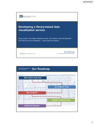
- 1. 10/24/2015 1 NIH Library | http://nihlibrary.nih.gov Developing a library-based data visualization service Doug Joubert, Chris Belter, MaShana Davis, Lisa Federer, and Ariel Deardorff 2015 MAC-MLA Annual Meeting - Library Services Session Our Roadmap Our DataViz Team DataViz Evaluation DataViz Tools/Training NIH Library Tech Hub Why DataViz?
- 2. 10/24/2015 2 Our Community NIH Library Technology Hub 3D Printing Recording Studio Software & Collaborative Workspaces Source: Livescribe.com Smartpens Mobile Apps & Devices Display & Touchscreen Source: Samsung.com Source: Asus.comSource: Apple.com
- 3. 10/24/2015 3 NIH Library DataViz Team • Graphic design • Network visualization • Visual perception • Infographics Chris Belter • R and R Studio • Visualization for exploratory data analysis • Interactive and dynamic visualizations • Infographics Lisa Federer • Graphic design • Data analysis • Data visualization • GIS and mapping • Spatial analysis Doug Joubert DataViz Community of Practice • Quarterly meetings and a listserv • Knowledge sharing and best practices • Case study focused on the graphical display of information, network visualization, online mapping, and spatial data
- 4. 10/24/2015 4 Our Tools Software and Support • There are three levels of support for each pod: • Basic - open the software, create a project, and add files to a project. • Medium - all of the tasks in basic support category plus the ability to create original content. • Full - all of the tasks in the medium category, plus, support for advanced features.
- 5. 10/24/2015 5 Our Training • Demonstrates how to process data in RStudio so it is in the proper format for creating a heatmap and how to create and customize a heatmap • Offered in-person and via webinar. • 2 sessions; 64 total attendees Creating Heatmaps with R
- 6. 10/24/2015 6 Advanced Heatmaps with R • Demonstrates drawing dendrograms that visualize hierarchical clustering and how to create customized color palettes • Builds on the concepts from Creating Heatmaps with R class • Offered in-person and via webinar • 2 sessions; 46 total attendees • Hands-on session introducing participants to using ggplot2 with RStudio • Offered in-person and via webinar • 5 sessions; 112 total attendees DataViz with ggplot2
- 7. 10/24/2015 7 Principles of Data Visualization • Provides an overview of how data visualizations are constructed, how people tend to understand visual cues like shape and color, and how to use those cues to create visualizations that are both attractive and informative • Offered in-person and via webinar • 2 sessions; 56 total attendees • Explores Microsoft Excel Business Intelligence (BI) tools—Power Pivot and Power Query, which allow users to establish relationships between large datasets and develop complex queries • Offered in person and via webinar • 2 sessions; 110 total attendees Excel Business Intelligence
- 8. 10/24/2015 8 • Provides an overview of online mapping, with a focus on mapping health information • Case examples illustrated how data visualization tools have transformed how we make maps and analyze geographic patterns in health data • Offered via webinar. • 1 session; 62 total attendees. Spatial Literacy and Mapping • Hands-on session covering how to customize a network visualization and export a finished visualization into various file formats using Gephi • Offered in-person and via webinar • 1 session; 10 total attendees Visualizing Data with Gephi
- 9. 10/24/2015 9 • Hands-on session that introduces the principles of visual perception and best practices for data visualization and the use of Inkscape to create infographics • Offered in-person • 1 session; 21 total attendees Creating Infographics using Inkscape Our Evaluation
- 10. 10/24/2015 10 • NIH Library Data Visualization Survey • Gathered feedback to help us develop training and services to support data visualization at NIH and HHS • 10 questions on potential services, types of tools being used and types of tools for which training is desired, types of data to be visualized and its purpose of use, and demographics • 160 responses • Data Visualization Training Survey • 14 demographic questions, specific questions about the webinar experience [webinars only], and specific questions about course content • Ongoing survey that evaluates data visualization classes and webinars • Number and type of consultations Three Methods of Evaluation
- 11. 10/24/2015 11
- 12. 10/24/2015 12
- 13. 10/24/2015 13 NIH Library | http://nihlibrary.nih.gov Douglas Joubert douglas.joubert@nih.gov