
Recommended
Recommended
More Related Content
More from daqueenofsass14
Recently uploaded
Recently uploaded (20)
Jess Glynne Digipak Analysis
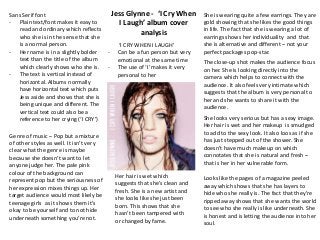
- 1. ‘I CRY WHEN I LAUGH’ - Can be a fun person but very emotional at the same time - The use of ‘I’ makes it very personal to her Sans Serif font - Plain text/font makes it easy to read and ordinary which reflects who she is in the sense that she is a normal person. - Her name is in a slightly bolder text than the title of the album which clearly shows who she is. - The text is vertical instead of horizontal. Albums normally have horizontal text which puts Jess aside and shows that she is being unique and different. The vertical text could also be a reference to her crying (‘I CRY’) Her hair is wet which suggests that she’s clean and fresh. She is a new artist and she looks like she just been born. This shows that she hasn’t been tampered with or changed by fame. She is wearing quite a few earrings. They are gold showing that she likes the good things in life. The fact that she is wearing a lot of earrings shows her individuality and that she is alternative and different – not your perfect packages pop-star. The close-up shot makes the audience focus on her. She is looking directly into the camera which helps to connect with the audience. It also feels very intimate which suggests that the album is very personal to her and she wants to share it with the audience. She looks very serious but has a sexy image. Her hair is wet and her makeup is smudged to add to the sexy look. It also loos as if she has just stepped out of the shower. She doesn’t have much makeup on which connotates that she is natural and fresh – that is her in her vulnerable form. Looks like the pages of a magazine peeled away which shows that she has layers to hide who she really is. The fact that they’re ripped away shows that she wants the world to see who she really is like underneath. She is honest and is letting the audience into her soul. Genre of music – Pop but a mixture of other styles as well. It isn’t very clear what the genre is maybe because she doesn’t want to let anyone judge her. The pale pink colour of the background can represent pop but the seriousness of her expression mixes things up. Her target audience would most likely be teenage girls as it shows them it’s okay to be yourself and to not hide underneath something you’re not. Jess Glynne - ‘I Cry When I Laugh’ album cover analysis
- 2. Jess Glynne Back CoverOn the back cover the font is the same as on the front cover. It is plain text/font which, again, makes it easy to read and ordinary which reflects who she is in the sense that she is a normal person and that she is not going to change for anyone. There is no image on the back cover it is just the same pink colour as on the front. This maybe is because she is trying to show the audience that she is a simple person. It has no extra imagery as she wants the audience to focus on the tracks and what they are saying (i.e. the lyrics). The track list is placed in the middle of the back cover which shows that it is the main focus of the album and that the music is at the centre of her life. The information about the record label is placed on the side of the back cover and is in a smaller font than the track list. This shows that it is not as important as the music. It also suggests that Jess cares more about the music and is focused on herself and what message she wants to put across. The writing down the spine is in the same simple white font as the title and the track list. It only mentions her name, the title of the album and the record label which, again, suggests that she is simple and that her main focus is the music. The pale pink colour of the background can represent pop and shows that she is girly as pink is used to represent girls. Stereotypically girls are sensitive and emotional so this could represent that she is trying to let all of her feelings and emotions out through her music. This is why she feels her music is important and should be the focus.
- 3. Jess Glynne DiscHalf of the album is the same pale pink colour as the backgrounds of the front and back cover which represents pop. However the use of the images mixes things up. Unlike the back cover the CD has the same images that look like a magazine peeled away as if by layers. Half of the CD is covered by this which could show how she was hiding her real self away and is coming out of her shell. Through releasing this album she is starting to show the world who she really is underneath. The information about the record label is placed around the edge of the CD which, again, shows that it is not as important as what she is trying to put across. It is in the same white font and is smaller than all of the text on the cover which shows that it is not the focus of the CD.