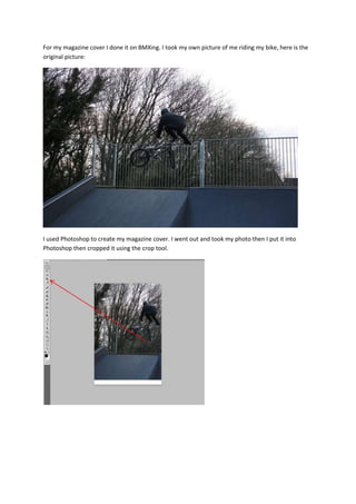
1. For my magazine cover I done it on BMXing. I took my own picture of me riding my bike, here is the
original picture:
I used Photoshop to create my magazine cover. I went out and took my photo then I put it into
Photoshop then cropped it using the crop tool.
2. Then I chose a font and name for my magazine using the text tool.
Then I created some stories on the left hand side using my knowledge of left hand side third to make
the blue lines I used the paint brush tool then changed the kind of brush then used the text tool to
make the text and the colour tool.
3. Then I made my own barcode using a website (http://www.dafont.com) then I put a puff at the
bottom of the magazine to show what else is inside.
The strengths of my magazine cover is the bold easy to read
title and I used the picture I did because it relates to the
target audience and using the rules of making a magazine like
left side third and using plugs. Some of the weaknesses of my
cover is that some of the font and colour is not easy to read
and doesn’t have any puffs. Also it looks like a BMX magazine
that other companies would make such as Ride UK BMX.
Overall I like the way my magazine cover turned out, if I was
to do it again I would use a different picture so I could change
the colour of the font and maybe add abit more.