1. Analysis of Film Magazine Covers
Scream(Horror Magazine)
The target audience for Scream magazine is not only fans of films but to be more specific
fans of horror films. This is represented in all the different aspects of the magazine cover.
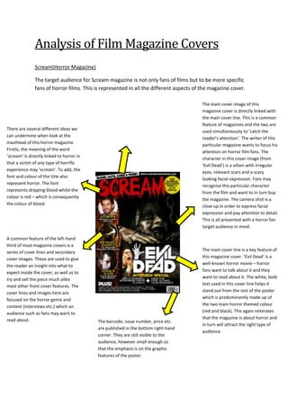
There are several different ideas we
can undermine when look at the
masthead of this horror magazine.
Firstly, the meaning of the word
‘scream’ is directly linked to horror in
that a victim of any type of horrific
experience may ‘scream’. To add, the
font and colour of the title also
represent horror. The font
represents dripping blood whilst the
colour is red – which is consequently
the colour of blood.
A common feature of the left-hand
third of most magazine covers is a
series of cover lines and secondary
cover images. These are used to give
the reader an insight into what to
expect inside the cover; as well as to
try and sell the piece much alike
most other front cover features. The
cover lines and images here are
focused on the horror genre and
content (interviews etc.) which an
audience such as fans may want to
read about.
‘Blood, guts, gore and more’. The
language used in this banner is linked
to directly to the horror genre and is
used in conjunction with the rest of the
cover to target a very narrow target
audience of horror fanatics.
The barcode, issue number, price etc.
are published in the bottom right-hand
corner. They are still visible to the
audience, however small enough so
that the emphasis is on the graphic
features of the poster.
The main cover image of this
magazine cover is directly linked with
the main cover line. This is a common
feature of magazines and the two are
used simultaneously to ‘catch the
reader’s attention’. The writer of this
particular magazine wants to focus his
attention on horror film fans. The
character in this cover image (from
‘Evil Dead’) is a villain with irregular
eyes, relevant scars and a scary
looking facial expression. Fans may
recognise this particular character
from the film and want to in turn buy
the magazine. The camera shot is a
close up in order to express facial
expression and pay attention to detail.
This is all presented with a horror fan
target audience in mind.
The main cover line is a key feature of
this magazine cover. ‘Evil Dead’ is a
well-known horror movie – horror
fans want to talk about it and they
want to read about it. The white, bold
text used in this cover line helps it
stand out from the rest of the poster
which is predominantly made up of
the two main horror themed colour
(red and black). This again reiterates
that the magazine is about horror and
in turn will attract the right type of
audience.
2. Empire (Film Magazine)
Empire magazine is a well-established magazine series that concentrates its product on the
modern-day Hollywood theatre business. Its target audience is predominantly fans of films
with ages ranging from young adults to the middle-aged.
The fact that the mast head of this magazine is
hidden behind other features and not the vocal
point of the cover tells me that the magazine is
extremely well-established – the reader can
recognise the magazine regardless. The font of the
mast head is modern and the chosen colour of red
is the only source of that particular colour on the
page.
One cover line on this cover page
reads “The Hot Issue” and is a clever
play on words in relation to the main
cover image. Megan Fox is known for
being one of the hottest actors in the
Hollywood.
In the bottom left hand corner of the
page there are extra cover images
and eye-catching cover lines. These
tell us what features will be included
inside the magazine. It is important to
let the reader know what they are to
expect and to get them looking
forward to the content which they
might find.
Empire magazine is targeted at a
young, modern-day audience with
an interest in film entertainment.
The colour scheme of this cover
(greys, blues, reds and black) and
the fonts used are all
representative of this target
audience.
This mid long shot of Megan Fox is
the main cover image of this
magazine cover. The image takes
up most of the page – covering
some of the mast head. This is the
vocal point of the cover. Megan
isn’t wearing many clothes in the
picture and this is used to attract
the target audience. Although not
all readers are heterosexual male
– the way she is looking at the
camera and the fact that she isn’t
wearing a top is going to catch any
eye.
3. Fangoria (Horror Magazine)
Fangoria magazine features all different types of horror however is more specifically tailored
to fans of gore horror.
The colour scheme for this magazine cover
is a mix of darker blues/blacks and a
mixture of more vibrant reds, yellows,
orange and white. The darker colours are
representative of horror and fear whilst the
vibrant colours make the magazine appeal
to the reader. Red can also be associated
with blood and gore – the use of this colour
for the mast head is appealing.
The main cover line on this cover
page reads ‘Martyrs’ – a horror
movie. It is presented in a stylistic
bold, white font which is both
larger and a different colour to the
other cover lines. The audience
may recognise the movie and
consequently want to read/buy
the magazine. The other cover
lines on the magazine cover also
read titles of horror films.The
yellow/orange colours used in
contrast to the dark background
make the cover lines significantly
stand out. It is clear to the reader
what to expect from the
magazine.
appealing.
The main cover image of this magazine takes up
the majority of the page. Although the colours
are dark and in the background, as oppose to
the mast head and various cover lines, it is the
most representative aspect of horror on the
cover. The facial expressions of the character
along with the long, black hair and scarred body
are fearful to look at.
The mast head used for the
Fangoria magazine cover is typical
of a horror magazine mast head
both through the design and lexical
choice. The word ‘fang’ is associated
with horror – vampires and other
inhumane horror characters have
fangs. The word ‘gore’ can also be
interpreted from this title. Gore is a
feature of some horror movies and
can be linked with the fact that the
title is red – blood and gore. Finally,
the ‘F’ and the ‘A’ at each end of the
mast head are shaped like fangs.
When these three aspects are put
together the mast head becomes a
‘horror’ and appeals to the right
audience for the magazine. The
reader sees words and colours
related to their desired subject of
reading and grows a sense of
appeal.