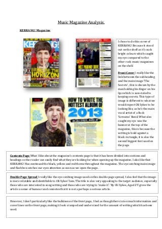
1. Music Magazine Analysis.
KERRANG! Magazine
I chose to do this cover of
KERRANG! Because it stood
out on the shelf as it’s such
bright colours which caught
my eye compared to the
other rock music magazines
on the shelf.
Front Cover I really like the
link between the subheading
and the main image ‘The
Secrets’ , this is shown by the
man holding his finger on his
lips which is associated to
keeping secrets. This type of
image is different to what we
would expect Oli Sykes to be
looking like, as he’s the main
vocal artist of a Rock
‘Screamo’ Band. What also
caught my eye was the
banner at the top of the
magazine, this is because the
writing is bold against a
black rectangle, it is also the
second biggest font used on
the page.
Contents Page What I like about the magazine’s contents page is that it has been divided into sections and
headings so the reader can easily find what they are looking for when opening up the magazine. I also like that
KERRANG! Has continued the black, yellow and red theme throughout the magazine. The eye catching main image
and flash box catches our eyes attention as soon as we open the page.
Double Page Spread I really like the eye catching image used on this double page spread, I also feel that the image
is more relatable and identifiable to Oli Sykes’ fans. The title is also very appealing to the target audience, especially
those who are interested in song writing and those who are trying to ‘make it’. ‘By Oli Sykes, Aged 25’ gives the
article a sense of humour and connotes that it is not a perhaps a serious article.
However, I don’t particularly like the bulkiness of the front page, I feel as though there is too much information and
cover lines on the front page, making it look cramped and under sized for the amount of writing which has been
used.
2. Q Magazine
I chose to analyse this particular
issue of Q magazine because it’s
such an eye catching and intense
photograph of Florence Welch
from Florence And The Machine.
Front Cover This front cover is
one of my favourite covers, it’s so
simple and eye catching, the
simplicity of it is truly stunning.
What makes it so great is the
main image, it’s such an intense
and eye catching photograph, you
completely forget that this is
actually a music magazine. There
are no cover lines clogging and
over crowding the image, which
gives the feel of a peaceful
interview perhaps. The one word
which stands out from the cover
is her name in capitals.
The photographer has captured
and emphasised her ginger hair
and the paleness of her skin, to
some extent that she perhaps
matches the Q identifier.
Contents Page What I like about Q’s contents page is that it’s the same style in all of the issue’s. I also like that all
the writing is small apart from perhaps the main cover line which is in bolder and bigger writing ‘Meet the new
Simon Cowell’, this also relates to the magazines target audience as they would perhaps be interested in how to
make it in the music industry.
Double Page Spread Once again the main image subtly relates to the title of the article, this is by having Florence
being in the dark with only a little bit of light leaked onto her face. Being in the dark and all by yourself connotes
loneliness. The colour scheme also works well as the image is mostly black, and so is the title of the article; I think
this look makes the double page look sophisticated.
Although, I do not feel as though the contents page for this issue is laid out correctly. By this I mean that instead of
the image used for number 86, I feel as though a picture of Florence should be there instead, showing the reader
who perhaps, like me, picked up this issue to read about Florence rather than a man they do not know of.
3. NME Magazine
I found this issue of NME much
more intriguing to look at rather
than the other two I have looked
at and analysed previously.
Front Cover When I first looked
at this cover, I wondered why
Alice Glass had her arm
positioned the way it is, but as I
read the lead line, I realised that
in fact the main image and lead
line link perfectly together. The
main image is very eye capturing.
Because of the white background
what they are wearing and the
colour of Alice’s hair stands out
even more, making it eye
capturing.
I also like the contrast in colours
of the red, black, and blue.
Because the background is white,
the cover lines and lead line
stand out even more.
Contents Page NME’s contents page is different to the other three as instead of titling it ‘Contents Page’
they have named it ‘Inside This Week’ and because they have renamed it that, it shows continuity of the
magazine. I also like the layout and the use of images, the large numbers within boxes are similar to Q
magazine, but it still manages to look better in NME magazine.
Double Page Spread I cannot explain how much I love this double page spread. The image used really
captures my eye, when I was reading the article on the other page, I couldn’t help but look at Alice’s
pose. I also really like the title of the article, and how NME has turned round the ‘S’ in twisted to add
another effect and level into the article. I believe that even if the article wasn’t mind blowing, the image
and how the title has been presented really makes this double page spread.
I cannot think of anything bad to say about either of these three things. I really enjoyed looking at the
front cover, it really engaged me and made me want to read the interview NME done with Crystal
Castles.