Building a budgeting app that's kinda fun case study
•Download as KEY, PDF•
2 likes•1,417 views

Presented at EuroIA 2010 in Paris.

Recommended
Recommended
More Related Content
What's hot
What's hot (20)
Similar to Building a budgeting app that's kinda fun case study
Similar to Building a budgeting app that's kinda fun case study (20)
Recently uploaded
Recently uploaded (20)
Building a budgeting app that's kinda fun case study
- 1. Case study: Building a budgeting app that’s kinda fun
- 2. We all work to avoid this
- 3. So we got a call to do something a bit different
- 4. Flickr Credit: London Permaculture
- 5. “We want to do something that helps people in these crappy times -- a budgeting app that actually helps them with their money” Flickr Credit: London Permaculture
- 7. Challenge #1: Personal budgeting ≠ fun
- 11. but Mint isn’t in Europe
- 13. Apps make us do the hard work
- 14. Apps make us do the hard work
- 15. Obvious general principle #1: Don’t ask people questions they can’t easily answer
- 18. I don’t have a favourite athlete!
- 19. Project principle #2: Ignore categories people can’t easily change Flickr Credit: infomatique
- 20. The big idea: Forget your mortgage, think about those coffees
- 21. Our design principles • Low effort to use • A bit of fun, but not totally frivolous • Give actionable results • Focus on a single-visit use • Make it worth sharing
- 22. • Discretionary • Frequent • Easy-to-calculate • Provocative • Widespread
- 23. Initial theme: riffing on the Irish Catholic thing
- 25. Sketchy wireframes leads to sketchy visual design?
- 41. So let’s see what worked
- 42. Not-so-obvious design principle: Long funnels can work
- 47. • Nice visual design? • Good copy writing? • Interest in the results?
- 48. Common design challenge: How to convince client/ boss to go with the better design?
- 51. User-testing A/B testing Collaborative design workshops Design rationale + jargon-y terms to add credibility (banner-blindness) Convince one member of client team -- have them work behind the scenes to persuade the other!
- 52. User-testing A/B testing Collaborative design workshops Design rationale + jargon-y terms to add credibility (banner-blindness) Convince one member of client team -- have them work behind the scenes to persuade the other! Design changes/decisions late in the process tend to be hurried, and have high risk of having unintended risk to overall design
- 53. • 11% clicked through to client’s brochureware
- 54. • 11% clicked through to client’s brochureware
- 55. • only 2% shared the site • and very little usage of the Compare filters
- 56. Making things successfully social is hard to do • only 2% shared the site • and very little usage of the Compare filters
- 57. Ongoing challenge: How can agencies move from launch, launch and test, learn leave it to improve, repeat
- 58. Thanks! @brian_donohue www.iqcontent.com We’re recruiting! and thanks to for letting us do this case study
Editor's Notes
- So today I want to talk you about what I hope proves to be an interesting case study.
- And I think one of the reasons we're all here is that we like to think that the work we do helps avoid things like this. This isn’t Ryanair we’re talking about here, but Facebook, who prides themselves on their usability. And still cockups like this happen, that really piss people off. So I think one of the luxuries of our jobs, is that we get to fight, or try to fight, the good fight. To make things better.
- But I digress. Because we don’t do work for Facebook (nor for Ryanair), but we do tend to work for bigger organisations -- banks, telecoms, utilities, which translates into a certain flavour of work. But this time we got a request to do something a bit different.
- You may be aware of this thing called a recession --. And this was a request for a pretty small app, not an all singing all dancing sort of thing. For PR primarily, but not a marketing gimmick.
- You may be aware of this thing called a recession --. And this was a request for a pretty small app, not an all singing all dancing sort of thing. For PR primarily, but not a marketing gimmick.
- Keep in mind that the banks, particularly in Ireland (we're coughing up 25 billion for the failed Anglo Irish Bank), took a serious beating to their reputations, so this was a little more delicate than normal.
- it's hard, it's painful, it's a big investment of time and energy. I’ve actually done this -- used Apple’s Numbers budgeting template -- went through all my bills, figured out average spends. Did it over the course of several weeks. Huge pain (though very useful).
- Some of the pitches they received proposed variants of this whole shebang approach.
- But even Mint ignores this little detail -- cash. Where do we spend our cash? Irish people are still fond of using cash.
- I don’t know how much I spend on groceries each week!
- I have no idea how many web pages I view in a day, or emails I send, or emails with attachments...
- It’s like those awful password recovery questions -- I don’t have a childhood hero, or a favorite athlete!!
- Another problem with the standard approach of budgeting tools is that they focus on expenses you can’t really do much about anyway. I mean, if you spend 50e a month on the bus for your commute, are you really gonna consider walking the 10 miles into work? Changing these types of expenses requires a lot of effort. And a lot of effort is exactly what we set out to avoid with spendometer.ie.
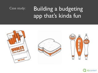
- There’s another big problem with your standard budgeting apps — they ignore a lot of places where we do spend our money — our vices. I’m talking about the obvious ones, like smokes and drink, and the more innocent-seeming ones as well, like take-out coffees. Consider that person in your office who gets a couple of take-away coffees a day. Do they have any idea how much they spend each month on those café lattes?
- A major consideration is what spending categories to include -- here’s the criteria we came up with to choose among them.
- We really liked this, but, understandably, the bank was a bit worried this approach could prompt a bit of a backlash -- "What about your own financial sins!"
- Had a fun word-association brainstorming session, which eventually brought us here...
- We frequently use the Konigi sketch stencil for Omnigraffle -- whole purpose is to get people not to focus on anything resembling visual design -- but client actually like it! I’ve talked to a few other people who’ve run into this situation. Happily, in our case, it genuinely does suit the app.
- Demo the app
- Demo the app
- Demo the app
- Demo the app
- Demo the app
- Demo the app
- Demo the app
- Demo the app
- Demo the app
- Demo the app
- Demo the app
- Demo the app
- Demo the app
- Demo the app
- 10 categories + savings + personal details = 12 step funnel. This is really long. (Can’t even fit all the steps in GA.) But perhaps the thing I’m most happy about on this project is the analytics on this. You’d expect drop-outs at each step, particularly the personal details pages. But most pages have a 99% step completion rate.
- Why did the funnel have such a high success rate? Perhaps 1 reason is we used this mad-lib style before Luke W gave it a lot of attention on his blog. It worked well in the user testing, and I think it’s an example of trying to make the interaction match the way we think. Also makes it feel a little less like a standard form, less like work.
- Why did the funnel have such a high success rate? Perhaps 1 reason is we used this mad-lib style before Luke W gave it a lot of attention on his blog. It worked well in the user testing, and I think it’s an example of trying to make the interaction match the way we think. Also makes it feel a little less like a standard form, less like work.
- Hard to say for sure why the funnel worked so well -- presumably a combination of it all.
- Obviously, this is the design that *you* think is better.
- Concerns about scrolling had the client wanted this version of the CTA. We preferred a version that integrated the CTA with the results.
- Concerns about scrolling had the client wanted this version of the CTA. We preferred a version that integrated the CTA with the results.
- Concerns about scrolling had the client wanted this version of the CTA. We preferred a version that integrated the CTA with the results.
- First two weren’t options. Third option didn’t work well enough. 4th one did.
- First two weren’t options. Third option didn’t work well enough. 4th one did.
- The result...
- Maybe this is because people are wary of sharing their spending habits? Is it a little too personal? Hard to believe given how much info people share these days. I wish I had the answer to this.
- Maybe this is because people are wary of sharing their spending habits? Is it a little too personal? Hard to believe given how much info people share these days. I wish I had the answer to this.
- This is among the biggest hurdles agencies face to providing the best value.