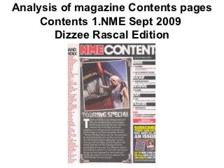
2. Contents page NME Analysis
There is a banner at the
NME masthead is the same top to highlight and
colour scheme as the front introduce the name
Subheadings are blocked
The image is edited so it
out into black sub sections
looks like a photography
to show they are important
straight from a camera
and have a meaning
from the tour she was on
Brief heading and summary
The main image is joint of content with page number
with an article in the centre in red to separate the block
to show the importance of information but does not
over power each point
Bands are listed in red
with page number in black Promotion/advert is placed
so although it has it own in the corner to make is
column it stands out more seem like the reader is
getting a great deal
3. ANALYSIS OF LAYOUT/DESIGN FEATURES OF
CONTENTS PAGE
Band index- Masthead and word contents- Bold at the top so
showing a scheme is recognized and then date added
list of any underneath
bands
named in Photo- Introducing the News, radar, reviews,
this edition writer and giving an live, features- This is
so fans can idea into the articles displayed in separate
easily contents columns to advertise
search and each section to the
look for their magazine with page
favourite numbers included
ones and go
straight to Introducing article- Plus- Extra parts to
that page Special section of text the magazine which
which gives a opening give the idea you are
to the magazine and an getting extra for your
idea of what is included money
Advertising- This
section give details of
subscription to the
magazine and the
offers that are
available