
Recommended
More Related Content
What's hot
Viewers also liked
Similar to Media music magazine evaluation
Similar to Media music magazine evaluation (20)
More from agreen1994
Recently uploaded
Recently uploaded (10)
Media music magazine evaluation
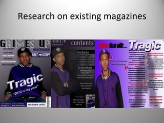
- 1. Research on existing magazines
- 2. I decided to use RWD,Flavour and vibe to help create my magazine. I followed the codes and conventions of RWD the most as not only is it is similar in style and tone to my magazines genre, but also due to its targeted audience. I used RWD for my cover layout as I like the calmness of the image and the story was similar. There’s not too much information but the main story is made clear. My cover has slightly more information at the front to let the readers know more. Also the colour conventions on my front cover are different. However I have decided to use a large relaxed image in the centre and the models name is shown large.
- 13. People from my magazines social group
- 16. The images I started with were each taken with a professional camera in chosen locations, and I decided to have them with backgrounds that could be cut out easily. With each image I had to use the magic lasso tool to cut around the. Then I had to place them on a plain background of a chosen colour. After I would then use the eraser tool to dispose of any remains of the original background so the pictures look more professional. Finally I used free transform to stretch the images without pixilation.
- 17. This is a first draft of my cover. As you can see I used the same image as my final draft but the cover is lacking text, text which I feel was needed to introduce the magazine being a first issue. The text is across the model and in black which I found quite boring and bland so I decided to change the colour and tilt it. Also I made the image slightly lighter to try and escape that dark feeling. With this contents page I also used the same image but once again it is lacking vital information and looks very simple. The words grime up are written simply, not even showing the magazines logo. Also it is made clear it’s the contents page but the text is small and not very not attractive. A few pages and their artist are shown but it is clear that not enough information us present for a reader. The best feature is probably the associating colours.