Michelle Thompson
UK Illustrator,who has a master’s degree in Illustration from the Royal College of
Art in 1994-1996 and a BA Honors/first class in Graphite Design from Norwich
School of Art in 1991-1994.
Michelle Thompson is a freelance illustrator from 1996 and onwards and is a
member of the association of Illustrators.
Her work uses a combination of traditional collage techniques and digital
technology, as she uses a found material combination (books, magazines,
packaging, etc.) with painted, drawn and printed elements. Additionally her
work refers to share memories by how she cuts up and reassemble the images of
recent history to reflect the contemporary themes and popular culture of today.
(Source: http://www.michelle-thompson.com/about.asp).
Analysis of the piece
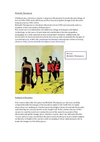
One reason why I like this piece by Michelle Thompson, as she has carefully
compositionally the images of the people in right to left ‘walk’ line to imply
where they are walking to. Furthermore the bright colours from both the people
and lettering are very powerful as the bright ‘red’ letter catches the eye of the
viewer to read the word as it makes the word the main focus point of this
illustration/graphite design piece. Another reason, why I am influenced by the
‘re-use’ piece as you can tell that the piece has be built up in layers which implies
an illusory of depth in the work as well as making it three-dimensional a bit to
make the images to lift off the piece.
Re-use
Michelle Thompson
2.
Analysis of thepiece
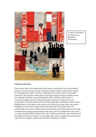
One reason, why I was influenced by the piece as Michelle uses characteristic
features on the London transport (double-deckers buses and the tube trains).
For example the bright red colour symbolizes the colour used on the public
transport. The features of the pieces represents many transports links such as
the underground tube map showing how all the stations and London is
connected together by this method of public transport. Furthermore the
composition of the placement of the visual images gives definition and reveals a
hidden illusory of London, such as the cut out positive shapes that represents
buildings on top of the surface whilst the tube map shows what goes off
underneath the surface. Additionally the lettering on the illustration piece helps
to define the meaning and message of the piece. As for example the word ‘river’
is representing the River Thames, but also is illustrated by the representation of
the ‘light blue’ colour and the cut out shape that shows roughly shows where the
tube crosses and goes underneath the River Thames in London.
London Transport-
Architectures
Michelle
Thompson
3.
Michelle Thompson’s workshows a clear understanding in what she has studied
at the two universities, as she illustrates recent history through her
contemporary artwork. As she allows the viewer to have a powerful, clear
understanding of what is going off in the world today, as Michelle gives them a
different approach by a visual image than words in text of newspaper or social
media. The two pieces that I would influenced by her illustration/graphite
design artwork creates this message clearly to me, as I understand perfectly
about what they are on about and makes me aware of the issue. Unlike me
reading words to gave an understanding, these visual illustration gets the viewer
straight to the point without misleading them by ‘unclear, rubbish’ articles in
newspapers.