Not your average responsive email design – lyris blog
•
0 likes•418 views

Andrew King decodes the Menu drop-down based responsive email design for emailers from envirofone.

Recommended
Recommended
More Related Content
Recently uploaded
Recently uploaded (20)
Featured
Featured (20)
Not your average responsive email design – lyris blog
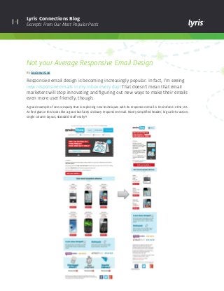
- 1. 1 Lyris Connections Blog Excerpts From Our Most Popular Posts Not your Average Responsive Email Design By Andrew King Responsive email design is becoming increasingly popular. In fact, I’m seeing new responsive emails in my inbox every day! That doesn’t mean that email marketers will stop innovating and figuring out new ways to make their emails even more user friendly, though. A good example of one company that is exploring new techniques with its responsive email is Envirofone in the U.K. At first glance this looks like a good but fairly ordinary responsive email. Nicely simplified header, big calls-to-action, single column layout, standard stuff really?!
- 2. 2 Lyris Connections Blog Excerpts From Our Most Popular Posts Then I noticed the menu button in the top right of the email. I’m familiar with this type of button on mobile websites as it usually indicates that there is a dropdown menu. So I tried tapping on it and was surprised to find that the same thing happened within this email. Now I know what you’re thinking, this probably works great on iPhones but will be a shambles in other email clients and devices. Not so! Check out these tests here. As you can see, it displays normally on Webmail or desktop email clients and it also isn’t doing anything odd in Android or Windows devices. So how does this work? The menu button is contained within a div with the class “menu-dropdown” which is hidden on large screens using a media query. The key element here is the checkbox, which is positioned off screen. When this is checked, a list which has been styled to look like a dropdown is displayed; when it’s not checked, it’s hidden.
- 3. lyris.comCopyright © 2014 Lyris, Inc. All rights reserved. About Lyris Inc: Lyris (@Lyris ) is a leading global provider of digital marketing solutions that help companies engage with customers in more meaningful ways. Lyris products and services empower marketers to design, automate, and optimize data- driven interactive marketing campaigns that facilitate superior engagement, increase conversions, and deliver measurable business value. Lyris’ high-performance, secure, and flexible digital marketing platforms improve marketing efficiency by providing automated digital message delivery, robust segmentation, and real-time digital channel analytics. The Lyris solutions portfolio is comprised of both in-the-cloud and on-premises offerings – Lyris HQ and Lyris LM – combined with customer-focused services and support. More than 5,000 companies worldwide partner with Lyris to manage and execute sophisticated digital marketing campaigns across email, social, Web, and mobile channels. Learn more at www.lyris.com. Keep up with the latest industry trends, developments and best practices for continuously optimizing your digital marketing campaigns. Visit Lyris Connections Blog This is a key piece of the CSS which displays the list when the checkbox has been checked. As you can see, this is simply done by changing display:none; to display:block;. There is obviously a lot of additional styling within the head of this email to make the dropdown look as good as it does, so it’s not quite as easy as I’ve made it sound. However, this is an excellent solution overall which could have many other applications within an email. I could see it used to show and hide content throughout an email, not just in the header – making it a great replacement for Progressive Disclosure, which never really took off due to incompatibility issues on certain devices and clients.