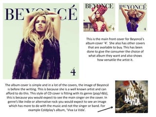
1. This is the main front cover for Beyoncé's
album cover ‘4’. She also has other covers
that are available to buy. This has been
done to give the consumer the choice of
what album they want and also shows
how versatile the artist it.
The album cover is simple and in a lot of the covers, the image of Beyoncé
is before the writing. This is because she is a well known artist and can
afford to do this. This style of CD cover is fitting with its genre (pop/r&b),
this is because you would expect to see the main singer on the cover. In
genre’s like indie or alternative rock you would expect to see an image
which has more to do with the music and not the singer or band. For
example Coldplay’s album, ‘Viva La Vida’.
2. R&B Pop Country Pop
One convention of pop music is that the performer is on the front cover of their album or
single. This is because people are sometimes interested in buying into the artist as much as
they are buying the music. We decided to use a shot of the performer in our cover and its is not
only similar to Beyoncé's album but Miley Cyrus a country pop singer.
3. One of the first noticeable connections Beyoncé has with her album and her music video is the
costume. She has worn similar black fur on her shoulders and has worn gold jewellery She also
has the same hairstyle and and dark makeup around the eyes.
4. By using the same style in the album and the music video, it means that there is a clear theme
and connection between the two. By continuing the style in both it shows they have a clear
understanding of the type of character they are trying to portray to their viewers.
5. In our music video we also tried to connect the album
with the music video by incorporating the same
costume.
6. These are some examples of where we used the same costume in
the shoot for our digi pack and for our music video. It continues the
theme of our music video and the personality of the performer.
7. Here you can see that the same makeup
choices have been made in order to keep the
style Beyoncé has continuous within her
album and music video. This heavy makeup
continues a theme of her being intimidating
and strong therefore it has been kept
throughout.
8. In order to keep the style of the song and the fact that the album is
called ‘RED’ we wanted to insure that not only on the album but
within the music video the performer would be wearing red lipstick.
This was a key way of us making the connection between our digi
pack, music video and eventually our magazine advert.
9. Another similarities between the album and
the music video is the positioning of
Beyoncé's body. This has been done to reflect
the same themes within the music video on to
the album. It could also reflect the genre
because the music video has a lot of
choreographed dancing. This is typical within
the genre and especially in Beyoncé's music
video’s.
10. In the music video we see various long shots that show the
strength Beyoncé is trying portray. This has been done because
of the genre and because of the song she is singing. She has
decided to make sure she looks powerful in both the music
video and on her album. This is to continue the female strength
theme we can so obviously see. Without making sure that she
looked as powerful in her album, it would mean that the music
video wouldn’t match her album and therefore would make it
seem weaker.
11. Within the album cover there is a page specific for the ‘Run The World’ song. In this we can see
Beyoncé with heavy makeup and similar hair style you would see in the music video. She is also
balancing on a pair of ropes. After looking at shots of her riding on a horse in the beginning of the
music video and commanding a lion by her side; these all contribute to one theme. It seems as if she
is the master of the circus. This theme is continued in both the music video and the album insert.
12. As you have seen Beyoncé has
decided to have different album
covers available we have also
decided to do this, however we
have done it with the actual CD’s
available. This means that when
our target audience would buy the
album they wouldn’t know which
CD they had chosen, making it a
surprise. We felt that this would fit
our young female audience and fits
the fun loving theme of the music
video.
13. Here the title of both the albums is at the top however because we
wanted our magazine advert to look like it had been signed by the artist
the signature is situated at the bottom
In both adverts you can see that an image of the
album is displayed. This is typical in many adverts
so that if people want to buy the album they
know what to look out for
14. Both adverts mention what songs are included.
We have done this because it fits the conventions
of what you might see on a advert with a similar
genre or audience
Miley Cyrus has also decided to have her album cover
on display so that people will recognize it. Her advert
is on a a YouTube video which is a good idea when
considering her audience and them being young and
in to technology.