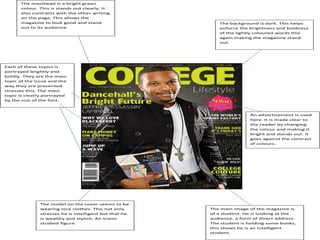
1. The masthead is a bright green
colour. This is stands out clearly. It
also contrasts with the other writing
on the page. This allows the
magazine to look good and stand The background is dark. This helps
out to its audience. enforce the brightness and boldness
of the lightly coloured words this
again making the magazine stand
out.
Each of these topics is
portrayed brightly and
boldly. They are the main
topic of the issue and the
way they are presented
stresses this. The main
topic is clearly portrayed
by the size of the font.
An advertisement is used
here. It is made clear to
the reader by changing
the colour and making it
bright and stands out. It
goes against the contrast
of colours.
The model on the cover seems to be
wearing nice clothes. This not only The main image of the magazine is
stresses he is intelligent but that he of a student. He is looking at the
is wealthy and stylish. An iconic audience, a form of direct address.
student figure. The student is holding some books,
this shows he is an intelligent
student.
2. Title of the magazine is placed at the
top of the cover page. Black and
Heading is big bold and bright. This white colouring clearly stands out
stands out clearly and shows to the and shows the audience what
audience what the main theme or magazine it is.
topic of the issue is about.
Two models are
used, both are
wearing
sporting
clothing and are
in a
stadium, this
makes the
magazine
appealing to a
sports audience
and also shows
them to be
good at their
sport
Small puffs are used to show other
topics that are within the magazine.
These will be short and interesting,
to grab attention of the reader.
3.
4. This picture may suggest
that the college may be an all
The volume and issue girls one because all the
number are displayed clearly models are female or that
at the top to show the the sports team is successful.
audience what issue/volume You can see the students are
they are reading happy. Their happy
expressions connote
excitement during college
life.
This picture
shows to its
audience a
view of one of
its buildings.
The building
itself is very
well
structured
and elegant.
The magazine
is showing the
audience the
architecture.
Page numbers
are clearly
stated to show
reader what
page article is on
Conventional
large title font,
used to show
reader title of
article.
Small font size and non bold
explanation text explaining
what article is about etc.
5. Bold question, shows
its reader what
features and topics are
inside the magazine.
Various
pictures
placed to
entertain
the audience
and make
the contents
Page numbers
page seem
used to show
more
reader what
colourful
page articles
and
are on. They
are all neatly appealing.
aligned in a
straight line,
making it
easier for the
reader to find
articles.
Magazine has highlighted Various adverts and
certain articles in orange as company names inserted at
cover stories. These may be bottom of page to advertise
interesting or motivational the companies or show who
articles. is involved in the making of
the magazine. It gives the
reader a perspective of these
elements.
6. Evaluation
I have created a cover page and a contents page for a college magazine. I
think that I successfully constructed a realistic and interesting double
page spread. Each of the pages are both colourful and stand out to the
target audience, which is college students (16-19). I think that the layout
is one that college students can relate to and enjoy reading as well as
grabbing their attention when coming to choosing a magazine to read. I
think I have successfully applied the right conventions when coming to
construct a college magazine. For example the magazine itself is bright
and has one main image, this is similar to the magazines I have
researched and therefore would compete in the market. I have learnt a
lot during the construction of magazine. I have learnt about two new
applications. In design and Photoshop I used both when creating my
magazine cover and contents page. Both applications are fairly complex so
when I first used them I struggled to fully grasp what I needed to do.
However after a while I got used to them and now know how to use them.
Before I started creating my cover and contents page I researched
other pages so I had an idea of what to add to my pages to make them
interesting as well as professional. I think by using this research I have
made my pages the most professional and realistic as possible. If I were
to repeat the task, I would change the pictures and change the box types.
The reason I would do this is because there would be a variety of
difference on the two pages. I think that this again helps influence the
reader when coming to choose a magazine. Overall I think that I have
successfully constructed both a cover page and a contents page for a
college magazine. I have learnt to use new types of technology and will
use this new knowledge when creating my music magazine. I have also
learnt that it is extremely hard to create a magazine and is a complex
business.