2. Few categories are as difficult to design for
as Beer in Central and Eastern Europe. These
very conservative markets demand a relatively
strict adherance to established category codes
and traditional cues. Nevertheless, the most
forward thinking brands push hard against these
restrictions in order to differentiate themselves
and create shelf impact and buzz in these very,
very crowded markets.
A demanding category
3. The recent re-design of Staropramen represents the latest attempt by
Staropramen to move the category forward — cleaning up cluttered labels,
updating established brand cues, and using consumer insight to build a brand
which speaks to the needs of their target audience.
A history of pushing the envelope
2011
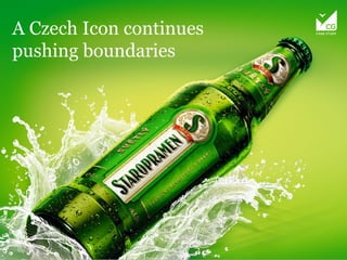
5. The final identity, as expressed mainly on packaging, uses a number of
2D and 3D enhancements. The use of a vertical label - already a big step
pioneered by Staropramen years ago (and copied countless times since),
is continued here and made even more powerful by the use of the ‘S’ as a
strong, unique new mark, or badge, for the brand. Whereas the logomark
on the old brand was shunted to the side, it now takes center stage. The
brand name and mark become true heroes of the brand. Many of the quality
cues which before cluttered the design have now been migrated to the
bottle itself in a series of embossments and a new structure which is both
distinctive and bold.
A new icon
6. Off the pack, the brand block is now much cleaner and more modern, with
stylish and flexible shape device. Indeed this is brand refreshes your sense
of what a beer brand should look like!
A total identity
7. After the development of the basic brand, Cocoon Group also worked to
develop a number of additional SKUs (11 in all) and the identity manual for
the brand.
The new lineup
8. The new design of Staropramen successfully
navigates the tightrope between category
mandatories and envelope pushing. The
success of this approach is already evident
in increased sales across the nation.