1. Front Cover Analysis essay
Mixmag Magazine analysis
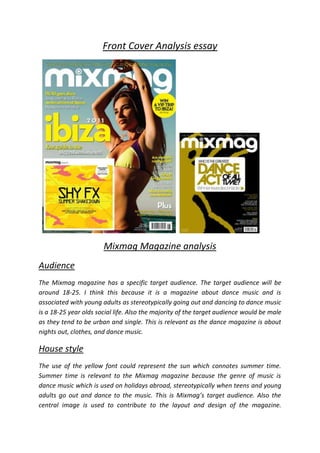
Audience
The Mixmag magazine has a specific target audience. The target audience will be
around 18-25. I think this because it is a magazine about dance music and is
associated with young adults as stereotypically going out and dancing to dance music
is a 18-25 year olds social life. Also the majority of the target audience would be male
as they tend to be urban and single. This is relevant as the dance magazine is about
nights out, clothes, and dance music.
House style
The use of the yellow font could represent the sun which connotes summer time.
Summer time is relevant to the Mixmag magazine because the genre of music is
dance music which is used on holidays abroad, stereotypically when teens and young
adults go out and dance to the music. This is Mixmag’s target audience. Also the
central image is used to contribute to the layout and design of the magazine.
2. However on the other Mixmag magazine the use of the colour gold represents the
seriousness of the magazine and the high class ‘who is the greatest dance act of all
time’ is emphasised in the middle of the layout giving the audience the impression
that that’s what the magazine will mainly concern.
The Guttenberg Design Principle
The primary optical area is used stereotypically as the masthead is there and that’s
where our eyes first look. Our eyes then go across horizontally to the strong fallow
area where the ‘win a VIP trip to Ibiza’ catches the reader’s eye. It then goes on to the
weak fallow area which gives away a free CD. This covers quite a large area of the
magazine. Finally the terminal area in the bottom right corner is where the reader
generally finishes reading which has the least important features of the magazine
such as the small coverlines.
Main images
The front cover of the Mixmag magazine has a central image of a girl in a bikini
dancing. This stereotypically represents the genre of dance music and the bikini she is
wearing represents the summer and also represents the magazine and its audience.
The only other image is the image of the CD which comes with the magazine showing
exactly what you can get.
Masthead
The Mixmag mastheads on both magazines are a very bold white font. This is a good
choice because the background colour of the magazine will never be white as it’s a
very colourful and bright magazine. The masthead is stereotypically at the top of the
magazine and uses the Guttenberg design principle well. The name Mixmag can
represent music relevantly because the word ‘mix’ can mean remixing a song which a
lot of dance music can be.
3. Q Magazine analysis
Audience
In the Q magazine the target audience will be for older people than the Mixmag
magazine for people in their 30’s and 40’s. This is because the Q magazine has more
mature music for older generations. The magazine can target both male and female
evenly as it has very common for both genders
House style
The house style of the Q magazine is very classy through the use of gold fonts. Also
the mast head uses a serif font which stereotypes a successful magazine. The layout
of the Q magazine also contributes to the house style as it stereotypically has a
central image and a masthead at the top, also the Guttenberg design principle is also
applied.
4. The Guttenberg Design Principle
The Guttenberg design principle for the Q magazine starts with the primary optical
area again with the masthead which is first recognised. The strong fallow area has a
large selection of the central image and a small piece of information about what’s
inside. The weak fallow area follows this in the bottom left area and uses a bold font
to make the coverlines stand out. The terminal area finishes with small essentials
such as the barcode.
Main images
The only image on the Q magazine is the central image of Jay-Z which is a close up.
This is very straight forward and simple to the main coverline of the magazine which
is about Jay-Z.
Masthead
The masthead of the Q magazine can represent different things relevant to the music
magazine itself. Q can also mean ‘queue’ which can represent queuing at a concert.
Also Q can mean ‘cue’ as in your cue to sing which is also music related. The colours
used on the masthead are the font being white and the background being red which
stands out and is very clear. The serif font also stereotypes the magazine.
Conclusion
Both the Mixmag magazine and the Q magazine have differences and similarities.
Firstly the audiences of the magazines are different because of the different genres of
music and the different ideas behind them. Also the house styles of the magazines use
different colours for different purposes. However on the second Mixmag magazine
the colour is gold just like the Q magazine for the same reason in a different content.
Also both magazines use the Guttenberg design principle effectively with professional
structures.
The two magazines use main images the same through the use of the central image
as their main coverline. This is the main story which catches the audience’s eye before
everything else as it is most dominant on the page on both magazines. However the
Mixmag magazine also uses a smaller image to show what they could have with the
magazine. Lastly the mastheads on both magazines are used professionally as they
are at the top of the page. However they have different purposes and effects to catch
their specific audience’s eye.