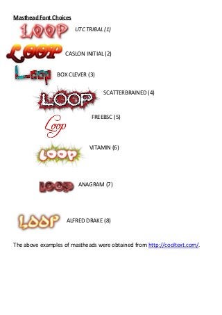
1. Masthead Font Choices
UTC TRIBAL (1)
CASLON INITIAL (2)
BOX CLEVER (3)
SCATTERBRAINED (4)
FREEBSC (5)
VITAMIN (6)
ANAGRAM (7)
ALFRED DRAKE (8)
The above examples of mastheads were obtained from http://cooltext.com/.
2. MASTHEAD ANALYSIS:
(1)- I enjoy the look of UTC TRIBAL; however I feel that the font style is
something more related to metal/heavy music, and I am choosing to stay away
from those kinds of genres in my magazine. Due to this I have decided to rule
out this text for my magazine masthead.
(2)- CASLON INITIAL is closer to the theme I want to portray to my target
audience, and I prefer these warm colours with the curvature of the letters. The
font style signifies the word “Loop” more than the others, as it literally loops
and twirls in a style that is more flashy and pristine than the others. This
masthead font is one I may consider.
(3)- BOX CLEVER graphically looks quite advanced, and this would appear more
eye-catching to the target audience I need to impress. On the other hand, the
style again is something I cannot quite see fitting my magazine style, which will
be something unique, stylish and suave. Due to these reasons I have decided to
rule out this font choice for the masthead of my front cover.
(4)-SCATTERBRAINED is definitely a font I would relate more to the style of the
magazine. Like the font suggests, it is kind of scatter-brained as well as eye-
catching and graphically advanced. I enjoy the colours also, which evoke
emotions of style and commotion. This will be one of the mastheads I will think
about for my magazine front cover.
(5)-FREEBSC I feel is a lot more simplistic than the other fonts, yet its simplicity
gives it class and style. I also feel that the word loop, like CASLON INITIAL, is
represented well in the style of the font. However, I am not sure whether the
simplicity of the masthead is something I would like in my music magazine, and
therefore I am unable to decide whether I would use this font or not.
(6)- VITAMIN is similar to SCATTERBRAINED and is closer to theme I would like
for my music magazine; I enjoy the spikes of colour emerging from the words
‘loop’ as it gives the title an extra way of standing out. For this reason I think
that it could make a good masthead. However, the actual font seems to be
slightly too bubble-like to be considered for the word ‘loop’.
3. (7)- ANAGRAM I feel is an interesting font, as it is clear and defined. However, I
do not feel it would suit the style of my magazine, which would include fonts
that are more thin and detailed. This font is to block-like for my liking and
therefore I have decided I will not use this font for my masthead.
(8)- ALFRED DRAKE seems to be relatively promising as a font, as it is accurate to
the style of magazine I would like to produce. The shimmer of light it portrays
and the warm colours it would give a welcoming vibe to the target audience,
therefore I will consider using this as my masthead for my magazine.
DECISION ON MASTHEAD:
I have decided to narrow my choices down from 8 to 4, choosing (2), (4), (6), and (8).
1. 2.
3. 4.
(I will find people to give me feedback on each masthead, as well as their favorite.)
4. Final MastHead Choice
I have decided to leave the final choice of my masthead to
the decision of others, so I have been given feedback on all
four of the Mastheads when it comes to the pros and cons
of each one. Due to this, number 2. Has been chosen.
I think that if had been left to me, I would of chosen the same Masthead. The reasons I
think this will suit my music magazine the most is because of its vibrancy as well as its
rigidity. It gives a flashy and graphically advanced representation of my alternative/indie
magazine. Some comments I received from my feedback sheet included things like “very
origonal looking” and “adds individuality”. Whilst these comments convince me this title is
the best way to stress identity and definability, I had other comments like “has the feel of a
metal magazine”, and because of this I am considering changing the colour scheme to a
green or a blue. I feel this will add less hostility to the Masthead and hopefully make it
seem less metal/rock based for a magazine. Another advantage to this masthead is that itv
is easy to read and is also quite pristine looking, yet messy.
I have decided that these colours suit my music magazine the most, and therefore I
have decided to use it for the masthead of my front cover. #