BÀI TẬP BỔ TRỢ TIẾNG ANH 11 THEO ĐƠN VỊ BÀI HỌC - CẢ NĂM - CÓ FILE NGHE (GLOB...
Magasin
1. MAGASIN
You Table of Contents
Got
ART? Adobe Illustrator: Saint Xavier University Visual Arts Center
VASE-Tastic
4
12
Hello, Hello Kitty! 22
Different Faces of Converse 27
FEATURING: Home Sweet Home 29
The Fall 2011 Computer Teapots Mania 32
Graphics Class of Saint
Xavier University. Computer Graphics Class of Fall 2011 36
Last Words 40
Blog Process
Magazine Product
NOVEMBER ISSUE
• VOLUME I •
2 • MAGASIN • VOLUME I • • VOLUME I • MAGASIN • 3
2. Adobe Illustrator: Saint Xavier University
Visual Arts Center
“The place where Saint Xavier University Department of Art and
Design professors mold and help their students to learn and to im-
prove their techniques and crafts in visual arts.”
4 • MAGASIN • VOLUME I • • VOLUME I • MAGASIN • 5
3. STEP 1: STEP 4:
• Place the image in Adobe • Add the bricks and use the
Illustrator but make sure the eyedropper tool to achieve the
image and the illustrator file is hue that is close to the original
in the SAME folder. image.
STEP 2: STEP 5:
• Trace the outline of the im- • Use the pen tool to trace the
age and make sure to work four corners of the page to
from background to fore- create a rectangular shape
ground. Also, use the eyedrop- for the background and use
per tool to have the same hue the eyedropper tool to fill in
as the original image. the light blue hue. Next, use
the paintbrush tool create the
clouds and use a white hue for
the strokes.
STEP 3:
• Trace the columns of the FINISH
PRODUCT!
image and add some details to
make the grahic more realistic
which is the main goal of this
exercise.
6 • MAGASIN • VOLUME I • • VOLUME I • MAGASIN • 7
4. Visual Arts Center .......
Spin Off
8 • MAGASIN • VOLUME I • • VOLUME I • MAGASIN • 9
5. Visual Arts Center...
Spin Off
T he Visual Arts Center is the home of the talented
arts students of Saint Xavier University located
at 10435 South Spaulding Avenue, Chicago, Illinois,
CRAFT
I used my Nikon S60 camera to
and used the eyedropper tool
to fill in colors closest to the
original hue of the VAC picture.
take a picture of the Visual Arts Fifth, I traced the bricks one by
6055. This is the place where SXU Department of Art one and used the eyedropper
Center. I took a picture from
and Design professors mold and help their students to an angle so when I place my tool to mimic the original color
learn and to improve their techniques and crafts. As a picture on Adobe Illustrator it of the bricks. For this exercise,
Computer Studies major, I decided to take an art class is going to be easier for me to I’m exploring the color of my
zoom in and out of the picture. building to make it more inter-
this semester for me to explore and to improve my art esting. I use the Pop Art palette
I used the pen tool, eyedropper
skills. In addition, this class helps me to learn more to make the color more vibrant
tool to trace my art work.
about designing that will tremendously help me in de- and interesting. I think the color
signing web sites in the future. makes the building pop out of
COMPOSITION the black background. I like the
idea of contrast in this exercise,
because it makes me step out of
First, I put the VAC picture in a my comfort zone of always be-
folder then opened Adobe Illus- ing precise yet still sticking on
trator to make a new page and the details of the original image.
saved it on the folder where the
“Great things are done by a series of VAC picture is. The two files
has to be on the same folder, if CONCEPT
small things brought together.” not it is not going to work fine.
Second, I created a layer where
- Vincent Van Gogh the original picture is then The concept of my artwork is
another layer for my picture art. our school’s Visual Arts Center.
Third, I started tracing the out- I think it is interesting because it
line of my picture by using the gives different angles and I can
pen tool, because it is always control the eyes of my viewer to
easier to work from the back- go in to different direction.
ground to the foreground, so I
can be sloppy to the area where
the foreground is going to
overlap the background. Fourth,
I traced the details of the picture
10 • MAGASIN • VOLUME I • • VOLUME I • MAGASIN • 11
6. VASE-Tastic
CRAFT COMPOSITION CONCEPT
I used long brushstrokes to build The darker hues help define The concept for this piece was
up the shape of each bottle. the shadows on each object. to take two complimentary
After building a general shape I By creating this value contrast colors and set them against each Did You Know Picasso’s full name has 23 words?
went in and added cross hatch- between the medium tones and other in an effort to show the
ing lines to give the shape more the darker and lighter ones the different hues and values and
Picasso was baptized Pablo Diego José Francisco de Paula Juan Nepomuceno María de los
definition and more structure. I objects begin to stand out and how they work together and can
Remedios Cipriano de la Santísima Trinidad Martyr Patricio Clito Ruíz y Picasso. He was
layered line after line. I started take real shape. help each other stand out.
named after various saints and relatives. The “Picasso” is actually from his mother, Maria
layering with darker and lighter
Picasso y Lopez. His father is named Jose Ruiz Blasco.
hues to give the objects real
shape and three dimensionality.
SOURCE: http://www.neatorama.com/2008/10/25/10-fun-facts-about-pablo-picasso/
Images and Texts By:
Amy Duffy
12 • MAGASIN • VOLUME I • • VOLUME I • MAGASIN • 13
7. VASE-Tastic
CRAFT COMPOSITION CONCEPT
To create these images I used The hue that was used in this The left image was a tall and
illustrator. in Illustrator I chose was green and orange because wide vase that had natural lines
the brush tool and and made they are on opposite side of the and branches. The right side
“There are painters who transform the sun into a yellow two layers. The first layer was color spectrum. The image has has a short more narrow vase
made with a green pallet and its a lot of darker values on the with more lines and branches as
spot, but there are others who, thanks to their art and all 5s. the second (bowls) layer left side of the left image and well. both have natrual shapes
intelligence, transform a yellow spot into the sun.” was made with different size right side as well. where on the to them.
brushed ranging from .25-10. opposite side has a lot more
The color pallet used for that lighter values. The reason the
- Pablo Picasso was orange monochromatic 2. two colors were chosen were
Images and Texts By: because they create a very nice
Roxy Wasiunec contrast.
14 • MAGASIN • VOLUME I • • VOLUME I • MAGASIN • 15
8. VASE-Tastic
CRAFT COMPOSITION CONCEPT
For the following images I use I want my audience to see the The main focus of these images
Adobe Illustrator. The tools for growth of my images as they are about a glass bottle and a
this were the paint brush, color develop more color and detail. small round vase with lots of
guide (using multiple forms of The way their eyes to fall on the shadows.
color) and the the brush stroke. shades and shadows as well as
Images and Texts By: Also a glass bottle and small the shapes outline. Focus on the
Shawnita Montgomery round vase was used, and a Hue’s and values of the im-
bright light to give the objects ages. The images were created
shades. for my computer graphics class
recently and I want my growth
or skills to be noticed as I try to
advance my work to my best.
16 • MAGASIN • VOLUME I • • VOLUME I • MAGASIN • 17
9. VASE-Tastic
CRAFT COMPOSITION CONCEPT
The tools I used to make this I used different colors and sizes This drawing has an object
drawing were Adobe Illustrator, to not only create the back- that is tall and an object that is
the paint brush, and different ground, but also to create the short. It also has an object that
layers of color. The way I used different shapes. I also used is natural and an object that is
my hand to make this drawing value in this drawing, which is hand-made. What I want people
was by using lines to create the the relationship between these to think when they see this
shapes of the drawing. Also I objects and light. Finally I used drawing is a colorful drawing,
made the background by putting Hue and contrast of colors, to with two handmade objects
many different ways of writing really make this drawing pop up holding twigs. Background by
five with different colors and and cath the eyes of the viewer; putting many different ways of
Images and Texts By: size. eventhough it is ugly. writing five with different colors
Giovanni Diaz and size.
18 • MAGASIN • VOLUME I • • VOLUME I • MAGASIN • 19
10. for orange, but the third picture
has an almost brownish hue to
it. You can see the value in the
green and orange in that the
scale ranges from light to dark.
CONCEPT
Now, even though both vases, Did You Know?
in real life, are the same size,
I decided to draw one slightly The oldest known extant oil paintings date from 650 AD, found in 2008 in caves
bigger than the other. The rea- in Afghanistan’s Bamiyan Valley, “using walnut and poppy seed oils.”
son I did this was because that
is how I imagined them. I also SOURCE: http://en.wikipedia.org/wiki/Oil_paint
drew them so that they looked
man-made. That’s the look I
Images and Texts By: CRAFT COMPOSITION was going for.
Christian Rosales
First I opened Adobe Illustra- from light to dark green. Once By using light, dark, and even
tor and began drawing a green that done, I made a new layer, opposite colors I have given
background which is going to started drawing vases using my art contrast. As you can
be layer one. I used between a a five point brush I drew two see from the pictures above, the
5 and 10 point brush to make vases. Again, using the color background is a collaboration
the background full of fives. By guide, I used different shades of green colors. It’s hard to tell
using the color guide, I used of orange, ranging from light to which green is which, but you
different shades of green. The dark orange. can tell that they are green or of
shades ranged a greenish hue. The same goes
20 • MAGASIN • VOLUME I • • VOLUME I • MAGASIN • 21
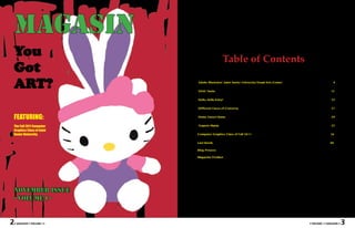
11. Hel lo,
Kit ty!
H e llo
CRAFT picture is. The two files has to thing to have a contrast. I
be on the same folder because want my viewers to focus
I used my Nikon S60 camera if not it is not going to work on my subject, Hello Kitty,
to take a picture of my Hello fine. Second, I created a layer that is why I did a dark
Kitty stuffed toy. I put Hello where the original picture hue background.
Kitty on the floor and sit it is then another layer for my
against the wall, so it can sit picture art. Third, I started CONCEPT
on its own. I laid my camera tracing the outline of my
on the floor so that it can take picture by using the pen tool, The artwork is about my
a closed up picture of Hello because it is always easier to favorite character Hello
Kitty. I intentionally did it so work from the background Kitty. I think it is going
that when I linked my picture to the foreground, so I can be to be fun to do something
in Adobe Illustrator I can sloppy to the area where the about my favorite char-
zoom in and out of my picture foreground is going to overlap acter because since when
with no problem. Next, I the background. Fourth, I was I kid I really love
transferred the photo I took Hello Kitty. I want my
in my all in one computer and audience to think about
used the software HP Photo I traced the details of the their childhood memories,
Viewer to view my picture. picture and used the eyedrop- because it reminds us of
“Every child is an artist. The problem is how to
Lastly, I used Adobe Illustra- per tool to fill in hues closest good times and sometimes
tor to traced my photo. to the original hue of the Hello bad times too. Also, it
COMPOSITION
Kitty picture. Fifth, I made a
background layer and used
helps us think that even
though there are a lot of
remain an artist once he grows up.”
the paintbrush tool to fill in changes that happened in
the area with lines of five and our life we will always love
- Pablo Picasso
First, I put the Hello Kitty pic-
ture in a folder then opened number 5 like what we did the things we liked when
Adobe Illustrator to make a in our warm-ups in class by we were young.
new page and saved it on the using black hue. Then, I used
folder where the Hello Kitty the red hue to do the same
22 • MAGASIN • VOLUME I • • VOLUME I • MAGASIN • 23
12. STEP 1 STEP 4
STEP STEP
2 5
STEP 3 FINAL
PRODUCT!
24 • MAGASIN • VOLUME I • • VOLUME I • MAGASIN • 25
13. Different
Faces of
Converse
CRAFT CONCEPT
In Adobe Illustrator, I used the The subject is a pair of shoes.
pen tool to create shapes and I That is what I want viewers to
used a camera to take a picture be able to recognize. Everything
of the image I was going to surrounding then will be more
create. clear once I add more detail be-
cause right now it is hard to tell
COMPOSITION what the shoes are setting on.
Images and Texts By:
Allison Horn The converse shoes are obvi-
ously the main subject of the
piece and they are sitting right
in the center of the page. They
are set on a step stool and there
is a sense of depth since I made
a wall in the background. I
wanted the viewer’s eye to
focus first on the shoes and
probably follow along the wavy
laces, then to look towards the
background.
26 • MAGASIN • VOLUME I • • VOLUME I • MAGASIN • 27
14. 28 • MAGASIN • VOLUME I • • VOLUME I • MAGASIN • 29
15. Home Sweet Home
Images and Texts By:
Tom Zwarycz
In this work, I imported an
image taken from my phone
(Nexus One) into Adobe Il-
lustrator. The original image
can be seen above. After im-
porting, I traced over the im-
age creating boxes and other
shapes that represented parts
of the original image. I used
the line and rectangle tools in
order to create these shapes. I
then used the eyedropper tool
capture the correct color and
used the gradient tool to add
depth and shade where need-
ed. Actual screen shots of
the progress of this work can
be seen below. Each day’s
work is separated into differ-
ent layers in the Illustrator
file in order to easily locate a
specific shape if needed. This
project took a combined total
of about 9 hours from start to
finish.
30 • MAGASIN • VOLUME I • • VOLUME I • MAGASIN • 31
16. CRAFT COMPOSITION CONCEPT
To variate the colors of the In some works that use color, I The whole idea with adding
objects, I used the pointer tool use light tints of each color to lighter colors allows me to
to select certain objects. I then make objects stand out more, control what the viewer will see
used the color swatches and such as windows and bricks. first and where the viewer’s eye
different color pallets to change This trick emphasizes more on will go next. If I make a certain
the color and feel of the work. the center object or point of object stand out by giving it a
Again, this is still using the interest and less on the back- high contrast, the viewer will
same program, Adobe Illustra- ground. look at that object int the work
tor. I also used gradients where first. I also used color to change
needed to show depth and the whole mood of the picture,
shade. for example, when I made the
photo look like it was taken in
the dark or on the scorching
sun.
“Creativity takes courage.” - Henri Matisse
32 • MAGASIN • VOLUME I • • VOLUME I • MAGASIN • 33
18. teapots...
Image By:
Christian Rosales
...MANIA
Images By:
Nico Krajecki
Image By:
Robert Furlan
36 • MAGASIN • VOLUME I • • VOLUME I • MAGASIN • 37
19. Computer Graphics Class of Fall 2011
Allison Horn Jordan Juarez
Christian Rosales Robert Furlan
Giovanni Diaz Roxy Wasiunec
38 • MAGASIN • VOLUME I • • VOLUME I • MAGASIN • 39
20. Computer Graphics Class of Fall 2011
Shawnita Montgomery Nico Krajecki
Amy Duffy Tom Zwarycz
Synthia Wesley Lovette Fernandez
40 • MAGASIN • VOLUME I • • VOLUME I • MAGASIN • 41
21. Last Words...
To all my magazine readers,
Thank you very much for picking up my first magazine, and
I really do hope you guys enjoyed it. Designing this magazine is a new
experience for me, and I know it will help me a lot in my future career.
Also, it’s been a creative and fun experience for me to work with my
wonderful and amazing classmates especially with my very talented and
energetic professor Nathan Peck.
I want to take this opportunity to thank God for always guiding
and blessing me and my family. I want to thank my parents for always
supporting and encouraging me to do my best in everything I do. I want
to thank my siblings for inspiring me to finish my school, even though
they are thousand miles away from me. I want to thank my friends for
being such a wonderful support system for me. Lastly, I want to thank
all my professors at Saint Xavier University for always encouraging me
to learn and to keep on learning. Again, THANK YOU VERY MUCH
everyone! I can’t stop thanking you all for being such a huge part of my
life. You all inspire me, and I hope I do the same way to you all too.
Love,
Lovette
42 • MAGASIN • VOLUME I • • VOLUME I • MAGASIN • 43