Recommended

Recommended
More Related Content
Recently uploaded
Recently uploaded (20)
Featured
Featured (20)
10 tips for creating landing pages to increase conversions
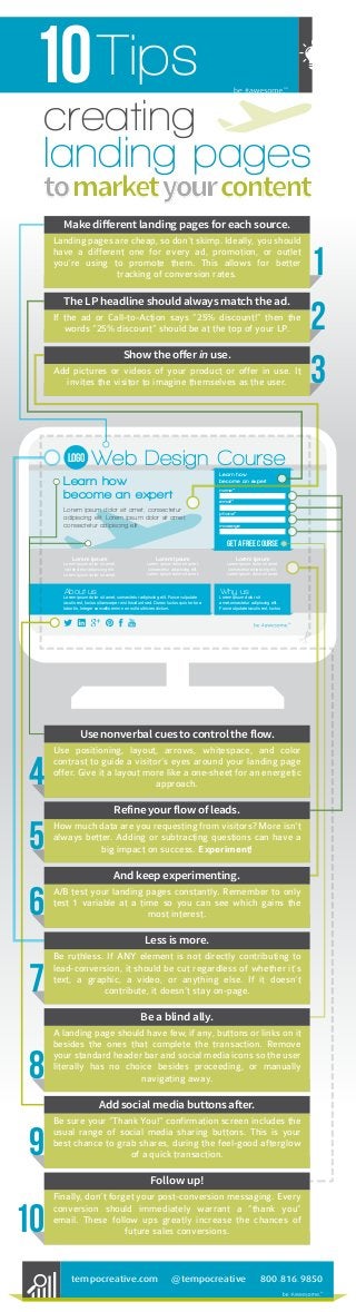
- 1. 10Tips creating landing pages tomarketyourcontent logo Web Design Course Learn how become an expert Lorem ipsum dolor sit amet, consectetur adipiscing elit. Lorem ipsum dolor sit amet, consectetur adipiscing elit. Learn how become an expert name* email* phone* massage get a free course Lorem Ipsum Lorem ipsum dolor sit amet, consectetur adipiscing elit. Lorem ipsum dolor sit amet, Lorem Ipsum Lorem ipsum dolor sit amet, consectetur adipiscing elit. Lorem ipsum dolor sit amet, Lorem Ipsum Lorem ipsum dolor sit amet, consectetur adipiscing elit. Lorem ipsum dolor sit amet, About us Lorem ipsum dolor sit amet, consectetur adipiscing elit. Fusce vulputate iaculis est, luctus ullamcorper nisi tincidunt sed. Donec luctus quis tortor a lobortis. Integer convallis enim non nulla ultricies dictum. Why us Lorem ipsum dolor sit amet,onsectetur adipiscing elit. Fusce ulputate iaculis est, luctus Make different landing pages for each source. Landing pages are cheap, so don’t skimp. Ideally, you should have a different one for every ad, promotion, or outlet you’re using to promote them. This allows for better tracking of conversion rates. 1 The LP headline should always match the ad. If the ad or Call-to-Action says “25% discount!” then the words “25% discount” should be at the top of your LP. 2 Show the offer in use. Add pictures or videos of your product or offer in use. It invites the visitor to imagine themselves as the user. 3 Use nonverbal cues to control the flow. 4 Use positioning, layout, arrows, whitespace, and color contrast to guide a visitor’s eyes around your landing page offer. Give it a layout more like a one-sheet for an energetic approach. And keep experimenting. 6 A/B test your landing pages constantly. Remember to only test 1 variable at a time so you can see which gains the most interest. Less is more. 7 Be ruthless. If ANY element is not directly contributing to lead-conversion, it should be cut regardless of whether it’s text, a graphic, a video, or anything else. If it doesn’t contribute, it doesn’t stay on-page. Follow up! 10 Finally, don’t forget your post-conversion messaging. Every conversion should immediately warrant a “thank you” email. These follow ups greatly increase the chances of future sales conversions. Add social media buttons after. 9 Be sure your “Thank You!” confirmation screen includes the usual range of social media sharing buttons. This is your best chance to grab shares, during the feel-good afterglow of a quick transaction. Be a blind ally. 8 A landing page should have few, if any, buttons or links on it besides the ones that complete the transaction. Remove your standard header bar and social media icons so the user literally has no choice besides proceeding, or manually navigating away. Refine your flow of leads. 5 How much data are you requesting from visitors? More isn't always better. Adding or subtracting questions can have a big impact on success. Experiment! @tempocreativetempocreative.com 800.816.9850