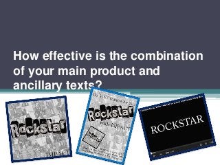
5. Typography
• The most important thing for me to make sure that I did throughout my Ancillarys
and main product was to keep important and identifiable aspects the same. The first
and one of the most important areas I kept the same was the typography. Throughout
both of my ancillary’s I used two types of font, the first font is a font commonly used
on Microsoft Word, ‘Batang’ and the second font is a downloaded font from
(www.dafont.com) called ‘Punksnotdead’ both of these fonts were used specifically
for certain purposes.
• I used the font ‘punksnotdead’ for the title ‘Rockstar’ in both Ancillary 1 and Ancillary
2, I used this font in particular due to it appearing to look like a graffiti font and I
wanted it to connote a rebellious image to the audience like ‘rockstars’ usually do.
• Considering ‘punksnotdead’ was such a prominent font, I wanted a more subtle font
that would stand out in it’s own way to upload the band name ‘Impact’ this was used
as it’s neat and bold to the audience. It stands out without taking over the image.
• I used the ‘Batang’ font for the opening slide of the music video where the title is
shown this creates synergy between all of the products.
IMPACT
6. Images
• Another way to create synergy throughout all of my media products was by making
sure that all of the products used the same images, characters and ideologies. I
created the background to my Ancillary 2 (Poster) and the Background to the
Ancillary 1 (CD Cover) by using images from the final music video.
• I did this to show that everybody who starred in the music video was a ‘rockstar’ and
‘famous’ in their own rights, this helped exaggerate my main concept of saying that
anyone watching this video can be an audience and that you don’t have to be famous
to be in a music video. Here is the origonal
image after I
collated all of the
screenshots for my
Ancillary 1
Ancillary 1
Original Screenshots