Millenials and Fillennials (Ethical Challenge and Responses).pptx
Double Page Spread Steps
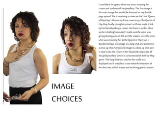
1. I usedtheseimagestoshowmy artistswearingthe
crownand to showoff herjewellery.The firstimage is
the mainimagethat would befeaturedonmydouble
pagespread.Sheis receivinga crownasshe'sthe ‘Queen
ofHip-Hop’. Alsoonmyfrontcoveritsays‘the Queenof
Hip-Hopfinallytaking hercrown’soI havemadeitlink
by herliterallytaking acrown.Herhand isonherchest
assheisfeelinghonoured.I madesurethe artistwas
givingdirectgaze soitfelt asifthereaderswerethe ones
who wascrowningherasthe QueenofHip-Hop.I
decidedtohaveoneimage ina longshot andanotherin
a closeup shot.My secondimageisacloseup shotasit
iseasytoseethe crowninherheadand easytoseeall
the goldjewellerywhichisconventionalofthe Hip-Hop
genre.The longshot wasused soheroutfitwas
displayedand itwascleartoseewhat the intentionof
the shotwas,whichwastoseeherbeinggivena crown.
IMAGE
CHOICES
2. All throughoutmymagazineconstruction,Ihavekeptthecolourthesame.On my
double pagespreadImadesure‘AnitaDiaz’wasin thesamecolourI usedon my
frontcoverandcontentspage.Itmakesthenameoftheartiststandoutonthepage
andshowswhothearticleisabout.ImadesureitwasbigandboldasI wantedmy
double pagespreadtohaveabold feeltoit.OnallthetitlesthatI haveused, Ihave
stuckwiththesameeffectstomakethemlookbiggerandattractattentionofthe
readers.ThefontthatI haveusedinmy doublepagespreadis‘LAHeadlightsBTN’,I
haveusedthisfontthroughoutmymagazineand itmakesthewritingstandoutand
itiscleartoread.Goldisusedonthequestionsbeingaskedfromtheinterviewerso
thatit’seasyforreaderstoseewhichresponsesaretheartistsandwhichare the
interviewer. Thegoldfitsinwithmy colourscheme ofgoldandburgundyand
makesthepagenotseemsoplain.
COLOUR AND
FONTCHOICE
3. I had some difficulties lassoing out these images. I originallywanted to havethreeimages on mydouble page spread but I
haveresorted to two images as it couldn’t all fit. All these images were considered for mydouble page spread but the final two
I chose looked better. Those6images I had cut out and attempted to put them onmypage but they all looked wrong. As
some of those images I took had a greybackground, it was a struggle for me to changeit from greyto white as certain areas
pickedup the exposure morethan others.
4. These arethe stages that Ihavetaken to produce my double page spread. Istarted off byputting the name ofthe artist on the page firstsothat I
could workaround it. Asit was the biggest text on the page it had tobe the firststep so Icould know how small tomake the images and other
fonts. Ithen added my firstimage so that Iknew where toplace the text. Iadded a description ofthe artist tointroduce the readers toAnita Diaz.
Ithen added my final image so that Icould establish a layout formy double page spread. Where the images areplaced, it was easier for me to
know where toplace the text. Ithen added all the text on the page andit was able tobe read easily as the layout was clear. Iadded a pull quote of
the artist andput it abovethe artists head so It would be obvious toreaders that it’s from the artist.
DIFFERENT STAGES
OF
PRODUCTION