

Recommended
More Related Content
Viewers also liked
Viewers also liked (11)
Recently uploaded
Recently uploaded (20)
Everyday type
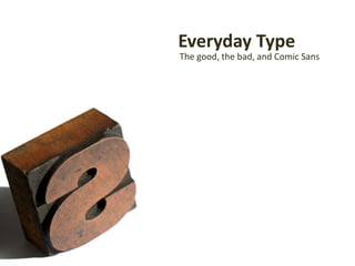
- 1. Everyday Type The good, the bad, and Comic Sans
- 13. Using a grid is a great way to get control. And it doesn’t mean everything has to be the same width. And it definitely doesn’t have to be the same size Or even the same typeface
- 14. Space
- 15. ″It was 1′ 4″ long.″ Well set type-all other things being equal-makes content shine. ″It can be fiddly, but 5-10 minutes is worth it.″ “ It was 1′ 4″ long.” Well set type — all other things being equal — makes content shine. “ It can be fiddly, but 5–10 minutes is worth it.”
- 16. “ Typography with anything to say aspires to a kind of statuesquetransparency. ” Robert Bringhurst
- 20. “ Typography exists to honour content. ” Robert Bringhurst
Editor's Notes
- So I guess the point of this is to persuade you lot to care a little bit about something I care deeply about – typography. It makes a massive difference to the way people react to your words, but it can seem like a pretty geeky thing to be passionate about.
- Maybe it is, but a big part of the appeal is that type is (or used to be) a physical, tactile, thing. So we're going to do some printing. These are little pieces of letterpress type. We're going to use a technique that people used to use when they were cutting metal type in the old days, a smoke proof.
- I'm going to do one, and if you've got a lighter or a match or something you can have a go too, or wait until you get home. So if we coat the end with soot it acts like the ink...and when we press it into the paper…
- …Bob's your uncle: we've printed a character. Here’s one I madeearlier. So that might be a bit childish...it's basically one step up from potato printing...but it's weirdly exciting, isn't it?
- And you get a letter that is unique. You created that, in all it's smudgy, imperfect, glory. And if you look closely, it's three dimensional, indented into the page. Metal type has depth as well as shape, each letter is a mini sculpture.
- But metal type is history, or art. Type is everyday. We're all creators of content...whether it's on the web, in Word, in PowerPoint...which means we're all typesetters, even if you’ve never touched a piece of type before. It’s humbling to think how much time it used to take.
- The average computer has more typefaces installed than any printer would have had in stock in the days of metal type. Adjusting leading or justification is a matter of clicking a button. So job one is to pick a typeface.
- Choosing the right type is like picking the right clothes. There ARE good and bad typefaces, but mostly there are appropriate and inappropriate typefaces for the job at hand.
- There’s a danger that access to all this choice of fonts and these powerful tools makes us like the sorcerer's apprentice, running around creating havoc until the master comes home. It's been said that good typography is invisible, but that doesn't mean it's easy. Time for some bad examples.
- If typefaces are clothes, Comic Sans is clown shoes...but that's too easy. Let's do Papyrus. You may recognise it from every café in the world, it's a shortcut for anyone that wants to look “natural”. Like the Na'vi. Or Lamb of God. The problem is that it’s become a cliché.
- Is there such a thing as a good cliché? Well you don't have to know many designers to discover their rule is "when in doubt, use Helvetica". [That's pretty sound thinking...although it kind of backfired on Gap!] Likewise, no one ever got sacked for using Bembo to set book text. But picking a typeface is pretty much the least important part of typography.
- More important are a relatively small set of rules designers use to set type. Step 1 is planning the architecture of the page in advance…not squeezing text to fit like PowerPoint does by default.
- One of the things that shows you're in capable hands is when elements of the design, particularly type elements, line up. Many designers will design to a grid...which works really well if you want to give a whole document a coherent and balanced rhythm.
- Designers also tend to be a lot more comfortable with whitespace than the rest of us. Big margins mean short lines, which are easier to read. Smaller text, with the right leading, looks better and is easier to read than big text poorly set.
- Sometimes it's the little details which, almost subliminally, make the difference. Things like proper use of quote marks, using the correct dashes, hanging punctuation so the text lines up, using ligatures. Little things, but they add up to more than the sum of their parts.
- Then there's the obscure stuff: lining figures, proper fractions and small caps. But a lot of it is about subtlety. Varying only one element for emphasis or headings.Good type, like most things, has a designed simplicity...it's all very zen.
- If you want advice, the web is overflowing with it...some of it good, and some of it bizarrely specific. Like typographyforlawyers.com (I wish I was joking) which, to be fair, is actually very good. But learning the rules is pretty easy…caring enough to apply them is what’s rare.
- And sometimes you need to break the rules to get the right effect. Occasionally your message is best served by a type treatment which goes against all the rules. David Carson epitomises this approach…but his type treatments still serve the overall message of his content. Like he says, it’s about communication.
- We're all typographers now, and we‘re all responsible for making our content look as good as it deserves to. It might turn you into a type geek, and it's dangerously addictive, but being in CONTROL of the way your words look is a great feeling.
- For all that I’ve talked about rules, the only one you really need to know is that type is about setting words, not glyphs. You should care about typography because it helps you tell your story in the most powerful way possible.