IndiaWest: Your Trusted Source for Today's Global News
UK's Largest Gig Guide Magazine
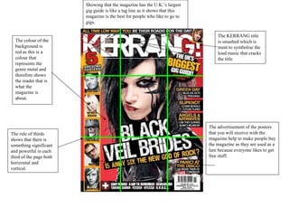
1. Showing that the magazine has the U.K.’s largest gig guide is like a tag line as it shows that this magazine is the best for people who like to go to gigs. The KERRANG title is smashed which is ment to symbolise the loud music that cracks the title The advertisement of the posters that you will receive with the magazine help to make people buy the magazine as they are used as a lure because everyone likes to get free stuff. The colour of the background is red as this is a colour that represents the genre metal and therefore shows the reader that is what the magazine is about. The rule of thirds shows that there is something significant and powerful in each third of the page both horizontal and vertical.
2. The lures in this magazine are of ratings of Reading and Leeds which lots of rock fans will want to read and also reviews of new albums which people will want to read the reviews of so they know whether or not to buy the album. As well as this it has quotes from Billy Joe. The sub heading of GREEN DAY and the fact that Billy Joe are on the front cover helps show which band this magazine will focus on and will also entice people as they are a very famous band. The main lure of this issue is the fact that you could win rare slipknot items which otherwise you would not be able to get your hands on. The blue of the background represents the genre rock which predominantly shows what this magazine is about. The light on Billy Joe from the stage light helps show that this magazine contains gigs.
3. The magazine designer has put the images of Matt Belemy and Bono’s faces facing towards each other as this certain issue is about the two bands of which they are front men of battling it out against each other so the images have been organised as they would be if it were set up like a wrestling match and they were the two contenders The logo is in the top left corner as it is very famous and eye catchy and the first thing you would see of the magazine on a shelf. A chance to win Glastonbury tickets would entice almost anyone so most people would want to buy the magazine. Would tell you which acts you must go and see therefore so people would go and buy this magazine so they would know which bands you should go and see for the best experience.
4. This paragraph may be related to the magazine and therefore could give some insight to the genre of the magazine. The fact that the you me at six article has the biggest image shows either they are the main focus of this magazine or that they at least have a very significant part to play in the magazine. The image also shows the band to be a happy funny group of people as they are doing a parody of the famous film “Sean of the dead” The other smaller sections with just band names show the reader what pages different bands are featured on which people would want to know so they can read about them. The subscription would intrigue people as more readers would be buying the magazine anyway so they would buy the subscription. The images on the contents page show that these are the other main articles of this issue because they are not just words on the page telling you what the articles are on so the images help to catch your eye.
5. Green Day taking up the first half of the contents page would show that they are main part of the issue as they are put out more than any of the other articles. Tells the reader that this is the contents page and which issue they have bought. Talks a little bit about what the editor has done within the week so therefore it could relate to the magazine and genre of music of the week so the reader may want to read this to find out about this weeks issue. The rest of the titles on the page show what pages the rest of the articles of the bands are on and which bands the are. The subscription is put out for the people who buy the magazine weekly so that they can get the magazine every week and for a cheaper price of which the reader will be more likely to buy. The image of My Chemical Romance shows that they are an important band in this weeks issue. The hot shots poster is advertised which helps to intrigue the reader further as they will now know where to get the posters from in the magazine and will lure them into reading the magazine.
6. The title of Contents shows that this is the contents page that is where they can find all of the pages where they can find the bands. The Q symbol shows which magazine it is. This bit of the contents shows the different features of the magazine for the week. The section marked Oasis Special shows that they are also a main part of this weeks issue and it also says what pages the main articles are on for oasis. This section shows that every week part of the magazine never changes and as the readers keep buying the magazine they will know where to find all of the extra parts to the magazine. This part of the contents page shows the reader where all of the reviews for albums and gigs etc… are on so that they can skip to these pages to see if a band is worth going to see or a album is worth buying. The image of The Courteeners takes up most of the page showing that they are the main article this week and it clearly tells you on which page their section starts.
7. The reds and blacks are very good signifiers of the genre metal of which the band are which would help to advertise them to someone whom may not of heard of them before A double page spread of Black veil Brides with an exclusive interview around the pages Which makes it stand out to fans as they will want to read the interview with them as they will enjoy it and want to know what is going on with them. The strong images stand out against all the writing and colours as they are the only images on the page and they consist of some very strange poses and they look like they are trying to stare straight into your soul through your eyes. Each of the images have a small caption the artists name and a small joke which helps lighten the load of the writing to read and also to tell you who the different people are.
8. The strong image shows the lead of the band who is staring at you which helps catch the readers eye and fans will realise who this is and therefore they will want to read the text beside the image. The writing is all in the words of said band which would interests the reader as they will want to read about what the band thinks. The colours are bright and contrasting and allow the colours and images to stand out. This also gives a small interview of what the lead of the band thinks about the release of their new album. In the middle of the text it shows the image of the guitarist in concert which has significance to the text and gives a rare site of a close up shot of the guitarist in full flow and a live concert.
9. The fact that the interview is held in a recording studio shows that the band are hard working and always working on there new albums but also that they enjoy working and being together as they are always in there and it is a rather small room. The members of Paramore are all staring out towards the reader to show that the reader and the band connect through the interview which will grab the reader s eye and will make them want to read the comments underneath. The orange of Hayley Williams’ hair works well with the title because the orange is very well represented with this band as Hayley Williams is very famous and is the key figure of the band so the bright colours of orange have become very well represented with the band. Also the orange of both things contrasts very well with all other dark colours. Hayley Williams’ facial expression may make the reader/buyer of the magazine want to know why she has an oh my god expression so they will want to read the comments/articles below to find out. The interview is made up of lots of small pieces of virtual paper which make the interview look smaller therefore the readers will be less reluctant to read it as the main target audience is teenagers who would not always be convinced to read long vast amounts of text.