
Recommended
More Related Content
What's hot
What's hot (20)
Similar to BBC TV Guide Delivers Trusted Entertainment
Similar to BBC TV Guide Delivers Trusted Entertainment (20)
BBC TV Guide Delivers Trusted Entertainment
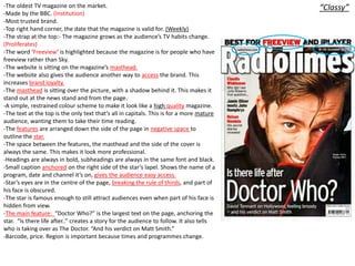
- 1. -The oldest TV magazine on the market. “Classy” -Made by the BBC. (Institution) -Most trusted brand. -Top right hand corner, the date that the magazine is valid for. (Weekly) -The strap at the top:- The magazine grows as the audience’s TV habits change. (Proliferates) -The word ‘Freeview’ is highlighted because the magazine is for people who have freeview rather than Sky. -The website is sitting on the magazine’s masthead. -The website also gives the audience another way to access the brand. This increases brand loyalty. -The masthead is sitting over the picture, with a shadow behind it. This makes it stand out at the news stand and from the page. -A simple, restrained colour scheme to make it look like a high quality magazine. -The text at the top is the only text that’s all in capitals. This is for a more mature audience, wanting them to take their time reading. -The features are arranged down the side of the page in negative space to outline the star. -The space between the features, the masthead and the side of the cover is always the same. This makes it look more professional. -Headings are always in bold, subheadings are always in the same font and black. -Small caption anchored on the right side of the star’s lapel. Shows the name of a program, date and channel it’s on, gives the audience easy access. -Star’s eyes are in the centre of the page, breaking the rule of thirds, and part of his face is obscured. -The star is famous enough to still attract audiences even when part of his face is hidden from view. -The main feature: “Doctor Who?” is the largest text on the page, anchoring the star. “Is there life after..” creates a story for the audience to follow. It also tells who is taking over as The Doctor. “And his verdict on Matt Smith.” -Barcode, price. Region is important because times and programmes change.
- 2. Four main colours “Classy” used. Only two or three ‘NEW’ ‘PLUS’ Titles fonts used, italics to are in black, draw attention to highlighted orange the features. to make them stand out against the blue background and to All text is catch the eye. straight, fonts on the features remaining the same size and all features Feature in the are in white. Added bottom left hand information is in corner is orange. neat, edges not ripped, to make it ‘classier’. Top of the master head, the date that the magazine is valid for. (Weekly) Website on the cover, under the master head to give more access to the brand.
- 3. -The product has about SIXTEEN colours on the front cover alone. “Trashy” This is used to draw people in to the bright, colourful, trashy magazine. -The date for how long the information is valid is placed over the mast head in plain black text, on a bright background to make it visible. -The pricing is right by the mast head in four colours to make it stand out. It’s on top of the picture to stand out on the news stand. -The magazine website (at the bottom of the product), giving the audience another way to access the brand. -On the right side of the cover, the days of the week are colour coded. This makes it easier for the audience to find each day of the week quickly. -The feature photos have been taken in character, mostly photo shopping two people together to fit the story line. -ALL CANTED text is tilted in the same direction and to the same degree, creating organised chaos. Nothing here is random. -The main feature's text has a glow around it, drawing attention to it. The star photo also has the same glow, linking the two together.
- 4. Disposable media “Trashy” with a value for money. EIGHT different colours on this publication making it bright, cheap, cheer ful. Jumps out at the news stand to catch your eye. The photos are taken from the shot, posed quickly in character or Along the red box, it photo shopped to lookes like the page has create a story in a been ripped. This again picture. gives the image of disposable media. ALL CANTED text is tilted in the same direction and to the same degree. Nothing is random. Wide banner at the top catches the audience’s Lots of rhetorical eye on the news stand as it is different to other questions and soap magazines. punctuation creates Wide banner, “2 weeks revealed!” implies value excitement?! for money and appears on every issue.