9654467111 Full Enjoy @24/7 Call Girls In Saket Delhi Ncr
Editing final poster - step by step
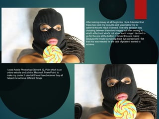
1. After looking closely at all the photos I took I decided that
these two were my favourite and would allow me to
achieve the end result I wanted. The hard decision was
choosing between these two images but after looking at
what's effect and what's not about each image I decided to
go for the one at the bottom. I picked this one mainly
because the model is making direct eye-contact and I felt
that this was needed for the type of poster I wanted to
achieve.
I used Adobe Photoshop Element 12, Pixlr which is an
online website and a bit of Microsoft PowerPoint to
make my poster. I used all these three because they all
helped me achieve different things.
2. I started off by
downloading
Photoshop and then
I opened the
program. To start
editing the photo I
wanted to use I
needed to open it, I
did this by going to
File, open and then
selecting my image.
3. Next I decided to crop my
photo to achieve the size and
shape I wanted. I did this by
selecting the crop icon on the
toolbar and selecting the area
I wanted to get by highlighting
it and then clicking on the
green tick to crop.
4. Next I wanted to get remove the
background to achieve a
blank/white background, this will
help me to get rid of the shadows
and also the background colour.
This will allow me to put a new
background if I wanted to by then
creating layers. I removed the
background by selecting the wand
icon on the toolbar. This tool will
select all the areas which look
alike in colour allowing me to then
delete that selected area. I also
selected the refine edges button
which is under ‘quick selection’ to
ensure I got the edges of the
deleted area as smooth as
possible.
5. This is the finished
effect I added up with
after removing the
background.
6. I went to the
‘adjustment’ section
on the right hand
side and selected
the ‘colour’ tab. I
went to the hue
section and click on
the first one which
gives the image a
green hue/tint which
I wanted.
7. I then went to the
‘vibrance’ Section and
selected the first one
again to tone down
the brightness of the
photo. I also went
back and selected the
wand tool to get rid of
the models hair. After
this I saved what I
have edited so far
onto my computer.
8. I went on the pixlr
website by typing in
‘pixlr.com’. I then
opened up the
image I have edited
on Photoshop
previously by going
to file and open
image.
9. On Pixlr I edited the
brightness of the photo
to -9 to make the photo
more darker. As you
can see the hair and
the right shoulder has
been removed, this
does not matter
because later I am
going to crop the
picture in half.
10. During the editing
process the colour of
the lipstick wore by the
model has changed
colour from red to blue.
To get the red colour
back I selected the tool
which looks like a pain
brush on the toolbar
and then selecting the
colour I wanted on the
colour wheel. Instead
of going for a red
colour I went for a
more orange red.
11. I used this tool to change the
colour of the model’s lips. I
changed the tolerance level
to 10 so that the colour is not
very vibrant because I know
when I edit the picture further
the colour may become more
visible and vibrant. I also
increased the size of the
brush so that it will cover a
large surface area so that the
colour distribution is even
throughout. Her is the finish
effect after using the tool.
12. I went back on
Photoshop and
increased the
vibrance to 75
to get the colour
on the lips more
visible. I also got
back the right
shoulder.
13. I then selected
the exposure and
decreased it to
-3.0 to get the
dark tint back and
create a light grey
background.
14. Now that I have
finished editing my
photo I open up
Microsoft
PowerPoint and
opened the picture.
15. Here is the before and after of my photo
and I am very happy with the finish product.
It came out just how I planned and now I
am going to crop the image in half and start
adding text so that the image looks like a
poster such as a tagline and date of release
16. IT’S AS EASY
Here is a mock up of my poster, this
allows me to visually see how my
finished poster may look and check
to see if there is anything I want to
change or add. I used the Arial
front for all the text and experienced
with the placement of the film title
and colours. I decided to go for
colours which compliment the
colours in the photo used which
lead me to a blue and red colour
scheme.
AS TAKING
CANDY
FROM A
BABY
CANDY
CANDY
17. Here is the finished poster, I deceived to
combined both mock up posters together to
create my finished poster. I changed the
colour of the tagline to a more orange red
to match with the lipstick and this also
works with the orange in the lollipop. This
prop was used because it relates to both
the tagline and title of the film and is a way
to keep the name of the film in the viewers
mind. I added the release date under the
title in the same colour as the tagline, I also
added the website of the film to the bottom
of the poster in small front, the dream
works logo which I made on PowerPoint
and a 18 adviser age as well. I went for a
simplistic teaser trailer with a modern style ,
I was inspired by an ‘In Time’ poster I saw.
18. These are the two poster that
inspired me to create my poster, both
of them use the an extreme close-up
cropped in half and a blue colour
scheme. I have analysed the ‘In time’
poster and I think both posters are
very effective.