
Recommended
More Related Content
What's hot
What's hot (20)
Viewers also liked
Viewers also liked (16)
Similar to Contents page overview
Similar to Contents page overview (20)
Contents page overview
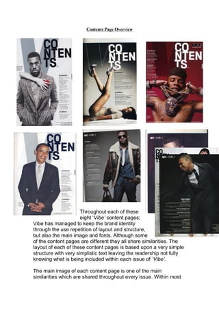
- 1. Contents Page Overview Throughout each of these eight ‘Vibe’ content pages; Vibe has managed to keep the brand identity through the use repetition of layout and structure, but also the main image and fonts. Although some of the content pages are different they all share similarities. The layout of each of these content pages is based upon a very simple structure with very simplistic text leaving the readership not fully knowing what is being included within each issue of ‘Vibe’. The main image of each content page is one of the main similarities which are shared throughout every issue. Within most
- 2. of the content pages the main image tends to be placed on the right hand side of the page or in the middle, this is done because it will catch the readerships attention as it’s the first thing they will see when opening the front cover, making this effective. The images which are used on Vibe’s content pages are all similar also, aside from one (image of President Obama) they are all RnB music artists, thus portraying the genre of this music magazine. The backgrounds are also similar as none of the eight content pages shown above feature background settings; only a coloured background has been used to again display the simplistic structure of the magazine. Another similarity feature that appears within Vibe’s content pages is that both men and women feature within all of them making the target audience of both men and women being able to relate to this music magazine as this is the genre of music the readership is interested in. Furthermore within all of these content pages there doesn’t appear to be any title or headline, some have nothing at all aside from the word ‘Vibe’ in the top left hand corner. However the majority of them have the word ‘Contents’ written in a black, bold font mainly on the right hand corner of the page depending on the main image; this to also to keep the simplistic layout and structure of the music magazine. The word ‘Contents’ has been broken into three parts to give it a more modern and edgy feel to the music, keeping its younger generation involved and engaged. Vibe doesn’t have to use any gimmicks or catch their reader’s attention or need huge text with lots of images on their content pages and reflect this by having a high status in the RnB music industry. Within all of the content pages their isn’t a lot of text used, but the text that is displayed is presented in a column/list format throughout each content page reflecting again the simplistic design that Vibe carries thus being another similarity, which all helps to maintain the brand identity of this magazine. By keeping the text in every issue of Vibe’s music magazine the readership become fond of this, making it recognisable and familiar to the reader, therefore they know straight away where to find what they are looking for.
- 3. of the content pages the main image tends to be placed on the right hand side of the page or in the middle, this is done because it will catch the readerships attention as it’s the first thing they will see when opening the front cover, making this effective. The images which are used on Vibe’s content pages are all similar also, aside from one (image of President Obama) they are all RnB music artists, thus portraying the genre of this music magazine. The backgrounds are also similar as none of the eight content pages shown above feature background settings; only a coloured background has been used to again display the simplistic structure of the magazine. Another similarity feature that appears within Vibe’s content pages is that both men and women feature within all of them making the target audience of both men and women being able to relate to this music magazine as this is the genre of music the readership is interested in. Furthermore within all of these content pages there doesn’t appear to be any title or headline, some have nothing at all aside from the word ‘Vibe’ in the top left hand corner. However the majority of them have the word ‘Contents’ written in a black, bold font mainly on the right hand corner of the page depending on the main image; this to also to keep the simplistic layout and structure of the music magazine. The word ‘Contents’ has been broken into three parts to give it a more modern and edgy feel to the music, keeping its younger generation involved and engaged. Vibe doesn’t have to use any gimmicks or catch their reader’s attention or need huge text with lots of images on their content pages and reflect this by having a high status in the RnB music industry. Within all of the content pages their isn’t a lot of text used, but the text that is displayed is presented in a column/list format throughout each content page reflecting again the simplistic design that Vibe carries thus being another similarity, which all helps to maintain the brand identity of this magazine. By keeping the text in every issue of Vibe’s music magazine the readership become fond of this, making it recognisable and familiar to the reader, therefore they know straight away where to find what they are looking for.
- 4. of the content pages the main image tends to be placed on the right hand side of the page or in the middle, this is done because it will catch the readerships attention as it’s the first thing they will see when opening the front cover, making this effective. The images which are used on Vibe’s content pages are all similar also, aside from one (image of President Obama) they are all RnB music artists, thus portraying the genre of this music magazine. The backgrounds are also similar as none of the eight content pages shown above feature background settings; only a coloured background has been used to again display the simplistic structure of the magazine. Another similarity feature that appears within Vibe’s content pages is that both men and women feature within all of them making the target audience of both men and women being able to relate to this music magazine as this is the genre of music the readership is interested in. Furthermore within all of these content pages there doesn’t appear to be any title or headline, some have nothing at all aside from the word ‘Vibe’ in the top left hand corner. However the majority of them have the word ‘Contents’ written in a black, bold font mainly on the right hand corner of the page depending on the main image; this to also to keep the simplistic layout and structure of the music magazine. The word ‘Contents’ has been broken into three parts to give it a more modern and edgy feel to the music, keeping its younger generation involved and engaged. Vibe doesn’t have to use any gimmicks or catch their reader’s attention or need huge text with lots of images on their content pages and reflect this by having a high status in the RnB music industry. Within all of the content pages their isn’t a lot of text used, but the text that is displayed is presented in a column/list format throughout each content page reflecting again the simplistic design that Vibe carries thus being another similarity, which all helps to maintain the brand identity of this magazine. By keeping the text in every issue of Vibe’s music magazine the readership become fond of this, making it recognisable and familiar to the reader, therefore they know straight away where to find what they are looking for.
- 5. of the content pages the main image tends to be placed on the right hand side of the page or in the middle, this is done because it will catch the readerships attention as it’s the first thing they will see when opening the front cover, making this effective. The images which are used on Vibe’s content pages are all similar also, aside from one (image of President Obama) they are all RnB music artists, thus portraying the genre of this music magazine. The backgrounds are also similar as none of the eight content pages shown above feature background settings; only a coloured background has been used to again display the simplistic structure of the magazine. Another similarity feature that appears within Vibe’s content pages is that both men and women feature within all of them making the target audience of both men and women being able to relate to this music magazine as this is the genre of music the readership is interested in. Furthermore within all of these content pages there doesn’t appear to be any title or headline, some have nothing at all aside from the word ‘Vibe’ in the top left hand corner. However the majority of them have the word ‘Contents’ written in a black, bold font mainly on the right hand corner of the page depending on the main image; this to also to keep the simplistic layout and structure of the music magazine. The word ‘Contents’ has been broken into three parts to give it a more modern and edgy feel to the music, keeping its younger generation involved and engaged. Vibe doesn’t have to use any gimmicks or catch their reader’s attention or need huge text with lots of images on their content pages and reflect this by having a high status in the RnB music industry. Within all of the content pages their isn’t a lot of text used, but the text that is displayed is presented in a column/list format throughout each content page reflecting again the simplistic design that Vibe carries thus being another similarity, which all helps to maintain the brand identity of this magazine. By keeping the text in every issue of Vibe’s music magazine the readership become fond of this, making it recognisable and familiar to the reader, therefore they know straight away where to find what they are looking for.