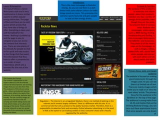
1. Introduction
This is the main homepage to Rockstar
Energy. As you can see there is a dark
theme with some vibrant colours to make
things stand out more. This promotes the
extreme sports featured and gets people
to look at their energy drinks.
Purpose & Function
The purpose of the product is
to entertain and inform
people about their products.
Rockstar now has a variety of
energy drinks available, even
though they are the same,
but present them in various
ways. Rockstar also
encourages action sports
such as BMX Racing, Skating,
Snowboarding and Surfing. It
also encourages Motorsports
like NASCAR and Snowcross.
They show all of the recent
news on the homepage, as
well as images, videos,
related links and a social feed
where people can interact
with each other and talk
about events and other
products.
Layout &Navigation
The layout follows a classic
Word press style and is very
traditional as it shares similar
aspects to other popular
energy drink sites. The page
is filled and there are no void
spaces which proves that
they have lots of things to
offer. Everything is clean and
well formatted for the
viewer. Nothing is jumbled up
and the page is easy to
navigate so you can access
the content that interests
you. There are also plenty of
thumbnails for people to click
on for quick and easy access
to the things that they want.
The information that they
have to offer is presented to
us in order of most
importance, which sets a
standard for the rest of the
website.
The Content and Format
The content is appropriate to the
target audience as the thumbnails
selected all show dynamic and exciting
images that you can view from free.
The producers of this site are using
gritty , vibrant and abstract textures.
The content reflects the need of the
audience, its is exciting, exclusive and
friendly. The site contains images of
aspirational characters that are
carrying out breath-taking stunts and
tricks which invites us to culture and
ideology of the brand. There are links
to social networks so we can spread
the word of the community to friends,
family and others.
Regulation – The internet is an unregulated Medium, there is no method of policing on the
internet and it remains largely unfiltered. There is a difference with this site. It is a
commercial site that sells a product to the public/ business market. Therefore, there is a
responsibility to advertise fairly and accurately. Online behaviour advertising is in the remit
of ASA as the option to use tracking cookies is now a consumer choice and is heavily
regulated by the authority.
Primary focus, style, and target
audience
The website is focused on making
grand statements through the
images used. As you can see
there is a limited use of text.
There are mainly images which
invite you to read on or view the
next video/ article. The primary
focus for the audience is the
daredevil at the top of the page.
The audience is young males from
14-25 and implies that just by
drinking Rockstar Energy, you can
carry out these aspirational stunts
that some people can only dream
of.
2. Introduction
Welcome to the Relentless energy drink homepage.
As you can see there is a very specific theme. There is
a standard dark black theme but is contrasted with a
vibrant yellow colour that makes this website
interesting.
Layout and Navigation
The layout is slightly different
from the traditional style that
we see for example on the
Rockstar homepage. The
screen is filled with images
that catch the audience’s
attention. Everything is neat
and well laid out for the
audience to navigate to what
they want to see. Objects are
presented centrally on the
page in order of importance.
The images include famous
artists/ bands that are
popular to the public which
will entice them to read on.
The main image sets the
precedence for the rest of
the page, and the thumbnails
used are there to allow quick
access to the content that
you want to view.
The content and the format
The content is appropriate to the
target audience as the
thumbnails selected all show
dynamic and exciting images
that you can view from free. The
producers of this site are using
vibrant and abstract colours to
grab the audience’s attention.
The content reflects the need of
the audience, its is
exciting, exclusive and friendly.
The images are awe-inspiring to
the audience that have been
waiting to see their favourite
artists for some time and are
there so we can tell our friends
and family about the events so
they can go.
Regulation – The internet is an unregulated Medium, there is no method
of policing on the internet and it remains largely unfiltered. There is a
difference with this site. It is a commercial site that sells a product to the
public/ business market. Therefore, there is a responsibility to advertise
fairly and accurately. Online behaviour advertising is in the remit of ASA
as the option to use tracking cookies is now a consumer choice and is
heavily regulated by the authority.
Purpose and Function
The purpose of the product is to
inform and entertain. Relentless
in fairly new and there are a few
people who don’t know about it,
however it does have a big
following with many ways of
grabbing new attention, such as
live gigs, events, meet-ups and
festivals. There are images,
videos, reviews and
merchandise to be viewed
which all preach their product
and what they have to offer.
Everyone is invited to join the
party and the language used is
informal and very friendly.
Primary focus, style, and target
audience
The website is focused on
making grand statements
through the amount of images
used. As you can see there is a
limited use of text here. There
are mainly images that invite
you to read on or view the next
video/ article. The target
audience is any young male that
loves music. The images make it
seem like just by drinking
Relentless, you will change in
some way and become cooler or
more tuned into an alternative
lifestyle.
3. Introduction
This is the Rip It homepage. As you can see
again, there is a dark, gritty theme to this
website, but it is made vibrant through the bright
red/ pink colours. The images promote an
alternative lifestyle through extreme events.
Layout and Navigation
The layout is traditional
and follows a classic word
press style. Objects are
sensibly formatted and
well laid out for the
audience. The grandest
and most enticing image is
at the top of the page
which sets a precedence
for the rest of the website.
Unfortunately, there is a
lot of blank and negative
space which makes it seem
like they don’t have much
to offer. The thumbnail for
the main image sets the
tone for the rest of the
website, as it shows that
this brand will try and
grab your attention
through bright colours
which is a lot different
from the previous two
websites that have been
analysed.
The content and format
The content is appropriate to
the target audience as it
shows what the brand has to
offer with their energy
drink, although it seems that
this brand is implying that if
you buy their energy
drink, who will be able to
attract girls, as implied by the
main image, which seems a
bit far-fetched. Although it
may be appropriate for the
audience, it seems like false
advertising.
Regulation – The internet is an unregulated Medium, there is no
method of policing on the internet and it remains largely unfiltered.
There is a difference with this site. It is a commercial site that sells a
product to the public/ business market. Therefore, there is a
responsibility to advertise fairly and accurately. Online behaviour
advertising is in the remit of ASA as the option to use tracking
cookies is now a consumer choice and is heavily regulated by the
authority.
Primary focus, style, and target
audience
The website is focused on
making grand statements
through the amount of images
used. As you can see there is a
limited use of text here. There
are mainly images that invite
you to read on or view the next
video/ article. The target
audience is any young male that
loves any sport or any outdoor
activities.. The images make it
seem like just by drinking
Relentless, you will change in
some way and become cooler or
more tuned into an alternative
lifestyle
Purpose and Function
The purpose and function of the
product is to inform and entertain.
Rip It has a variation of flavours and
types of energy drinks to offer, but
they are a fairly new band and not
that many people know about them
which is proven by the amounts of
content seen on the homepage.
They don’t have much to offer apart
from their drink which doesn’t seem
to be popular. There are images,
articles, videos and links to their
Facebook page which allows fans to
interact with each other and talk
about Rip It’s offers.