Introduction to Responsive Web Design
•
1 like•437 views

A brief introduction to responsive web design presented to Biomedical Communications (MScBMC) students on March 15, 2013.

Recommended
More Related Content
What's hot
What's hot (19)
Similar to Introduction to Responsive Web Design
Similar to Introduction to Responsive Web Design (20)
Recently uploaded
Recently uploaded (20)
Introduction to Responsive Web Design
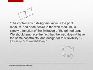
- 1. “The control which designers know in the print medium, and often desire in the web medium, is simply a function of the limitation of the printed page. We should embrace the fact that the web doesn’t have the same constraints, and design for this flexibility.” http://alistapart.com/article/dao
- 2. Not responsive: Responsive: http://www.english.utoronto.ca/Page4.aspx
- 3. Front-end ingredients for RWD: http://alistapart.com/article/responsive-web-design
- 4. h1 {font-size: 1.5 em}
- 5. target ÷ context = result eg. 24px ÷ 16px = 1.5em • Also applies to grid dimension • Can avoid context considerations with rems http://aralbalkan.com/notes/pixel-parity-rems/
- 7. Image considerations: Scaling vs. large downloads 1. Serve as a and swap at break-points 2. Use to serve the appropriate size image github.com/filamentgroup/Responsive-Images/
- 8. “At some point everything breaks.” • Media queries are used to solve breakpoints • Responsive websites usually have at least 3 breakpoints • Trend is towards device agnosticism
- 9. @media screen and (min-width: 1024px) { body{font- size = 100%} } Syntax: • media type • keyword • 1+ expression http://www.w3.org/TR/CSS2/media.html https://developer.mozilla.org/en/docs/CSS/Media_queries#Media_features
- 12. • “Mobile first”, work up from smallest target device • Design to look right, not for the device size • Test, redesign, test, rinse, repeat: • • • •
- 13. Maybe RWD is not right for you, but fixed-width is no longer viable. • • • http://www.lukew.com/ff/entry.asp?1509 http://googlewebmastercentral.blogspot.ca/2012/06/recommendations-for-building-smartphone.html http://electricpulp.com/notes/more-on-apples-mobile-optimization-in-ecommerce/ http://www.w3.org/TR/mobile-bp/#OneWeb
- 14. Recommended reading • http://alistapart.com/article/responsive-web-design • "Responsive Web Design” by Ethan Marcotte Useful Resources • A px to em math tool: http://pxtoem.com/ • Responsive grid resources: • http://goldengridsystem.com/ • http://www.responsivegridsystem.com/ • http://foundation.zurb.com/ • http://twitter.github.com/bootstrap/ • http://www.tinyfluidgrid.com/
Editor's Notes
- While the book is entering its "post artifact phase" when tangible objects are being produced less and less and the written word is no longer limited by the physical constraints of the page, the web, by contrast, never had an artifact phase; no physical object is produced by designing for the web. Funnily enough however. in the absence of physical constraints, artificial constraints were placed on it: "mapping previous experiences onto the new more foreign one, using them to gradually orient ourselves". When presented with the inherent flexibility of a webpage are the width and height, the first constraint we place is the same first constraint as when we create a new Photoshop file. We establish the area of the canvas as we are accustomed to doing in the physical world, and we try to do it according what the "average" minimum screen size, e.g. the 960 grid.
- While a static canvas is convenient, many designers have been asking if it is really the best option for website users. While these constraints provide fixed a box to design in, it doesn't follow that the more controlled design is more successful.Fixed designs are easily broken and will break more often as more and more devices are produced that are both smaller and larger. One approach, adaptive design which fragments content "across different 'device-optimized' experiences is, at the very least an unsustainable one proposition: someone needs to maintain the code for all those separate sites. Responsive design offers an alternative to the workload involved in creating and maintaining separate sites through the creation of a single site build that responds to its environment.RWD is a design strategy to allow content to respond to its viewing context, a sort of "one size fits all" sisterhood of the travelling pants. RWD is a growing movement but is also at the early stages of its development. The term itself was coined by Ethan Marcotte, who established the language and theory for discussion of a new approach to web design. <img Explore a responsive site in action>
- The front-end ingredients to RWD according to E.M.: 1. Flexible grid2. Flexible media3. Media queries
- Let's begin with a demo of the principle behind the creation of a flexible grid. Exercise: rwd_flexTypeSTARTh1 {font-size: 1.5 em}Note simpleheadline markup and CSS styling. Need to express h1 proportionally, relative to the size of the window. To express pixelsproportionally EM usesems. How convenient. (We are alreadysomewhatcomfortable to sizing text relative to a baseline usingems.) To makeitproportional, wedivide the target value of h1 by the font-size of the containingelement or context. (See script formula). Since E.M. likes to put the mathbehindhismeasurements in a commentbeside, so I willtoo. Wedo the same for the link within h1, notingthat the contexthaschanged to 24px. (!important) Butwhatallthishave to do with a responsive grid? The sameprincipleapplies. Everyaspect of ourgrid (margins, padding and width) can be represented in proportions.
- The formula, target / context = result, also applies to grid dimensions, in percentages and ems.Exercise: rwd_miniFlexGridDemoApply proportional representation of text to grid elements – context is a chore.Context considerations. Keeping track of context can be a chore as you need keep in mind the nesting of elements and subsequent changing on contexts as you build a responsive site. Add to that, for margins the context is the width of the element container, but for padding its the width of the element itself.Breaking! I came across a post regarding the rem (short for root em), which is "a relative unit that gets its value from the font size of the root element (the html element)", i.e. if you want a margin 16 pixels wide, you would set the CSS property to 1 rem since the default font size of the root html element in browsers is 16px.
- The image will render at whatever size it wants as long as it's narrower than the container, and if it's wider than the container than it will shrink to match it. The same rule can be applied to most media, including video.Add cat image to both section and footer…
- As visual media creators we must be especially concerned with images, which are actually quite a complex problem. You don't want to use small images and have them lose quality on scale up, but providing large pictures would punish mobile users with larger, unnecessary downloads.Two possible solutions (for more see Agnes' talk) are 1) if the image is decorative and not part of structure, you can serve it as a background image and swap it out at the breakpoints in the media queries. This is limited to images that don't need to be within the HTML 2) Use image.js to serve the appropriate size image. (replaces small images with larger ones if the screen is wide enough)Ultimately, rwd is still evolving and we need to pay attention and adopt new methods for providing responsive images as they mature
- Even with a responsive grid, as some point the design will look terrible – this is a breakpoint. A breakpoint is the width at which the design breaks. In RWD code is used to switch from one layout to another at these breakpoints. Almost all responsive websites will have at least three breakpoints targeted for three different devices roughly corresponding to mobile, tablet and desktop dimensions. But as we'll see later, the growing trend is to be "device agnostic".Media queries emerged when the W3C at some point decided to create media types as an attempt to classify browsers and devices by broad, media specific categories, such as screen, print and projection. This allowed designers to create styles sheets for different media types that shared properties, but had different property values. In RWD the preferred method is to create an @media block in the CSS to solve "break points".Exercise: http://bradfrost.github.com/this-is-responsive/ (open in Chrome Dev tools)Resize browsers to smallIn Chrome dev tools click on container. Notice style applied at right. Now embiggen the browser, notice style applied to container size.Few other things to notice, Brad Frost uses ems, and codes breakpoints for browser windows of increasing size, in line with the idea of “progressive enhancement”. Which, Instead of graceful degrade is the idea documents are built for the least capable devices first, then moves to enhance those documents for more modern browsers so that they don’t burden on baseline devices.
- The @media query consists of…Media query syntax: Media queries contain a media type, e.g. screen (targets all colour computer screens), and one or more expressions (a property value pair), e.g. min-width: 1024px (targets viewports that are at least 1024px wide). Keywords such as "and" and "not" help refine when styles are applied. Combined, media types, keywords and expressions are used test whether a style is applied or not.
- There are a number of media features that we can test for,which can be chained together to test for multiple features in a single query. In practise, min-width is often all that is needed in rwd, as we saw in Brad Frost’s site, especially if designing "mobile first". Note that there is a growing movement to set width media queries using ems rather than pixels as this creates a responsive design that responds not only to browser window width, but user zooming as well.
- Finally, support for media queries is very good. Most modern browsers and mobile browsers support media queries, and respond.js can be used to add support for older browsers.
- Now that we’ve covered the techniques…Mobile firstRecommended development strategy for designing a responsive site is to start with smallest target size and work up ("mobile first"). Making assumptions about mobile users is too often used as an excuse to limit and pare down the contentWhen really it should be used to set a hierarchy. Plan for a mobile sight at WORK UP, or work on them simultaneously, allows you to be more focussed on content. After making initial wireframes for mobile and desktop, start planning for breakpoints--know the extremes and will probably end up with 3-4 breakpoints in between. The criticisms, "doesn't deliver same content" are more failings of design than of responsive web design.Design to look right, not for the device.Breakpoints should be coded when the design falls apart instead of for specific device widths. This is for the simple fact that you can't predict future devices and their dimensions, vis-a-visiPad mini, and this approach is device agnostic. If you adjust your design when it looks right, you won’t have to worry about retro-fitting your media queries for new devices.Test, test, testuser-defined breakpoints: http://www.benjaminkeen.com/open-source-projects/smaller-projects/responsive-design-bookmarklet/preset breakpoints: http://www.responsinator.com/animated preset breakpoints: http://responsive.is/typecast.comcomes with measurement bars: http://screenqueri.es/
- Choosing an approach, final thoughtsMaybe RWD is not for you. It depends on budget context, project timeline, skill set of the team, and client expectations. (For advice on choosing an approach: http://www.lukew.com/ff/entry.asp?1509) Whatever approach you use, a single, fixed-width layout is no longer viable, given that 77% of the world now owns a mobile device., not just because Google thinks so"Sites that use responsive web design, i.e. sites that serve all devices on the same set of URLs, with each URL serving the same HTML to all devices and using just CSS to change how the page is rendered on the device. This is Google’s recommended configuration.” Or because transactions on e-commerce sites that adopted rwd saw as much as a 333.33% increase in transactions (purchases) on mobile devices and as little as 71.11% on desktop over a comparable time periodBut because it conforms to the W3C's goal of "One Web""One of W3C's primary goals is to make these benefits [of the Web] available to all people, whatever their hardware, software, network infrastructure, native language, culture, geographical location, or physical or mental ability.""Given their proliferation and increasing diversity, making any general assumptions about specific device capabilities and/or particular circumstances of their use is, at best, unwise. In particular, the assumption that access to the web is primarily by means of a desktop or notebook browser and that this is the default web experience is very much open to challenge. “