
Recommended
More Related Content
Similar to Draft newspaper layout analysis
Similar to Draft newspaper layout analysis (20)
More from maxybrown
Recently uploaded
Recently uploaded (20)
Draft newspaper layout analysis
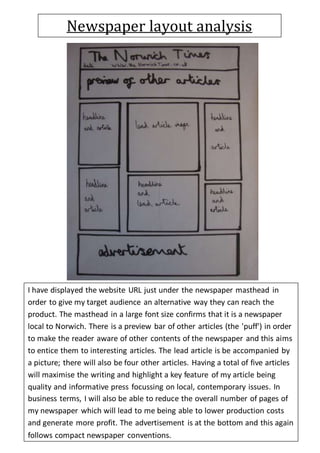
- 1. Newspaper layout analysis I have displayed the website URL just under the newspaper masthead in order to give my target audience an alternative way they can reach the product. The masthead in a large font size confirms that it is a newspaper local to Norwich. There is a preview bar of other articles (the 'puff') in order to make the reader aware of other contents of the newspaper and this aims to entice them to interesting articles. The lead article is be accompanied by a picture; there will also be four other articles. Having a total of five articles will maximise the writing and highlight a key feature of my article being quality and informative press focussing on local, contemporary issues. In business terms, I will also be able to reduce the overall number of pages of my newspaper which will lead to me being able to lower production costs and generate more profit. The advertisement is at the bottom and this again follows compact newspaper conventions.
- 2. I have included the date, name and page number at the top of the second page as this is a convention of newspapers. The content menu is positioned at the top left to help readers find a particular section of the newspaper to read. There is one article with a picture, and another article below. Again, the advertisement is at the bottom of the page. Having another two articles and only one advertisement on the second page maximises the writing and fits the convention of a compact newspaper focussing on quality and informative writing.