Weaving digital information into physical space
•
5 likes•1,905 views

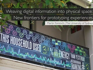
The document discusses new frontiers for prototyping experiences that weave digital information into physical space. It describes prototyping neighborhood energy usage scoreboards that displayed households' daily energy usage and comparisons to motivate conservation. Public displays reduced energy use by 13.2% while private displays reduced use by 12.1%, outperforming areas with no display. The document emphasizes balancing privacy and clarity in design and evaluating prototypes.

Recommended
Recommended
More Related Content
What's hot
What's hot (11)
Viewers also liked
Viewers also liked (20)
Similar to Weaving digital information into physical space
Similar to Weaving digital information into physical space (15)
More from Martin Tomitsch
More from Martin Tomitsch (6)
Recently uploaded
Recently uploaded (20)
Weaving digital information into physical space
- 1. Weaving digital information into physical space: New frontiers for prototyping experiences Martin Tomitsch | The University of Sydney
- 15. Balance privacy and clarity (low-res vs high-res)
- 16. Balance privacy and clarity (low-res vs high-res) Designing for a dynamic architectural fabric
- 17. Balance privacy and clarity (low-res vs high-res) Designing for a dynamic architectural fabric Prototyping as a form of evaluation
- 23. cityofsound.com
- 30. Blackboard display moods –!blackboard customization
- 31. Blackboard display moods – filling in information
- 35. location/shape
- 36. location/shape
- 42. 1 3 5 7 9 11 13 15 17 19 21 23 25 27 29 31 2 4 6 8 10 12 14 16 18 20 22 24 26 28 30 1 24 , THAN YESTERDAY MON TUE WED THU FRI SAT SUN 1. change in % change energy usage of household in % compared to the day before.
- 43. 1 3 5 7 9 11 13 15 17 19 21 23 25 27 29 31 2 4 6 8 10 12 14 16 18 20 22 24 26 28 30 24 , THAN YESTERDAY ... and 5 % more than LASt WEEK MON TUE WED THU FRI SAT SUN 2 2. ranking ranking based on percentage of change. updated 3 times a day
- 44. 1 3 5 7 9 11 13 15 17 19 21 23 25 27 29 31 2 4 6 8 10 12 14 16 18 20 22 24 26 28 30 3 house 24 , 9am THAN YESTERDAY ... and 5 % more than LASt WEEK neighbourhood MON TUE WED THU FRI SAT SUN 3. graph 3a. graph for house 3b. graph for neighbourhood avergae
- 45. 4 1 2 3 4 5 6 7 8 9 10 11 12 13 14 15 16 17 18 19 20 21 22 23 24 25 26 27 28 29 30 31 house 24 , 9am THAN YESTERDAY ... and 5 % more than LASt WEEK neighbourhood MON TUE WED THU FRI SAT SUN 4. bar resume of behaviour – relative system – not compared to neighbourhood – only compared to own previous behaviour
- 46. -3 -2 -1 0 +1 +2 +3
- 47. day 12: less usage, jumps to +1 +1 (not to -2) -3 day 11: same usage on a -2 level = again -2 3 times -2 = -3 day 10: same usage on the -2 level = again -2 -2 day 9: same usage on a -1 level = again -1 -2 3 times -1 = -2 day 8: more usage -1 = again -1 day 7: more usage -1 = jumps to -1 (not to +2) day 6: no change or improvement – third +3 day in a row = +3 +2 day 5: less usage = second crown / +2 day 4: still no change +2 no change on a +1 level = +1 3 positive days in a row (3x +1) = +2 energy usage +1 day 3: no change in usage – but the day before was an improvement so it‘s still considered +1 +1 day 2: less usage = +1 day 1: everyone starts with 0 0
- 48. 1 3 5 7 9 11 13 15 17 19 21 23 25 27 29 31 2 4 6 8 10 12 14 16 18 20 22 24 26 28 30 house 24 , 9am THAN YESTERDAY ... and 5 % more than LASt WEEK neighbourhood MON TUE WED THU FRI SAT SUN
- 49. 1 3 5 7 9 11 13 15 17 19 21 23 25 27 29 31 2 4 6 8 10 12 14 16 18 20 22 24 26 28 30 24 1 3 5 7 9 11 13 15 17 19 21 23 25 27 29 31 , ... and 5 % more than 2 4 6 8 10 12 14 16 18 20 22 24 26 28 30 THAN YESTERDAY 24 and 5 % more LASt WEEK , THAN YESTERDAY than LASt WEEK house 9am house neighbourhood MON TUE WED THU FRI SAT SUN house NBHD 9am MON TUE WED THU FRI SAT SUN
- 50. alternative 1 3 5 7 9 11 13 15 17 19 21 23 25 27 29 31 2 4 6 8 10 12 14 16 18 20 22 24 26 28 30 1 2 3 4 5 6 7 8 9 10 11 12 13 14 15 16 17 18 19 20 21 22 23 24 25 26 27 28 29 30 31 24 , THAN YESTERDAY ... and 5 % more than LASt WEEK 24 and 5 % more , THAN YESTERDAY than LASt WEEK house 9am neighbourhood MON TUE WED THU FRI SAT SUN house house NBHD 9am MON TUE WED THU FRI SAT SUN
- 57. www.neighbourhoodscoreboards.com public & private private display no display 50 m display (A) only (B) (C)
- 58. www.neighbourhoodscoreboards.com Change after the installation in week 4: Public display - 13.2% Commercial energy monitor -12.1% No display - no change
- 59. www.neighbourhoodscoreboards.com Average change per week over 7 weeks: Public display - 2.5% Commercial energy monitor -1% No display - 0.5%
- 60. Balance privacy and clarity
- 61. Balance privacy and clarity
- 62. Designing for a dynamic architectural fabric 1 3 5 7 9 11 13 15 17 19 21 23 25 27 29 31 2 4 6 8 10 12 14 16 18 20 22 24 26 28 30 24 1 3 5 7 9 11 13 15 17 19 21 23 25 27 29 31 , ... and 5 % more than 2 4 6 8 10 12 14 16 18 20 22 24 26 28 30 THAN YESTERDAY 24 and 5 % more LASt WEEK , THAN YESTERDAY than LASt WEEK house 9am house neighbourhood MON TUE WED THU FRI SAT SUN house NBHD 9am MON TUE WED THU FRI SAT SUN
- 63. alternative Designing for a dynamic architectural fabric 1 3 5 7 9 11 13 15 17 19 21 23 25 27 29 31 2 4 6 8 10 12 14 16 18 20 22 24 26 28 30 1 2 3 4 5 6 7 8 9 10 11 12 13 14 15 16 17 18 19 20 21 22 23 24 25 26 27 28 29 30 31 24 , THAN YESTERDAY ... and 5 % more than LASt WEEK 24 and 5 % more , THAN YESTERDAY than LASt WEEK house 9am neighbourhood MON TUE WED THU FRI SAT SUN house house NBHD 9am MON TUE WED THU FRI SAT SUN
- 64. Prototyping as a form of evaluation
- 65. Prototyping as a form of evaluation
- 66. Prototyping as a form of evaluation
- 67. Prototyping as a form of evaluation
- 68. Prototyping as a form of evaluation
- 69. Balance privacy and clarity (low-res vs high-res) Designing for a dynamic architectural fabric Prototyping as a form of evaluation
- 73. Image credits Slide 03: ENIAC Computer – http://en.wikipedia.org/wiki/File:Eniac.jpg Slide 04: ATTiny – http://www.flickr.com/photos/project-hal0/2322389540/ (Example taken from Mike Kuniavsky’s book “Smart Things”) Slide 05: Xerox Star – http://catchrandom.blogspot.com/2010/05/first-computer-user-interface-1981.html Slide 07: http://www.flickr.com/photos/mac_fun/5328640028/sizes/l/in/photostream/ Slide 08: Ambient Orb – http://www.ambientdevices.com/cat/images/greenorb_withchair.jpg Slide 09: Weather Toaster – http://infosthetics.com/archives/2005/12/ambient_weather_toaster_visualization.html Slide 10: http://www.ambientdevices.com Slide 13: Augmented City (Keiichi Matsuda) – http://www.keiichimatsuda.com/augmentedcity.php Slide 14: Honours project by Mandy Leung @ Sydney Uni (photo by Josh Mcinerheney) Slide 19: http://www.flickr.com/photos/jamesm/2053805960/ Slide 20: Home Joule (Ambient Devices) Slide 21: Wattson – http://www.diykyoto.com/uk/wattson/about Slide 22: Honours project by Silje Johansen @ Sydney Uni Slide 23: Sketch by Dan Hill (cityofsound.com) Slide 70: Real Ideal concept – http://depts.washington.edu/ixd/blog/2009/12/20/intel-envisioning-interactions-in-the- home-of-the-future/ Slide 71: Mockup by Hanley Weng (Advanced Interaction Design class, 2011 @ Sydney Uni) Slide 72: http://www.webpagesthatsuck.com/over-the-top-web-sites.html
- 74. Andrew Vande Moere Martin Tomitsch Monika Hoinkis @martintom Elmar Trefz The University of Sydney Silje Johansen Design Lab Allison Jones Josh Mcinerheney Damien Kwan Credits & thanks: Public feedback display sketches and mockups by Monika Hoinkis; Photos by Josh Mcinerheney, Nikash Singh, Martin Tomitsch, Elmar Trefz; Dan Hill for inspiration and input during the initial project phase; Timo Arnall for using dashed lines to show hidden information. The project was funded by the Faculty of Architecture, Design & Planning – Sustainability Cluster. www.neighbourhoodscoreboards.com