The Fit for Passkeys for Employee and Consumer Sign-ins: FIDO Paris Seminar.pptx
Evaluation]
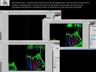
1. Paint Bucket Tool – I used the paint bucket tool to fill the background in and cover the missing colour in
the font I used like below. I used this for the font as the black non green parts of the font were
transparent and therefore I needed to fill them in with black so it was more clear and visible.
2. Polygonal Lasso Tool – I used this tool to cut out various objects and shapes from their original background such as the
gravestone. I used this instead of the magic wand tool as there was too much detail in the background of the picture for me to
select over the preferred object, whereas the polygonal lasso tool enabled me to cut out the parts of the picture I wanted.
3. Text Box Tool – I used this tool to insert text into my brochure and can enabling me to add information,
titles and captions. I also used the text settings to change the colour, size and paces in the font. The text tool
was helpful for making bold statements that could stand out making a point to the audience.
4. Rubber Tool – The rubber tool can be used to get rid of small bits on pictures or
brushes. Although I only used this tool once when i adjusted the settings so that the
rubber did not erase as hard as normal therefore just fading the edges of certain
things.
5. Rectangular Lasso Tool – I used the polygonal lasso tool to easily deleted selected
areas of certain objects
6. Move Tool – I used the move tool to move my objects into places as well
as resizing them. To keep the pictures in proportion i would hold shift
whilst resizing it.
This is an example of an “out of
proportion” picture
This is an example of a picture
that is in proportion
7. Custom Shape Tool – I used this tool to add extra effect on things and also added
downloaded vector shapes from the internet to create the initial design for my drink
can. I downloaded them from http://all-silhouettes.com/vector-zombie/
I also used these vector shapes on each
page (apart from the front and back) to
create the same style each time making
the brochure more professional.
8. Magic wand tool – I used this tool to select specific areas in which I wanted to edit. A
prime example of this is the text as, due to the type of font I used, the centre of the
text was transparent therefore I needed to fill it in so the text would be easier to
read. Although I previously used the paint bucket tool to do this I later found it
easier to select the text and just brush over it with the paintbrush tool.
9. Paint Brush Tool – I used the paintbrush tool to add all the extra details onto
my design. As well as colouring in the text, as previously stated. I downloaded
my flame brushes from http://sugarbreezy.deviantart.com/art/Flame-Brushes-
133287388 and blood splatter brushes from
http://kaikudo.deviantart.com/art/Blood-Brush-Test-62431058
10. Levels Adjustment – I adjusted the levels on different pictures to make them look
more professional. I mainly darkened the pictures so that they had a scarier feel
to them, adding to the zombie/horror theme.
11. Hue/Saturation Adjustment – I used the hue/Saturation adjustment to
create different colour effects on the pictures, therefore creating different
moods. For example I chose a 3 picture collage and changed the saturation
of each picture differently creating stranger pictures, aiding to the set
theme.