

Recommended
More Related Content
Similar to Graphing Practice
Similar to Graphing Practice (20)
More from Joe McClung
More from Joe McClung (20)
Recently uploaded
Recently uploaded (20)
Graphing Practice
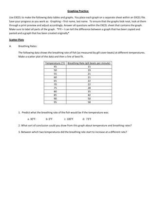
- 1. Graphing Practice: Use EXCEL to make the following data tables and graphs. You place each graph on a separate sheet within an EXCEL file. Save your progress as you work as: Graphing – first name, last name. To ensure that the graphs look neat, look at them through a print preview and adjust accordingly. Answer all questions within the EXCEL sheet that contains the graph. Make sure to label all parts of the graph. *FYI – I can tell the difference between a graph that has been copied and pasted and a graph that has been created originally* Scatter Plots A. Breathing Rates: The following data shows the breathing rate of fish (as measured by gill cover beats) at different temperatures. Make a scatter plot of the data and then a line of best fit. Temperature (°F) Breathing Rate (gill beats per minute) 45 15 50 19 55 21 60 21 65 22 70 22 75 28 80 35 85 42 90 50 95 58 1. Predict what the breathing rate of the fish would be if the temperature was: a. 30°F: b: 0°F c: 100°F d: 73°F 2. What sort of conclusion could you draw from this graph about temperature and breathing rates? 3. Between which two temperatures did the breathing rate start to increase at a different rate?
- 2. B. Avg. Temperature: The data below is arranged in an odd manner. Clean up the data and see if you can make a table and scatter plot from the results. Start by putting the months in order from January to December. The data is supposed to be about which month it is and the average temperature during that month. This data probably won’t look very linear so when creating a line of best fit, I would choose polynomial. January is -12°C and in June is 12°C. May and November had the same temperature at 10°C, while February was cold at -15°C. March was the only other month at 6°C below 0°C. April was cold to at 5°C above 0°C and December was only 2°C . July and August were nice months at 20°C 25°C respectively. September was 18°C and October was 3°C less than September. 4. Between which months was there the greatest increase in temperature? Greatest decrease? 5. Which month would you predict is the month for the start of Spring? Fall?
- 3. C. Rockets: The data below is for three different types of rockets. The data shows the measured maximum speed at which a rocket travels for different sized payloads. Graph the results in a scatter plot and create lines of best fit. Max Speed of Rockets in (km/hr) Mass of Payload (kg) V1 Rocket Saturn V Rocket Duel-Booster Rocket 5050 601 851 1062 7532 534 804 997 8235 498 793 881 9235 389 740 848 10314 357 745 772 12002 298 702 692 6. Which rocket is least affected by the increase in mass? 7. If each rocket fired without having a payload (mass = 0 kg), what would their maximum speeds be? (Hint: Use the equations you got from the lines of best fit.) 8. What are some inferences you could make based off of observing the data from the graphs. I want at least 3! 9. Bonus Point: At what mass would the Saturn V Rocket and the Duel-Booster Rocket travel at the same speed?
- 4. Pie Charts: D. Lake: Make a circle graph to show the number of each species of fish in Slippery Lake from the data below. Have EXCEL put the percentages of each species on your pie chart. catfish – 90 trout – 45 largemouth – 15 smallmouth – 65 salmon – 55 pike – 10 perch – 60 gar – 20 10. What percent of the lakes population are perch? 11. What percentage of the lakes population are a bass species (large & smallmouth)? 12. Make some inference on the catfish percentage and the largemouth percentage as to why you think their numbers are the way they are?
- 5. E. Cookies At the end of the year you are looking at your sales figures for your bakery shop. You have organized your menu items. Listed beside each item is the amount of money you spent on making the item and the amount of money you received for selling the item. Make two pie charts, one for money spent and one for money received for the menu items. Cost to Money Type of Cookie Make Received Chocolate Chip Cookies $12,894 $21,978 Oatmeal Cookies $7,639 $15,841 Lemon Cookies $1,297 $1,967 Raisin Cookies $3,972 $5,789 White-Chocolate Cookies $6,982 $16,783 M&M Cookies $14,576 $18,350 Mint Cookies $489 $1,021 13. Which two cookies did you receive the most money from? 14. If you were going to focus on one particular cookie for next year, which cookie would it be and why? 15. What percent of your total sales went to making Oatmeal Cookies? 16. Can you create a pie chart that shows the amount of money you made for each type of cookie? Do it. 17. Of the 3 charts you have made, which one is more valuable as a business owner and why?
- 6. Bar Graphs: F: Grades The following data shows the grade distribution of 36 student’s test scores in Hon Algebra I. Make a bar graph of the data: Number of Students Earning Grade Grade Earned 6 A 9 B 13 C 6 D 2 F 18. Make an observation about the graph you have created. 19. How can this be useful information to the rest of the class? Useful to a teacher?
- 7. G: Students The following set of data displays the number of students Mr. Campbell has in a typical day by the period number. Make a bar graph of the information. nd rd Twenty-eight students are in first period, which is 2 more than the number in 2 period and 3 more than 3 th th period. Only eight students show up daily for Lunch Corral, Mr. Campbell’s 4 Period Class. The 5 period class th th is his least of the day at 21 students, 2 more than his 7 period class. 6 Period is when Mr. Campbell is planning for the next day and has no students. 20. During why period of the day would you infer Mr. Campbell is most relaxed? 21. By looking at the graph, would you say Mr. Campbell has a busier morning or afternoon?
- 8. H. Rabbits The following set of data shows the number of rabbits living in a state park during 2007. The rabbits were th counted on the 15 of each month starting in January and continuing to December. Make a bar graph of the data shown. Number of Rabbits: 6, 6, 5, 9, 16, 19, 27, 24, 17, 14, 11, 3 rd th 22. Make some inference as to why you think the numbers increase from the 3 number above to the 7 number listed? th 23. After the 7 Number, make some inference as to why the number would decline? 24. Between which two months was there the greatest increase in rabbits? Decrease? 25. Throughout these graphing activities you have been given the data in different formats. Explain why the method above is not a good method for presenting data. 26. Data that is presented in a bar graph can also be presented in a pie chart. Speculate on when it is a good idea to use a bar graph and when is it a good idea to use a pie chart. That is the end of your graphing lab. Go over all of your labs and make sure they are neat and in presentable fashion. Are all your axis labeled with units? Do all your graphs have descriptive titles? Have you looked at each sheet under ‘print preview’ to see if it looks presentable? Have you renamed each sheet with the name of the graph? Have you answered all the questions that go with each graph as completely as possible? Once you have gone through the checklist save the document as Graphing-firstname,lastname. Place the file in the share drive under Woodland / Campbell / Period #