2. In what ways does your media
product use, develop or challenge
forms and conventions of real
media products?
3. Cover Conventions
The conventions that apply
to the front cover of real
Music Magazines are:
Logo/Masthead is placed top left
Leader for main story and
other stories are on the left hand
side of the page with a single
photograph related to the main
story which covers most of the
page offset to the right.
Plain style sans serif font and
use of block capitals for both
major and minor headlines.
The barcode is on the bottom
right.
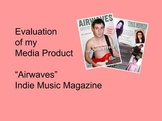
4. Conventions and My Cover
With my front cover, I have challenged most of
the conventions of the genre and used a
layout similar to Cosmo..
I have the masthead/logo occupy the full
width. This is to make it look more like
Cosmopolitan magazine
Unlike the other magazines, I have some
leaders in block capitals and some in mixed
case and they are not all aligned on the left
hand side of the page. I have also used a
mixture of ‘girly’ serif and plain sans serif
fonts.
I have also positioned my single photograph
centrally instead of offset to the right and put
the barcode on the bottom left instead of right.
I have challenged conventions because
although I want my magazine to be recognised
as belonging to the genre, it is aimed at
females and I want it to stand out as looking a
bit different.
5. Contents Conventions
On the Contents page of
real magazines, the
Masthead is centred on the
page and in block capitals.
The page number of the
lead cover story is usually
larger or has a larger photo
to make it easy to find.
The page numbers
themselves are large or in a
contrast colour to make
them stand out.
Each Content Line has the
name of the artist followed
by a leader that gives you a
flavour of the article.
6. Conventions and My Contents Page
On my Contents page, I have chosen to
challenge convention by using right-align for the
Masthead rather than centre it on the page
however I decided to stick to block capitals.
I have not made the page number of the lead
cover story larger or used a larger photo but I
have positioned it at the top to make it easy to
find.
In line with convention, I have made the page
numbers themselves large to make them stand
out.
I have also followed the convention of each
Content Line having the name of the artist
followed by a leader that gives you a flavour of
the article.