More than Just Lines on a Map: Best Practices for U.S Bike Routes
Powerpoint double page spread
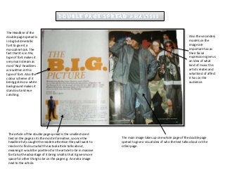
1. The Headline of the
double page spread is
in big bold metallic
font to give it a
masculine look. The
fact that it is in this
type of font makes it
very main stream as
most ‘Rap’ headlines
are written in this
type of font. Also the
colour scheme of it
being gold on a white
background makes it
stand out and eye
catching.
The article of the double page spread is the smallest sized
text on the page as its the most informative, so once the
headline has caught the readers attention they will want to
read on to find out what the actual article talks about,
meaning it would be pointless for the article to be in massive
font also the advantage of it being small is that it gives more
space for other thing to be on the page e.g. An extra image
next to the article.
Also the secondary
models on the
image are
important too as
their facial
expressions give us
an idea of what
kind of music this
artist creates and
what kind of affect
it has on the
audience.
The main image takes up one whole page of the double page
spread to give a visual idea of who the text talks about on the
other page.
2. The headline isn’t very big but its the biggest text on the double page
spread, also its quite small font size compared to other double page
spread headlines only because the article takes up so much space.
The main
article is in
the
smallest
text , this
doesn't
mean its
the least
important
part of the
double
page
spread but
only
because it
has so
much
information
it had to be
condensed
down to
small text.
We see quotes in the double page spread to
show evidence backing up the information
shown in the main article.
The main image takes up more
than one p0age as they want
to make this the centre of
attention and show the
audience a visual image of
who the artist is and what he
looks like etc.