Kanye, Lil Wayne, and 50 Cent analyzed in magazine contents pages
•Download as ODP, PDF•
0 likes•202 views


Recommended
More Related Content
What's hot
What's hot (18)
Viewers also liked
Viewers also liked (13)
Similar to Kanye, Lil Wayne, and 50 Cent analyzed in magazine contents pages
Similar to Kanye, Lil Wayne, and 50 Cent analyzed in magazine contents pages (20)
More from Jahangir Ahmed
Kanye, Lil Wayne, and 50 Cent analyzed in magazine contents pages
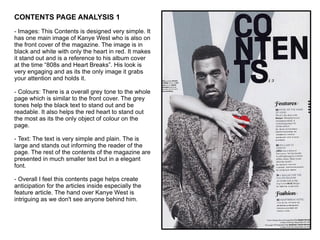
- 1. CONTENTS PAGE ANALYSIS 1 - Images: This Contents is designed very simple. It has one main image of Kanye West who is also on the front cover of the magazine. The image is in black and white with only the heart in red. It makes it stand out and is a reference to his album cover at the time “808s and Heart Breaks”. His look is very engaging and as its the only image it grabs your attention and holds it. - Colours: There is a overall grey tone to the whole page which is similar to the front cover. The grey tones help the black text to stand out and be readable. It also helps the red heart to stand out the most as its the only object of colour on the page. - Text: The text is very simple and plain. The is large and stands out informing the reader of the page. The rest of the contents of the magazine are presented in much smaller text but in a elegant font. - Overall I feel this contents page helps create anticipation for the articles inside especially the feature article. The hand over Kanye West is intriguing as we don't see anyone behind him.
- 2. CONTENTS PAGE ANALYSIS 2 - Images: This contents page also has only one main image of rapper Lil Wayne. It does not appear to be a studio photo shoot. It looks like its a paparazzi shot. This works well with the caption of “We cant believe what Weezys up to now” which is next to the picture. As its the only picture it grabs your attention straight away. - Colours: There is very little colour used in the page apart from the picture of Lil Wayne. The title of the page in in black and grey, contrasting with the plain white background. It looks very simple and authentic rather than very over the top design wise. The rest of the articles are in red making them look bold and also helping to make them stand out. - Text: The contents page is titled “Master Plan” rather then simply Contents. This may be a attempt to make them different from other magazines. The caption next to the main image creates interest in the story. - Overall this contents page is very plain and is simply used as a page to list all the articles within the magazine. It is very text based rather than image based.
- 3. CONTENTS PAGE ANALYSIS 3 - Images: The main image on this contents page is of rappers 50 Cent and Soulja Boy who also appear on the front cover of the magazine. They are posing together and the image takes up nearly half the page therefore it is the only picture. It creates more interest in the feature article about the two rappers. - Colours: The main colours on the page are white, black and red. Those are also the magazines signature colours. The rappers are wearing very dark or dull colours, this helps their gold jewellery stand out on the page. The black writing is easy to read on the plain white background. The little use of red helps to break up the black and highlights key words such as “Features” and magazines name “XXL”. - Text: There is a great deal of text on this page. The title of the contents page is The A-Side, as the second page is The B-Side. This is a reference to old cassette tapes. A short description of each article is written informing the reader on what to expect. - Overall the cassette tape reference works well as its a music magazine. The image from the feature article helps create interest for the story.