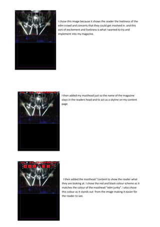
1. I chose this image because it shows the reader the liveliness of the
edm crowd and concerts that they could get involved in. and this
sort of excitement and liveliness is what I wanted to try and
implement into my magazine.
I then added my masthead just so the name of the magazine
stays in the readers head and to act as a skyline on my content
page.
I then added the masthead “content to show the reader what
they are looking at. I chose the red and black colour scheme as it
matches the colour of the masthead “edm junky”. I also chose
this colour as it stands out from the image making it easier for
the reader to see.
2. i then added the numbers in the same red. I added these numbers as
it identifies to the reader exactly what page each topic is on. This is
also standard for any normal magazine therefore it is essential to
make my magazine more efficient.
I then added the text which lists a variety of reviews and articles
relevant to my edm themed magazine, all about the latest trends to
the newest albums and upcoming artists. I chose a white text for this
as it stands out nicely from the black but also goes nicely with the red
of other text.
This is my final contents page and I decided to add another edm junky
masthead to emphasise to the reader the name of the of the
magazine. I believe that by looking at my contents page it looks
professional and clean its not to crowded and easy to read.