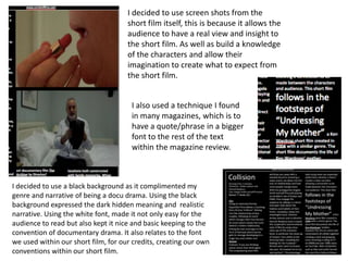
1. I decided to use screen shots from the
short film itself, this is because it allows the
audience to have a real view and insight to
the short film. As well as build a knowledge
of the characters and allow their
imagination to create what to expect from
the short film.
I also used a technique I found
in many magazines, which is to
have a quote/phrase in a bigger
font to the rest of the text
within the magazine review.
I decided to use a black background as it complimented my
genre and narrative of being a docu drama. Using the black
background expressed the dark hidden meaning and realistic
narrative. Using the white font, made it not only easy for the
audience to read but also kept it nice and basic keeping to the
convention of documentary drama. It also relates to the font
we used within our short film, for our credits, creating our own
conventions within our short film.