SlideShare a Scribd company logo
1 of 45
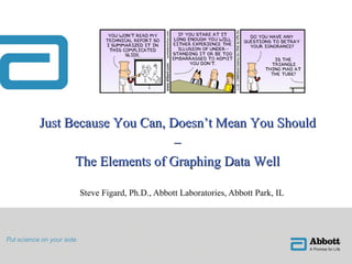
Steve Figard, Ph.D., Abbott Laboratories, Abbott Park, IL Just Because You Can, Doesn’t Mean You Should – The Elements of Graphing Data Well
Agenda/Objectives of Presentation ,[object Object],[object Object],[object Object],[object Object],[object Object],[object Object]
Introduction ,[object Object],[object Object],[object Object],[object Object],[object Object],[object Object],[object Object],[object Object],[object Object],[object Object],[object Object],[object Object]
Introduction ,[object Object],[object Object],[object Object],[object Object],[object Object],[object Object],[object Object],[object Object],[object Object],“ When a graph is made, quantitative and categorical information is encoded by a display method.  Then the information is visually decoded.  This visual perception is a vital link.  No matter how clever the choice of the information, and no matter how technologically impressive the encoding,  a visualization fails if the decoding fails .  Some display methods lead to efficient, accurate decoding, and others lead to inefficient, inaccurate decoding.” - William Cleveland ,[object Object],[object Object]
Terminology ,[object Object],[object Object],[object Object],[object Object],[object Object],[object Object],aka, y axis aka, x axis
Terminology ,[object Object],[object Object],[object Object],[object Object],[object Object],[object Object]
The Ten Commandments…of good graphics ,[object Object],[object Object],[object Object],[object Object],[object Object],[object Object],[object Object]
The Ten Commandments…of good graphics ,[object Object],[object Object],[object Object],[object Object],[object Object],[object Object],[object Object],[object Object],How relate to log 2 ? Now these numbers we understand!
The Ten Commandments…of good graphics ,[object Object],[object Object],[object Object],[object Object],[object Object],[object Object],[object Object],[object Object],The raw data:  interesting but not as informative… … as the actual difference between the lines.
The Ten Commandments…of good graphics ,[object Object],[object Object],[object Object],[object Object],[object Object],[object Object],[object Object],[object Object],The optical illusion: The lines are only one unit apart across the entire range. Why?  Because the eye is good at perceiving perpendicular distances between two curves, but not the difference in height. Lesson to be learned:  plotting the metric of interest may be more Informative than the raw data.
The Ten Commandments…of good graphics ,[object Object],[object Object],[object Object],[object Object],[object Object],[object Object],[object Object],[object Object],[object Object],[object Object],“ Get your facts first, and then you can distort them as much as you please. (Facts are stubborn, but statistics are more pliable).” - Mark Twain
The Ten Commandments…of good graphics ,[object Object],[object Object],[object Object],[object Object],[object Object],[object Object],[object Object],[object Object],[object Object],[object Object],[object Object],[object Object],one year interval five year interval
The Ten Commandments…of good graphics ,[object Object],[object Object],[object Object],[object Object],[object Object],[object Object],[object Object],[object Object],[object Object],[object Object],[object Object]
The Ten Commandments…of good graphics ,[object Object],[object Object],[object Object],[object Object],[object Object],[object Object],[object Object],[object Object],[object Object]
The Ten Commandments…of good graphics ,[object Object],[object Object],[object Object],[object Object],[object Object],[object Object],[object Object],[object Object],[object Object],JMP is particularly good at allowing “ on the fly” adjustment of axes
The Ten Commandments…of good graphics ,[object Object],[object Object],[object Object],[object Object],[object Object],[object Object],[object Object],[object Object],[object Object]
The Ten Commandments…of good graphics ,[object Object],[object Object],[object Object],[object Object],[object Object],[object Object],[object Object],[object Object],[object Object],[object Object],[object Object],[object Object],[object Object]
The Ten Commandments…of good graphics ,[object Object],[object Object],[object Object],[object Object],[object Object],[object Object],[object Object],[object Object]
The Ten Commandments…of good graphics ,[object Object],[object Object],[object Object],[object Object],[object Object],[object Object],[object Object],[object Object],JMP provides several sets of markers that should be evaluated with this commandment in mind
The Ten Commandments…of good graphics ,[object Object],[object Object],[object Object],[object Object],[object Object],[object Object],[object Object],[object Object],Anyone recognize Excel bar chart options here?! The moiré effect describes the phenomenon when the graphic design interacts with the physiological tremor of the eye to generate the distracting appearance of vibration and movement.
The Ten Commandments…of good graphics ,[object Object],[object Object],[object Object],[object Object],[object Object],[object Object],[object Object],[object Object],Can you say “garish”?! garish   adj .  1  too bright or gaudy; showy; glaring  2  gaudily or showily dressed, decorated, written, etc. (Webster’s New World College Dictionary, 4 th  Ed.)
The Ten Commandments…of good graphics ,[object Object],[object Object],[object Object],[object Object],[object Object],[object Object],[object Object],[object Object]
The Ten Commandments…of good graphics ,[object Object],[object Object],[object Object],[object Object],[object Object],[object Object],[object Object],[object Object],“ When a graphic is taken over by decorative forms or computer debris, when the data measures and structures become Design Elements, when the overall design purveys Graphical Style rather than quantitative information, then that graphic may be called a duck in honor of the duck-form store, ‘Big Duck.’” - Edward Tufte Based on an architectural observation that is valid for graphics: “ It is all right to decorate construction but never construct decoration.” Fortunately, this is really hard to do in JMP…you have to work at it.  Our Worst case selection will further clarify this rule of thumb.
The Ten Commandments…of good graphics ,[object Object],[object Object],[object Object],[object Object],[object Object],[object Object],[object Object],[object Object],[object Object]
The Ten Commandments…of good graphics ,[object Object],[object Object],[object Object],[object Object],[object Object],[object Object],[object Object],[object Object],Five different vertical scales are used to show the price and two different horizontal scales to show the passage of time without one indication of these changes (not even a scale break)! (FYI:  This qualifies as a “self-promoting graphical duck.”)
The Ten Commandments…of good graphics ,[object Object],[object Object],[object Object],[object Object],[object Object],[object Object],[object Object],[object Object],[object Object],Some data that doesn’t fit the pattern, an important observation, is actually obscured by the Marching Band…
The Ten Commandments…of good graphics ,[object Object],[object Object],[object Object],[object Object],[object Object],[object Object],[object Object],[object Object]
The Ten Commandments…of good graphics ,[object Object],[object Object],[object Object],[object Object],[object Object],[object Object],[object Object],[object Object],[object Object],Data-ink ratio up to ~ 0.9 All data clearly visible
The Ten Commandments…of good graphics ,[object Object],[object Object],[object Object],[object Object],[object Object],[object Object],[object Object],[object Object],[object Object],[object Object],[object Object],[object Object],[object Object],[object Object],[object Object]
The Ten Commandments…of good graphics ,[object Object],[object Object],[object Object],[object Object],[object Object],[object Object],[object Object],[object Object],This map of France was originally 27 square inches (close to that of previous slide).  It shows the location and boundaries of 30,000 French communes.  To recreate the data of the map would require somewhere in the neighborhood of 240,000 numbers:  30,000 latitudes, 30,000 longitudes, and an average of six numbers describing the shape of each commune.  The data density thus works out to be nearly 9,000 numbers per square inch.
The Ten Commandments…of good graphics ,[object Object],[object Object],[object Object],[object Object],[object Object],[object Object],[object Object],[object Object]
The Ten Commandments…of good graphics ,[object Object],[object Object],[object Object],[object Object],[object Object],[object Object],[object Object],[object Object],[object Object],[object Object],[object Object],[object Object],[object Object],[object Object]
The Ten Commandments…of good graphics ,[object Object],[object Object],[object Object],[object Object],[object Object],[object Object],[object Object],[object Object],[object Object],[object Object],Simplest: height by weight…
The Ten Commandments…of good graphics ,[object Object],[object Object],[object Object],[object Object],[object Object],[object Object],[object Object],[object Object],Wrap by sex:
The Ten Commandments…of good graphics ,[object Object],[object Object],[object Object],[object Object],[object Object],[object Object],[object Object],[object Object],Adding overlay by age: Eh, don’t like that? Hit undo button twice…
The Ten Commandments…of good graphics ,[object Object],[object Object],[object Object],[object Object],[object Object],[object Object],[object Object],[object Object],Redo by reversing the process use: wrap by age overlay by sex… And if you still don’t like it or see clearly the story in the data, UNDO…REDO!
The Ten Commandments…of good graphics ,[object Object],[object Object],[object Object],[object Object],[object Object],[object Object],[object Object],[object Object]
The Ten Commandments…of good graphics ,[object Object],[object Object],[object Object],[object Object],[object Object],[object Object],[object Object],[object Object],The concept that “the simpler the form of a letter the simpler its reading” was an obsession of beginning constructivism.  It became something like a dogma, and is still followed by “modernistic” typographers….  Ophthalmology has disclosed that the more the letters are differentiated from each other, the easier is the reading .  Without going into comparisons and details, it should be realized that  words consisting of only capital letters present the most difficult reading  – because of their equal height, equal volume, and with most, their equal width.  When comparing serif letters with  sans-serif, the latter provide an uneasy reading .  The fashionable preference for sans-serif in text shows neither historical nor practical competence.
A Word about PowerPoint ,[object Object],[object Object],[object Object],[object Object],[object Object],[object Object],[object Object],[object Object],[object Object],[object Object],Guilty as charged?
A Word about PowerPoint ,[object Object],[object Object],[object Object],[object Object],[object Object],[object Object],[object Object],[object Object],[object Object],[object Object]
Competitors for Best & Worst ,[object Object],[object Object],[object Object],[object Object],[object Object],[object Object],[object Object],Plots 6 (!) variables: 1. size of army 2/3. location on 2D surface 4. direction of movement 5. temperature 6. dates during retreat (time) … defies “the pen of the historian by its brutal eloquence.” Invasion starts with 422,000 men at Polish-Russian border A sacked and deserted Moscow reached with only 100,000 men Retreat in dead of winter depicted on lower darker band and linked to temp scale and dates on bottom Only 10,000 made it home!
Competitors for Best & Worst ,[object Object],[object Object],[object Object],[object Object],[object Object],[object Object],[object Object],Only  five  pieces of data (not variables) in this “ graphically preposterous” work of art. Colors signify nothing …” delighted connoisseurs of the graphically preposterous.” Not one but two axis breaks! 3D effect = chartjunk Since numbers all sum to 100%, plotting both is redundant.
Conclusion (in Tufte’s words) ,[object Object],[object Object],[object Object],[object Object],[object Object],[object Object],[object Object],[object Object],[object Object]
Handy References ,[object Object],[object Object],[object Object],[object Object],[object Object],[object Object],[object Object],[object Object],[object Object],[object Object]
Questions ? [email_address]

More Related Content

Viewers also liked

Organization study at chamundeshwari sugar
Organization study at chamundeshwari sugarOrganization study at chamundeshwari sugar
Organization study at chamundeshwari sugarProjects Kart
 
Advanced Process Control
Advanced Process ControlAdvanced Process Control
Advanced Process ControlRatul Das
 
Risk Management by using FMEA
Risk Management by using FMEARisk Management by using FMEA
Risk Management by using FMEANukool Thanuanram
 
Organization study at sri renuka sugars
Organization study at sri renuka sugarsOrganization study at sri renuka sugars
Organization study at sri renuka sugarsProjects Kart
 
Haccp food safety booklet
Haccp food safety bookletHaccp food safety booklet
Haccp food safety bookletRoyce G Chua
 
Production and Operations Management
Production and Operations ManagementProduction and Operations Management
Production and Operations ManagementRoyce G Chua
 
HR practices in sugar industries
HR practices in sugar industries HR practices in sugar industries
HR practices in sugar industries jennna
 
Yu-gi-oh Zexal Official Rulebook
Yu-gi-oh Zexal Official RulebookYu-gi-oh Zexal Official Rulebook
Yu-gi-oh Zexal Official RulebookHaris Setiawan
 
Fundamentals of transformer inrush
Fundamentals of transformer inrushFundamentals of transformer inrush
Fundamentals of transformer inrushmichaeljmack
 

Viewers also liked (9)

Organization study at chamundeshwari sugar
Organization study at chamundeshwari sugarOrganization study at chamundeshwari sugar
Organization study at chamundeshwari sugar
 
Advanced Process Control
Advanced Process ControlAdvanced Process Control
Advanced Process Control
 
Risk Management by using FMEA
Risk Management by using FMEARisk Management by using FMEA
Risk Management by using FMEA
 
Organization study at sri renuka sugars
Organization study at sri renuka sugarsOrganization study at sri renuka sugars
Organization study at sri renuka sugars
 
Haccp food safety booklet
Haccp food safety bookletHaccp food safety booklet
Haccp food safety booklet
 
Production and Operations Management
Production and Operations ManagementProduction and Operations Management
Production and Operations Management
 
HR practices in sugar industries
HR practices in sugar industries HR practices in sugar industries
HR practices in sugar industries
 
Yu-gi-oh Zexal Official Rulebook
Yu-gi-oh Zexal Official RulebookYu-gi-oh Zexal Official Rulebook
Yu-gi-oh Zexal Official Rulebook
 
Fundamentals of transformer inrush
Fundamentals of transformer inrushFundamentals of transformer inrush
Fundamentals of transformer inrush
 

Similar to Just Because You Can Doesn\'t Mean You Should - Graphing Data Well

Tableau Visual Guidebook
Tableau Visual GuidebookTableau Visual Guidebook
Tableau Visual GuidebookAndy Kriebel
 
How to make data-driven interactive PowerPoint presentations for operations
How to make data-driven interactive PowerPoint presentations for operationsHow to make data-driven interactive PowerPoint presentations for operations
How to make data-driven interactive PowerPoint presentations for operationsGramener
 
Engage Your Audience With PowerPoint Decks: Webinar
Engage Your Audience With PowerPoint Decks: WebinarEngage Your Audience With PowerPoint Decks: Webinar
Engage Your Audience With PowerPoint Decks: WebinarGramener
 
Data Presentation
Data PresentationData Presentation
Data Presentationcheergalsal
 
Ten tips for creating slides
Ten tips for creating slidesTen tips for creating slides
Ten tips for creating slidesTola Odugbesan
 
PowerPoint Presentation On giving effective PowerPoint Presentations
PowerPoint Presentation On giving effective PowerPoint PresentationsPowerPoint Presentation On giving effective PowerPoint Presentations
PowerPoint Presentation On giving effective PowerPoint PresentationsAmanda Gilmore
 
Good ol' excel is the ultimate data visualization tool (in most cases)
Good ol' excel is the ultimate data visualization tool (in most cases)Good ol' excel is the ultimate data visualization tool (in most cases)
Good ol' excel is the ultimate data visualization tool (in most cases)Luis Arteaga
 
Data visualization training session HELCOM
Data visualization training session HELCOMData visualization training session HELCOM
Data visualization training session HELCOMManuel Frias
 
Data visualization tools & techniques - 1
Data visualization tools & techniques - 1Data visualization tools & techniques - 1
Data visualization tools & techniques - 1Korivi Sravan Kumar
 
15 guidelines to effective presentations
15 guidelines to effective presentations15 guidelines to effective presentations
15 guidelines to effective presentationsApurupa Devi Valluru
 
Make Analysis Great Again!
Make Analysis Great Again!Make Analysis Great Again!
Make Analysis Great Again!Ed Thewlis
 
Leeds Digital Festival - Make Analysis Great Again!
Leeds Digital Festival - Make Analysis Great Again!Leeds Digital Festival - Make Analysis Great Again!
Leeds Digital Festival - Make Analysis Great Again!Ed Thewlis
 
Creating Functional Art in Excel
Creating Functional Art in ExcelCreating Functional Art in Excel
Creating Functional Art in ExcelAmanda Makulec
 
7 data presentation tips
7 data presentation tips7 data presentation tips
7 data presentation tipsTopgunAB
 
Powerpoint presentation-simplified
Powerpoint presentation-simplifiedPowerpoint presentation-simplified
Powerpoint presentation-simplifiedmohamedaslamh
 
The Human Experience: Design Systems & The 9 States.
The Human Experience: Design Systems & The 9 States.The Human Experience: Design Systems & The 9 States.
The Human Experience: Design Systems & The 9 States.Rachael Guay
 
5 errores de la visualización de datos en Qlik View
5 errores de la visualización de datos en Qlik View5 errores de la visualización de datos en Qlik View
5 errores de la visualización de datos en Qlik ViewBSolutions Group
 
How To Use Powerpoint -- A Briefing
How To Use Powerpoint -- A BriefingHow To Use Powerpoint -- A Briefing
How To Use Powerpoint -- A BriefingRohn Jay Miller
 

Similar to Just Because You Can Doesn\'t Mean You Should - Graphing Data Well (20)

Tableau Visual Guidebook
Tableau Visual GuidebookTableau Visual Guidebook
Tableau Visual Guidebook
 
How to make data-driven interactive PowerPoint presentations for operations
How to make data-driven interactive PowerPoint presentations for operationsHow to make data-driven interactive PowerPoint presentations for operations
How to make data-driven interactive PowerPoint presentations for operations
 
Engage Your Audience With PowerPoint Decks: Webinar
Engage Your Audience With PowerPoint Decks: WebinarEngage Your Audience With PowerPoint Decks: Webinar
Engage Your Audience With PowerPoint Decks: Webinar
 
Data Presentation
Data PresentationData Presentation
Data Presentation
 
Ten tips for creating slides
Ten tips for creating slidesTen tips for creating slides
Ten tips for creating slides
 
PowerPoint Presentation On giving effective PowerPoint Presentations
PowerPoint Presentation On giving effective PowerPoint PresentationsPowerPoint Presentation On giving effective PowerPoint Presentations
PowerPoint Presentation On giving effective PowerPoint Presentations
 
Design for Delight
Design for DelightDesign for Delight
Design for Delight
 
Good ol' excel is the ultimate data visualization tool (in most cases)
Good ol' excel is the ultimate data visualization tool (in most cases)Good ol' excel is the ultimate data visualization tool (in most cases)
Good ol' excel is the ultimate data visualization tool (in most cases)
 
Data visualization training session HELCOM
Data visualization training session HELCOMData visualization training session HELCOM
Data visualization training session HELCOM
 
Using Powerpoint
Using PowerpointUsing Powerpoint
Using Powerpoint
 
Data visualization tools & techniques - 1
Data visualization tools & techniques - 1Data visualization tools & techniques - 1
Data visualization tools & techniques - 1
 
15 guidelines to effective presentations
15 guidelines to effective presentations15 guidelines to effective presentations
15 guidelines to effective presentations
 
Make Analysis Great Again!
Make Analysis Great Again!Make Analysis Great Again!
Make Analysis Great Again!
 
Leeds Digital Festival - Make Analysis Great Again!
Leeds Digital Festival - Make Analysis Great Again!Leeds Digital Festival - Make Analysis Great Again!
Leeds Digital Festival - Make Analysis Great Again!
 
Creating Functional Art in Excel
Creating Functional Art in ExcelCreating Functional Art in Excel
Creating Functional Art in Excel
 
7 data presentation tips
7 data presentation tips7 data presentation tips
7 data presentation tips
 
Powerpoint presentation-simplified
Powerpoint presentation-simplifiedPowerpoint presentation-simplified
Powerpoint presentation-simplified
 
The Human Experience: Design Systems & The 9 States.
The Human Experience: Design Systems & The 9 States.The Human Experience: Design Systems & The 9 States.
The Human Experience: Design Systems & The 9 States.
 
5 errores de la visualización de datos en Qlik View
5 errores de la visualización de datos en Qlik View5 errores de la visualización de datos en Qlik View
5 errores de la visualización de datos en Qlik View
 
How To Use Powerpoint -- A Briefing
How To Use Powerpoint -- A BriefingHow To Use Powerpoint -- A Briefing
How To Use Powerpoint -- A Briefing
 

Just Because You Can Doesn\'t Mean You Should - Graphing Data Well

  • 1. Steve Figard, Ph.D., Abbott Laboratories, Abbott Park, IL Just Because You Can, Doesn’t Mean You Should – The Elements of Graphing Data Well
  • 2.
  • 3.
  • 4.
  • 5.
  • 6.
  • 7.
  • 8.
  • 9.
  • 10.
  • 11.
  • 12.
  • 13.
  • 14.
  • 15.
  • 16.
  • 17.
  • 18.
  • 19.
  • 20.
  • 21.
  • 22.
  • 23.
  • 24.
  • 25.
  • 26.
  • 27.
  • 28.
  • 29.
  • 30.
  • 31.
  • 32.
  • 33.
  • 34.
  • 35.
  • 36.
  • 37.
  • 38.
  • 39.
  • 40.
  • 41.
  • 42.
  • 43.
  • 44.

Editor's Notes

  1. Copyright © 2005, SAS Institute Inc. All rights reserved.