1. Salford City College
Eccles Centre
AS Media Studies
Foundation Portfolio
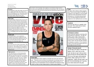
Masthead
The masthead is black which fades into red and
is in capitals which help make it stand out on
the white background. It is in the primary optical
area and strong fallow area. This is because it
where the buyers will look first so they
automatically know what the magazine is.
Comment on how the design of the magazine cover attracts the target audience:
The colours are sophisticated which attracts the older generation. Also, the rap artist
Eminem who is on the cover is well known with many generations therefore attracts a
wide range of audiences.
Main image
The main image is Eminem and he is put in the
centre of the cover. Within the mise en scene,
he is wearing a black vest top, a necklace with
a cross on and you can see his tattoos. He has
got a serious look on his face which shows how
serious he is but also shows that the story
which will be in the magazine is serious. A mid
shot is used which shows us how he is
standing. He is stood with his arms crossed
which suggest that people shouldn’t mess with
him. The shadow around his makes him stand
out.
The main colour scheme is black, red and
grey. These are associated to the R&B/ hip
hop genre of the magazine. The red stands
out which shows how important that bit of
information is. All of these colours stand
out on the white background which puts
emphasis on the masthead and cover lines.
Typefaces
All of the type face is in capitals, bold
san serif. This makes them all stand
out which attracts buyers.
Photography Lighting
There is high key lighting on his face which
emphasises his expression. The high key
lighting overall makes a shadow effect
around Eminem which puts emphasis on
his muscle tone and his tattoos. Within the
mise en scene, the vest top puts emphasis
on is muscles and tattoo’s. This represents
males to be strong and powerful which is a
stereotypical view of Eminem.
Model credit
The model credit is in red, capital letter,
‘EMINEM’ the last letter is slightly behind his
ear which makes Eminem stand out more. It is
in the primary optical area which follows the
design of the Gutenberg design rule.
Coverlines
The cover lines are in black, red and grey. They
all frame the main image of Eminem and are all
spaced out. All of the writing is in capitals but
each cover line is in a different size. The font is
bold san serif.
Main cover line
The main cover line is in the primary optical
area which indicates its importance. This is
what the buyer will see when it’s on the shelf so
it is important for it to stand out. The writing is in
capitals and a large font. The quote, ‘I literally
almost died’ interests the reader which will
make them want to know the rest of the story.
The names of the drugs are in grey which
suggests they are bad. Also the words ‘comes
clean’ is ironic as above drugs are names.
Colour
House Style
The house style for Vibe magazine is usually the colours red, black and
grey. These are bold colours and the arrangement has allowed each one
to stand out. These colours will attract the target audience which is 16+
because they are sophisticated colours compared to the bright and bubbly
colours you see on music magazines for a younger target audience.
Design Principles Used?
The design principle of Gutenberg’s
design rule is used here as the
main stories are put in the primary
optical area and strong fallow area.
This is so the buyer automatically
knows what is going to be in the
magazine. These stories need to be
the most entertaining as it is going
to be what attracts the buyers.