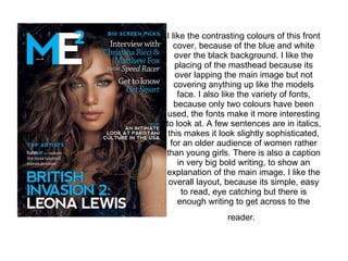
1. I like the contrasting colours of this front cover, because of the blue and white over the black background. I like the placing of the masthead because its over lapping the main image but not covering anything up like the models face. I also like the variety of fonts, because only two colours have been used, the fonts make it more interesting to look at. A few sentences are in italics, this makes it look slightly sophisticated, for an older audience of women rather than young girls. There is also a caption in very big bold writing, to show an explanation of the main image. I like the overall layout, because its simple, easy to read, eye catching but there is enough writing to get across to the reader.
![[object Object]](data:image/gif;base64,R0lGODlhAQABAIAAAAAAAP///yH5BAEAAAAALAAAAAABAAEAAAIBRAA7)