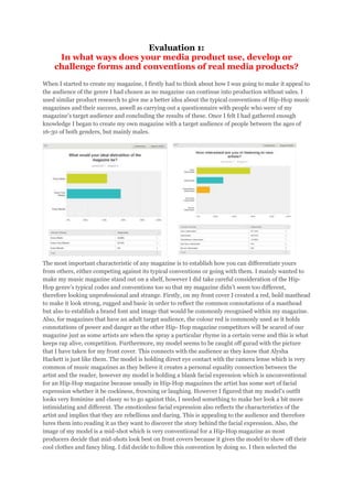
1. Evaluation 1:
In what ways does your media product use, develop or
challenge forms and conventions of real media products?
When I started to create my magazine, I firstly had to think about how I was going to make it appeal to
the audience of the genre I had chosen as no magazine can continue into production without sales. I
used similar product research to give me a better idea about the typical conventions of Hip-Hop music
magazines and their success, aswell as carrying out a questionnaire with people who were of my
magazine’s target audience and concluding the results of these. Once I felt I had gathered enough
knowledge I began to create my own magazine with a target audience of people between the ages of
16-30 of both genders, but mainly males.
The most important characteristic of any magazine is to establish how you can differentiate yours
from others, either competing against its typical conventions or going with them. I mainly wanted to
make my music magazine stand out on a shelf, however I did take careful consideration of the HipHop genre’s typical codes and conventions too so that my magazine didn’t seem too different,
therefore looking unprofessional and strange. Firstly, on my front cover I created a red, bold masthead
to make it look strong, rugged and basic in order to reflect the common connotations of a masthead
but also to establish a brand font and image that would be commonly recognised within my magazine.
Also, for magazines that have an adult target audience, the colour red is commonly used as it holds
connotations of power and danger as the other Hip- Hop magazine competitors will be scared of our
magazine just as some artists are when the spray a particular rhyme in a certain verse and this is what
keeps rap alive, competition. Furthermore, my model seems to be caught off gurad with the picture
that I have taken for my front cover. This connects with the audience as they know that Alysha
Hackett is just like them. The model is holding direct eye contact with the camera lense which is very
common of music magazines as they believe it creates a personal equality connection between the
artist and the reader, however my model is holding a blank facial expression which is unconventional
for an Hip-Hop magazine because usually in Hip-Hop magazines the artist has some sort of facial
expression whether it be cockiness, frowning or laughing. However I figured that my model’s outfit
looks very feminine and classy so to go against this, I needed something to make her look a bit more
intimidating and different. The emotionless facial expression also reflects the characteristics of the
artist and implies that they are rebellious and daring. This is appealing to the audience and therefore
lures them into reading it as they want to discover the story behind the facial expression. Also, the
image of my model is a mid-shot which is very conventional for a Hip-Hop magazine as most
producers decide that mid-shots look best on front covers because it gives the model to show off their
cool clothes and fancy bling. I did decide to follow this convention by doing so. I then selected the
2. colours of red, black and white because red holds connotations of energy, power and determination
while also being linked with passion, desire and love, suggesting that my magazine is different, going
against typical conventions of Hip-Hop magazines, white being youthful, innocent and sophisticated,
and black holding connotations of darkness and maturity. I have seen the colours black and red be
used in Hip-Hop magazines before so typically this is quite conventional. Furthermore, it holds the
conventions of creating a relationship with the reader as when they see these colours they instantly
know that it is my magazine. My magazine also holds the typical conventions of having a banner at the
top and bottom of the page which will prompt the audience to view our social networking sites which I
will go into more detail later in this evaluation.
My contents page also conforms to the typical conventions of Hip-Hop genre magazines like Vibe as I
have created charts to pick the best songs or albums in that particular week/month. Most magazines
in general have this on their contents pages. This will appeal to my target audience as it comes across
as welcoming, therefore inviting them in further to my magazine. It also adds a personal effect to the
magazine, reminding the reader that the magazine was actually written by a person who is just like
them, a fan of Hip-Hop. I have also placed the ‘Twitter’, ‘app’ and ‘subscribe’ features to the page,
therefore appealing to young readers who will be interested in social networking sites and the internet,
allowing them to form even more of a personal relationship with the magazine as they are able to
relate to it online too. This is very conventional of all magazines as the majority of magazines want to
connect with their younger audience on this deeper level and aswell as this, being part of social
networks online allows the magazine to be shared around quicker. This helps to portray my magazine
as more aware of the zeitgeist (spirit of the age). Furthermore, what else is very conventional about my
contents page as it includes headlines for each contents list, making it clear to the reader, which is
what many Hip-Hop magazines do.In fact, I created these headlines due to inspiration from an
R&B/hip-hop magazine called Vibe, so this just represents this in itself.
Finally, the double page spreads which I have used to conform to the house colours which I have
earlier discussed in order to create a brand image and reinforce the relationship with the audience.
Furthermore, on the first page I used this as an introductory page which is very conventional of an
R&B magazine as it briefs and introduces the reader to the article about to be presented. However,
what is unconventional about my magazine is that I created three red boxes each consisting of things
my artist has to say about other artists. These artists include Lil Wayne, Nicki Minaj and Eminem. I
thought of this idea myself and have never seen it in any other magazine, highlighting that it is unique
and unconventional to any other Hip-Hop magazine. Aswell as this, I also created a quirky black and
white grid of different close up shots of my model making ‘silly’ faces and poses. Usually, Hip-Hop
models are quite posed and serious, but my model goes against this convention in these facial shots,
presenting a completely different fun side of the Hip-Hop genre, while still being able to make the best
verses in the industry.