
Recommended
More Related Content
What's hot
What's hot (18)
Similar to Magazine article analysis
Similar to Magazine article analysis (20)
More from ciarakataria
More from ciarakataria (20)
Recently uploaded
Recently uploaded (20)
Magazine article analysis
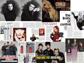
- 3. ANALYSING MAGAZINE ARTICLES: LORDE Images: There are 2 main images on the double page spread, both of Lorde as that is who the article is about. The pictures are black and white and her hair and make up have been done so that they look very striking. Her face appears to almost be framed by it’s surroundings because her hair is dark and she is wearing a black top so this frames her pale face and makes it look more interesting and unusual. She is directly addressing the camera so this and the poses make it very intense which kind of relates to the type of artist she is and the music she produces. Layout: This double page is laid out so the 2 images are at the top and below, there are 6 small columns of text. I think this is very neat and organised and it looks very good. Colour scheme: The colour scheme for this article is just black and white and there are no bright colours at all, even in the image. I think this makes it look very striking and unusual and also very nicely simplistic which I like. Text: in this article the text is all at the bottom and is in quit a small font, probably so that the pictures can be as big as possible. In the first column, there is just credits to the photographer and Lorde’s name in big font so people can tell the article is about her, the font is big but thin which adds to the simplistic feel of the article looks cool. The second column has a small introduction to Lorde in case if the reader wanted to know more about her or wanted to know what the article was about which is very helpful. This text is bigger than the rest so people can tell it’s an introduction and not part of the main body of text. There is a little bit of text below the picture which is not part of the article, just telling the reader what she’s wearing and stuff.
- 4. ANALYSING MAGAZINE ARTICLES: ARCTIC MONKEYS Images: There are a few images on this double page spread. The main image is the one on the left page because it is the biggest and it is boxed and it features all of the band members. They are wearing fairly casual clothes: jeans and a shirt or jacket, and the main singer, Alex Turner is holding a record. They are all looking directly at the camera and the background is just a wall. There are also a few other images, 3 of them are of album covers and there are 2 of men which are integrated with the text, there are 2 more of the Arctic Monkeys in the bottom right corner which are also boxed but are set at an angle, and there are a few pictures of records on the page too. Layout: This double page is not as simplistic as the previous one but it is still quite neat as most sections are in individual boxes, and there are a couple of columns in each. There is some text over the main image but it has a white background so it can be easily read. Colour scheme: The colour scheme for this article is red, grey, white and black so it’s not over the top but it does have a nice splash of colour and the images are also in colour. Text: The text on this page is a lot bigger on this article than the previous one. The main text is over the main image and looks like it might be a quote but the are no quotation marks so I can’t be sure, and then there’s a little explanation below it in smaller font explaining what the article’s about. The text on then other page is laid out in columns within boxes, each with a title, which for 2 of them is the name of artists and for the other 2 are quotes. The titles have a little bit of text below them explaining what it’s about. There are also little bits of text in red boxes both titled ‘Singled Out’ with pictures of records at the top.