SlideShare a Scribd company logo
1 of 6
Detailed Analysis of Music Magazine 
Typography 
The font styles used throughout this page is sans serif. Using a sans serif font connotes that the 
magazine is modern and gives off a relaxed feeling. The masthead is positioned to be bigger than the 
rest of the font so it’s easy for the audience to determine what the magazine they’re reading is 
called. The font and colours used within it also draw attention to it, so that it’s the first thing you 
look at. They also used the cover story ‘Beyoncé’ in a larger style font so it’s clear that that is the 
main cover story and exclusive interview for that issue. Under ‘Beyoncé’ there is a pull quote written 
in bold black font ‘I want to be an icon’ which gives a snippet about what the main, cover story is 
about. A majority of the text is placed along the left third of the magazine – this is an effective 
technique used by publishers so readers can determine the coverlines and other articles published 
within the magazine. It is also an effective use of layout as magazines tend to overlap on the shelves 
– by placing them on the left third, it allows the stories to be displayed. 
Layout 
The layout of this magazine is very ordered and very basic. This connotes that the magazine is aimed 
at an older target audience and young, pre-teen magazines tend to be very cluttered with lots of 
celebrities. By having an ordered layout it also signifies that the magazine is sophisticated and 
targeted towards older people. This magazine also uses lots of different techniques to reach out to 
its audience and make it a conventional magazine cover. The magazine uses both the ‘route of the 
eye’ and part of the rules of thirds. The route of the eye is an effective layout technique as it put’s 
items in order the path that our eye takes when we look at things. The first thing you see is the 
masthead, ‘Billboard’, which is distinctively placed at the top of the page in the primary optical area. 
It is very conventional to have the masthead placed at the top of the page as it makes the title of the 
magazine easy to determine. The eyes then follow a path straight through the middle of the page
where the cover story is placed ‘Beyoncé’ along with the pull quote ‘I want to be an icon’ which is 
supposed to entice the readers to look at the main cover story. The magazine also uses the left/rule 
of thirds to order the magazine. All of the coverlines are placed alongside the left third which, as I 
have mentioned before, is an effective technique when the magazines are placed on the shelves. 
They have placed some of the items on the ‘hotspots’ (cover story, Beyoncé herself and the cover 
story about Beyoncé) which are the places our eyes tend to stop and look at. 
Colour 
The mid-shot of Beyoncé used as the main image on the cover and is coloured black and white. Black 
and white connotes sophistication and that the magazine could be quite informative, a bit like a 
newspaper. However, they also use elements of colour to make the magazine appeal to the younger 
part of their niche audience as it makes it appear more fun and cheerful. A majority of the masthead 
is coloured black which makes it clear and stand out from the image of the magazine and also 
connotes that it has a classic and contemporary feel. This is also contrasted with pops of colour 
within the masthead – the hints of colour connote that the magazine is up-to-date and is quite 
conversant with the current news and music trends. Using colour also helps attract the magazines 
target audience. The cover story, ‘Beyoncé’ is coloured white which contrasts with the duller colours 
in the background. The main image is of a well -known celebrity who has a good reputation from 
others and toward her fans. The colour white signifies purity which colour also be reflected from 
Beyoncé’s persona. Finally, all of the coverlines are coloured red which contrasts with the rest of the 
magazine. The colour red draws attention and when used can immediately focus your attention on a 
particular part of the magazine. The use of red also connotes energy and excitement so helps appeal 
to the younger target audience this magazine has. 
Images inc. Mise-en-scène 
There is one central, main image on the magazine of ‘Beyoncé’ taken from a medium close-up. The 
use of a medium close-up displays Beyoncé facial expression and body language. Taking a photo 
from a medium close up can also show their significance and their importance. Using a medium 
close up of Beyoncé as the main image could help attract to those who like Beyoncé etc. However, 
this magazine cover is quite unconventional as it only has one image on it whereas typically there 
would be quite a few to make it more interesting and appeal to a wider range of people. 
Nevertheless, having just one image on the front cover makes it appeal to the smaller niche 
audience this magazine is aiming for. 
Lighting – This image is taken with high-key lighting. By using high-key lighting and setting the 
colours to darker, black and white colours allows the image to define Beyoncé’s beauty. This may 
attract more people to pick up the magazine as the people who read this magazine may have 
Beyoncé as a role model and want to read the stories within. 
Editing – There is not too much editing within this main image. The photograph has probably been 
through several layers of Photoshop beforehand, however, only the tone and contrast have been 
edited on this main image. 
Setting – The setting of this photograph is not displayed through the imagery as we see just a black 
background with Beyoncé placed in front of it. This connotes that the magazine wants all attention 
to be focused on her and her interview within the magazine. 
Costume – In this image it isn’t clear what Beyoncé is wearing as the image is taken from a medium-close- 
up. Despite this, we can see that she’s wearing some sort of black mess dress with some
jewellery around her wrist which signifies she is quite classy and quite elegant. This may appeal to 
others who fall into that category or who are inspired by the way Beyoncé dresses as there may be 
some more photos of her inside the magazine. 
Language 
The language used on this magazine cover clearly portrays this as a music magazine. It is all written 
in formal English which connotes that this magazine is aimed at older people and is quite 
sophisticated. They use pull quotes from Beyoncé’s interview to intrigue the readers and make them 
want to buy the magazine. For example, the use the quote ‘I want to be an icon’ which signifies that 
there could be some sort of exclusive interview with Beyoncé within the magazine. It also signs a 
light on Beyoncé’s persona as it connotes that she is a quite strong willed person who wants to be 
recognised for her work and influence her fans. 
Conventions 
This magazine cover is very conventional. It follows the typical form of a magazine including route of 
the eye and the rule of thirds and conventional features like placing the masthead at the top and 
using the left third for placing the coverlines on. It is also conventional to have the main image of a 
famous celebrity so that the magazines can use celebrity endorsement to help sell their magazines. 
Contents Page
Typography 
The typography on the contents page has a mixture of both serif and sans serif fonts. Having a 
mixture of fonts opens up the gap wider for a target audience. Serif font is seen as a more feminine 
style font and appeals more to women as opposed to men. However, this is balanced out with the 
sans serif fonts which are seen as a more masculine font. Appealing to both male and female 
readers. The size of the font is a lot smaller on the contents page to allow more information to be 
printed on the page making the magazine more informative and an interesting read. Billboard 
specifically choose to list the top albums and songs of different genres on the left of the third page. 
Layout 
The layout on the contents page is fairly ordered. It shows what’s in the charts and what page each 
song/album information is on. It also uses the rule of thirds as the contents is almost split into three 
different sections. Splitting the information up across the page allows the magazine to be more 
accessible so that people can navigate their way through the magazine. The main articles are shown 
under their own individual headings to make them easily portrayed as a significant part of that issue. 
You could also say that the layout on the contents page follow follows the route of the e ye. Along 
the primary optical area you see images of famous celebrities featured in this issue, you then see the 
main stories placed in the centre of the page. Finally when you reach the terminal area, you see the 
online and exclusive events section which inform people of what’s currently going on. 
Colour 
The range of colours on the contents page are quite masculine which will appeal to the male target 
audience. The colours are also quite plain and neutral which connotes the style of magazine is quite 
laidback and relaxed. 
Images 
The images on the contents page shows that it’s aimed at a broader target audience as they use a 
mixture of celebrities including both male and female. The first image looks like an album cover 
which is conventional for a music magazine as they may be informing the readers of a new 
release/upcoming band that is coming out soon. The second and third images along the top of the 
page show some more famous artists that feature within the magazine. This may appeal to the 
target audience as they like the artists and/or are interested in interviews they may have within the 
magazine. The last image on the page shows a female celebrity, taken from a long-shot. The long 
shot displays her relaxed and casual body language and the fact that she is smiling and reflects the 
personality of the magazine. 
Language 
The language on the contents page is quite colloquial as the word Brooklyn is abbreviated to ‘BKLYN 
ROCKS’. This shows that the language is quite informal and appeals to the younger target audience. 
It is also quite short and snappy making it quick and easy to read. Contractions and ‘text language’ 
i.e. missing out vowels is quite common with younger people as they tend to adapt to talking and 
writing like that during their younger, teenage years.
Conventions 
The contents page is very conventional with extra features added in also. For a magazine to have a 
contents page is very typical as it helps the reader to navigate their way through the issue and pick 
out something if they specifically want to read something in particular. It has the different sections 
highlighted and put under headings to make it even easier to find what you’re looking for. 
Double Page Spread 
Typography 
The typography of the double page spread is written in a serif style font. This is because serif font is 
said to be easier to read than sans serif font is when reading a big chunk of text. The typography is 
also very conventional for a magazine. It contains a standfirst which is sized bigger than everything 
else, this is because it acts as a ‘pull quote’ hinting more information about what the article is about 
and to intrigue people to read the entire article. Midway through the article there is also a ‘kicker’. A 
kicker is a conventional way to start off an article, it also makes the text look a bit more unique and 
interesting as well as drawing attention to itself. 
Layout 
The layout of the double page spread is very basic, yet typical for a music style magazine. The left 
page contains all of the text and the information about the interview or whatever it may be that’s 
written about the artist. Then the right hand page contains a full page, flattering photo of the 
artist/celebrity. The text is set into vertical columns to make full use of the page and break up the 
text. It also makes the text look less overwhelming when people want to read quickly. 
Colour 
The colour on this make comes from the image. Because the block of text is quite a vast chunk, the 
full page photo makes the magazine look a bit more balanced. The photo is taken in high key lighting 
making it appear a lot more bright and fun, also reflecting Katy Perry’s persona.
Images 
The images on this magazine double page spread is a full page photo of Katy Perry. She is wearing 
tight fitting and very revealing clothes which shows of her body language and makes her look 
attractive and sensual. 
Language 
The language used in the article is quite colloquial and aimed at a younger target audience. The fact 
that Katy Perry says ‘I took mushrooms at a daft punk show’ shows that she was a bit irresponsible 
and careless, like the stereotypical teenager is shown to be. This will help reach out to the teenage 
gap in the niche target audience Billboard has as stereotypically teenagers are seen as mischievous 
and ill-behaved by people older than them. They also use the pull quote ‘I took mushrooms at a daft 
punk show’ to attract people to read the article as it’s not something that we would expect from a 
pop singer who has a lot of younger fans. 
Conventions 
This double page spread is very typical for an interview style article. It shows all the story and 
information on the left hand page. Whereas on the right hand page we see a full scale, full page 
photo of the celebrity looking quite attractive. This is because i f it’s setup like this, it is easier to 
determine what or who the article is all about.

More Related Content

Recently uploaded

ICS2208 Lecture6 Notes for SL spaces.pdf
ICS2208 Lecture6 Notes for SL spaces.pdfICS2208 Lecture6 Notes for SL spaces.pdf
ICS2208 Lecture6 Notes for SL spaces.pdfVanessa Camilleri
 
THEORIES OF ORGANIZATION-PUBLIC ADMINISTRATION
THEORIES OF ORGANIZATION-PUBLIC ADMINISTRATIONTHEORIES OF ORGANIZATION-PUBLIC ADMINISTRATION
THEORIES OF ORGANIZATION-PUBLIC ADMINISTRATIONHumphrey A Beña
 
Activity 2-unit 2-update 2024. English translation
Activity 2-unit 2-update 2024. English translationActivity 2-unit 2-update 2024. English translation
Activity 2-unit 2-update 2024. English translationRosabel UA
 
Daily Lesson Plan in Mathematics Quarter 4
Daily Lesson Plan in Mathematics Quarter 4Daily Lesson Plan in Mathematics Quarter 4
Daily Lesson Plan in Mathematics Quarter 4JOYLYNSAMANIEGO
 
Millenials and Fillennials (Ethical Challenge and Responses).pptx
Millenials and Fillennials (Ethical Challenge and Responses).pptxMillenials and Fillennials (Ethical Challenge and Responses).pptx
Millenials and Fillennials (Ethical Challenge and Responses).pptxJanEmmanBrigoli
 
Expanded definition: technical and operational
Expanded definition: technical and operationalExpanded definition: technical and operational
Expanded definition: technical and operationalssuser3e220a
 
4.16.24 Poverty and Precarity--Desmond.pptx
4.16.24 Poverty and Precarity--Desmond.pptx4.16.24 Poverty and Precarity--Desmond.pptx
4.16.24 Poverty and Precarity--Desmond.pptxmary850239
 
Dust Of Snow By Robert Frost Class-X English CBSE
Dust Of Snow By Robert Frost Class-X English CBSEDust Of Snow By Robert Frost Class-X English CBSE
Dust Of Snow By Robert Frost Class-X English CBSEaurabinda banchhor
 
Transaction Management in Database Management System
Transaction Management in Database Management SystemTransaction Management in Database Management System
Transaction Management in Database Management SystemChristalin Nelson
 
INTRODUCTION TO CATHOLIC CHRISTOLOGY.pptx
INTRODUCTION TO CATHOLIC CHRISTOLOGY.pptxINTRODUCTION TO CATHOLIC CHRISTOLOGY.pptx
INTRODUCTION TO CATHOLIC CHRISTOLOGY.pptxHumphrey A Beña
 
Virtual-Orientation-on-the-Administration-of-NATG12-NATG6-and-ELLNA.pdf
Virtual-Orientation-on-the-Administration-of-NATG12-NATG6-and-ELLNA.pdfVirtual-Orientation-on-the-Administration-of-NATG12-NATG6-and-ELLNA.pdf
Virtual-Orientation-on-the-Administration-of-NATG12-NATG6-and-ELLNA.pdfErwinPantujan2
 
4.18.24 Movement Legacies, Reflection, and Review.pptx
4.18.24 Movement Legacies, Reflection, and Review.pptx4.18.24 Movement Legacies, Reflection, and Review.pptx
4.18.24 Movement Legacies, Reflection, and Review.pptxmary850239
 
Oppenheimer Film Discussion for Philosophy and Film
Oppenheimer Film Discussion for Philosophy and FilmOppenheimer Film Discussion for Philosophy and Film
Oppenheimer Film Discussion for Philosophy and FilmStan Meyer
 
Measures of Position DECILES for ungrouped data
Measures of Position DECILES for ungrouped dataMeasures of Position DECILES for ungrouped data
Measures of Position DECILES for ungrouped dataBabyAnnMotar
 
Integumentary System SMP B. Pharm Sem I.ppt
Integumentary System SMP B. Pharm Sem I.pptIntegumentary System SMP B. Pharm Sem I.ppt
Integumentary System SMP B. Pharm Sem I.pptshraddhaparab530
 
HỌC TỐT TIẾNG ANH 11 THEO CHƯƠNG TRÌNH GLOBAL SUCCESS ĐÁP ÁN CHI TIẾT - CẢ NĂ...
HỌC TỐT TIẾNG ANH 11 THEO CHƯƠNG TRÌNH GLOBAL SUCCESS ĐÁP ÁN CHI TIẾT - CẢ NĂ...HỌC TỐT TIẾNG ANH 11 THEO CHƯƠNG TRÌNH GLOBAL SUCCESS ĐÁP ÁN CHI TIẾT - CẢ NĂ...
HỌC TỐT TIẾNG ANH 11 THEO CHƯƠNG TRÌNH GLOBAL SUCCESS ĐÁP ÁN CHI TIẾT - CẢ NĂ...Nguyen Thanh Tu Collection
 
Incoming and Outgoing Shipments in 3 STEPS Using Odoo 17
Incoming and Outgoing Shipments in 3 STEPS Using Odoo 17Incoming and Outgoing Shipments in 3 STEPS Using Odoo 17
Incoming and Outgoing Shipments in 3 STEPS Using Odoo 17Celine George
 

Recently uploaded (20)

LEFT_ON_C'N_ PRELIMS_EL_DORADO_2024.pptx
LEFT_ON_C'N_ PRELIMS_EL_DORADO_2024.pptxLEFT_ON_C'N_ PRELIMS_EL_DORADO_2024.pptx
LEFT_ON_C'N_ PRELIMS_EL_DORADO_2024.pptx
 
ICS2208 Lecture6 Notes for SL spaces.pdf
ICS2208 Lecture6 Notes for SL spaces.pdfICS2208 Lecture6 Notes for SL spaces.pdf
ICS2208 Lecture6 Notes for SL spaces.pdf
 
THEORIES OF ORGANIZATION-PUBLIC ADMINISTRATION
THEORIES OF ORGANIZATION-PUBLIC ADMINISTRATIONTHEORIES OF ORGANIZATION-PUBLIC ADMINISTRATION
THEORIES OF ORGANIZATION-PUBLIC ADMINISTRATION
 
INCLUSIVE EDUCATION PRACTICES FOR TEACHERS AND TRAINERS.pptx
INCLUSIVE EDUCATION PRACTICES FOR TEACHERS AND TRAINERS.pptxINCLUSIVE EDUCATION PRACTICES FOR TEACHERS AND TRAINERS.pptx
INCLUSIVE EDUCATION PRACTICES FOR TEACHERS AND TRAINERS.pptx
 
Activity 2-unit 2-update 2024. English translation
Activity 2-unit 2-update 2024. English translationActivity 2-unit 2-update 2024. English translation
Activity 2-unit 2-update 2024. English translation
 
Daily Lesson Plan in Mathematics Quarter 4
Daily Lesson Plan in Mathematics Quarter 4Daily Lesson Plan in Mathematics Quarter 4
Daily Lesson Plan in Mathematics Quarter 4
 
Millenials and Fillennials (Ethical Challenge and Responses).pptx
Millenials and Fillennials (Ethical Challenge and Responses).pptxMillenials and Fillennials (Ethical Challenge and Responses).pptx
Millenials and Fillennials (Ethical Challenge and Responses).pptx
 
Expanded definition: technical and operational
Expanded definition: technical and operationalExpanded definition: technical and operational
Expanded definition: technical and operational
 
4.16.24 Poverty and Precarity--Desmond.pptx
4.16.24 Poverty and Precarity--Desmond.pptx4.16.24 Poverty and Precarity--Desmond.pptx
4.16.24 Poverty and Precarity--Desmond.pptx
 
FINALS_OF_LEFT_ON_C'N_EL_DORADO_2024.pptx
FINALS_OF_LEFT_ON_C'N_EL_DORADO_2024.pptxFINALS_OF_LEFT_ON_C'N_EL_DORADO_2024.pptx
FINALS_OF_LEFT_ON_C'N_EL_DORADO_2024.pptx
 
Dust Of Snow By Robert Frost Class-X English CBSE
Dust Of Snow By Robert Frost Class-X English CBSEDust Of Snow By Robert Frost Class-X English CBSE
Dust Of Snow By Robert Frost Class-X English CBSE
 
Transaction Management in Database Management System
Transaction Management in Database Management SystemTransaction Management in Database Management System
Transaction Management in Database Management System
 
INTRODUCTION TO CATHOLIC CHRISTOLOGY.pptx
INTRODUCTION TO CATHOLIC CHRISTOLOGY.pptxINTRODUCTION TO CATHOLIC CHRISTOLOGY.pptx
INTRODUCTION TO CATHOLIC CHRISTOLOGY.pptx
 
Virtual-Orientation-on-the-Administration-of-NATG12-NATG6-and-ELLNA.pdf
Virtual-Orientation-on-the-Administration-of-NATG12-NATG6-and-ELLNA.pdfVirtual-Orientation-on-the-Administration-of-NATG12-NATG6-and-ELLNA.pdf
Virtual-Orientation-on-the-Administration-of-NATG12-NATG6-and-ELLNA.pdf
 
4.18.24 Movement Legacies, Reflection, and Review.pptx
4.18.24 Movement Legacies, Reflection, and Review.pptx4.18.24 Movement Legacies, Reflection, and Review.pptx
4.18.24 Movement Legacies, Reflection, and Review.pptx
 
Oppenheimer Film Discussion for Philosophy and Film
Oppenheimer Film Discussion for Philosophy and FilmOppenheimer Film Discussion for Philosophy and Film
Oppenheimer Film Discussion for Philosophy and Film
 
Measures of Position DECILES for ungrouped data
Measures of Position DECILES for ungrouped dataMeasures of Position DECILES for ungrouped data
Measures of Position DECILES for ungrouped data
 
Integumentary System SMP B. Pharm Sem I.ppt
Integumentary System SMP B. Pharm Sem I.pptIntegumentary System SMP B. Pharm Sem I.ppt
Integumentary System SMP B. Pharm Sem I.ppt
 
HỌC TỐT TIẾNG ANH 11 THEO CHƯƠNG TRÌNH GLOBAL SUCCESS ĐÁP ÁN CHI TIẾT - CẢ NĂ...
HỌC TỐT TIẾNG ANH 11 THEO CHƯƠNG TRÌNH GLOBAL SUCCESS ĐÁP ÁN CHI TIẾT - CẢ NĂ...HỌC TỐT TIẾNG ANH 11 THEO CHƯƠNG TRÌNH GLOBAL SUCCESS ĐÁP ÁN CHI TIẾT - CẢ NĂ...
HỌC TỐT TIẾNG ANH 11 THEO CHƯƠNG TRÌNH GLOBAL SUCCESS ĐÁP ÁN CHI TIẾT - CẢ NĂ...
 
Incoming and Outgoing Shipments in 3 STEPS Using Odoo 17
Incoming and Outgoing Shipments in 3 STEPS Using Odoo 17Incoming and Outgoing Shipments in 3 STEPS Using Odoo 17
Incoming and Outgoing Shipments in 3 STEPS Using Odoo 17
 

Featured

2024 State of Marketing Report – by Hubspot
2024 State of Marketing Report – by Hubspot2024 State of Marketing Report – by Hubspot
2024 State of Marketing Report – by HubspotMarius Sescu
 
Everything You Need To Know About ChatGPT
Everything You Need To Know About ChatGPTEverything You Need To Know About ChatGPT
Everything You Need To Know About ChatGPTExpeed Software
 
Product Design Trends in 2024 | Teenage Engineerings
Product Design Trends in 2024 | Teenage EngineeringsProduct Design Trends in 2024 | Teenage Engineerings
Product Design Trends in 2024 | Teenage EngineeringsPixeldarts
 
How Race, Age and Gender Shape Attitudes Towards Mental Health
How Race, Age and Gender Shape Attitudes Towards Mental HealthHow Race, Age and Gender Shape Attitudes Towards Mental Health
How Race, Age and Gender Shape Attitudes Towards Mental HealthThinkNow
 
AI Trends in Creative Operations 2024 by Artwork Flow.pdf
AI Trends in Creative Operations 2024 by Artwork Flow.pdfAI Trends in Creative Operations 2024 by Artwork Flow.pdf
AI Trends in Creative Operations 2024 by Artwork Flow.pdfmarketingartwork
 
PEPSICO Presentation to CAGNY Conference Feb 2024
PEPSICO Presentation to CAGNY Conference Feb 2024PEPSICO Presentation to CAGNY Conference Feb 2024
PEPSICO Presentation to CAGNY Conference Feb 2024Neil Kimberley
 
Content Methodology: A Best Practices Report (Webinar)
Content Methodology: A Best Practices Report (Webinar)Content Methodology: A Best Practices Report (Webinar)
Content Methodology: A Best Practices Report (Webinar)contently
 
How to Prepare For a Successful Job Search for 2024
How to Prepare For a Successful Job Search for 2024How to Prepare For a Successful Job Search for 2024
How to Prepare For a Successful Job Search for 2024Albert Qian
 
Social Media Marketing Trends 2024 // The Global Indie Insights
Social Media Marketing Trends 2024 // The Global Indie InsightsSocial Media Marketing Trends 2024 // The Global Indie Insights
Social Media Marketing Trends 2024 // The Global Indie InsightsKurio // The Social Media Age(ncy)
 
Trends In Paid Search: Navigating The Digital Landscape In 2024
Trends In Paid Search: Navigating The Digital Landscape In 2024Trends In Paid Search: Navigating The Digital Landscape In 2024
Trends In Paid Search: Navigating The Digital Landscape In 2024Search Engine Journal
 
5 Public speaking tips from TED - Visualized summary
5 Public speaking tips from TED - Visualized summary5 Public speaking tips from TED - Visualized summary
5 Public speaking tips from TED - Visualized summarySpeakerHub
 
ChatGPT and the Future of Work - Clark Boyd
ChatGPT and the Future of Work - Clark Boyd ChatGPT and the Future of Work - Clark Boyd
ChatGPT and the Future of Work - Clark Boyd Clark Boyd
 
Getting into the tech field. what next
Getting into the tech field. what next Getting into the tech field. what next
Getting into the tech field. what next Tessa Mero
 
Google's Just Not That Into You: Understanding Core Updates & Search Intent
Google's Just Not That Into You: Understanding Core Updates & Search IntentGoogle's Just Not That Into You: Understanding Core Updates & Search Intent
Google's Just Not That Into You: Understanding Core Updates & Search IntentLily Ray
 
Time Management & Productivity - Best Practices
Time Management & Productivity -  Best PracticesTime Management & Productivity -  Best Practices
Time Management & Productivity - Best PracticesVit Horky
 
The six step guide to practical project management
The six step guide to practical project managementThe six step guide to practical project management
The six step guide to practical project managementMindGenius
 
Beginners Guide to TikTok for Search - Rachel Pearson - We are Tilt __ Bright...
Beginners Guide to TikTok for Search - Rachel Pearson - We are Tilt __ Bright...Beginners Guide to TikTok for Search - Rachel Pearson - We are Tilt __ Bright...
Beginners Guide to TikTok for Search - Rachel Pearson - We are Tilt __ Bright...RachelPearson36
 

Featured (20)

2024 State of Marketing Report – by Hubspot
2024 State of Marketing Report – by Hubspot2024 State of Marketing Report – by Hubspot
2024 State of Marketing Report – by Hubspot
 
Everything You Need To Know About ChatGPT
Everything You Need To Know About ChatGPTEverything You Need To Know About ChatGPT
Everything You Need To Know About ChatGPT
 
Product Design Trends in 2024 | Teenage Engineerings
Product Design Trends in 2024 | Teenage EngineeringsProduct Design Trends in 2024 | Teenage Engineerings
Product Design Trends in 2024 | Teenage Engineerings
 
How Race, Age and Gender Shape Attitudes Towards Mental Health
How Race, Age and Gender Shape Attitudes Towards Mental HealthHow Race, Age and Gender Shape Attitudes Towards Mental Health
How Race, Age and Gender Shape Attitudes Towards Mental Health
 
AI Trends in Creative Operations 2024 by Artwork Flow.pdf
AI Trends in Creative Operations 2024 by Artwork Flow.pdfAI Trends in Creative Operations 2024 by Artwork Flow.pdf
AI Trends in Creative Operations 2024 by Artwork Flow.pdf
 
Skeleton Culture Code
Skeleton Culture CodeSkeleton Culture Code
Skeleton Culture Code
 
PEPSICO Presentation to CAGNY Conference Feb 2024
PEPSICO Presentation to CAGNY Conference Feb 2024PEPSICO Presentation to CAGNY Conference Feb 2024
PEPSICO Presentation to CAGNY Conference Feb 2024
 
Content Methodology: A Best Practices Report (Webinar)
Content Methodology: A Best Practices Report (Webinar)Content Methodology: A Best Practices Report (Webinar)
Content Methodology: A Best Practices Report (Webinar)
 
How to Prepare For a Successful Job Search for 2024
How to Prepare For a Successful Job Search for 2024How to Prepare For a Successful Job Search for 2024
How to Prepare For a Successful Job Search for 2024
 
Social Media Marketing Trends 2024 // The Global Indie Insights
Social Media Marketing Trends 2024 // The Global Indie InsightsSocial Media Marketing Trends 2024 // The Global Indie Insights
Social Media Marketing Trends 2024 // The Global Indie Insights
 
Trends In Paid Search: Navigating The Digital Landscape In 2024
Trends In Paid Search: Navigating The Digital Landscape In 2024Trends In Paid Search: Navigating The Digital Landscape In 2024
Trends In Paid Search: Navigating The Digital Landscape In 2024
 
5 Public speaking tips from TED - Visualized summary
5 Public speaking tips from TED - Visualized summary5 Public speaking tips from TED - Visualized summary
5 Public speaking tips from TED - Visualized summary
 
ChatGPT and the Future of Work - Clark Boyd
ChatGPT and the Future of Work - Clark Boyd ChatGPT and the Future of Work - Clark Boyd
ChatGPT and the Future of Work - Clark Boyd
 
Getting into the tech field. what next
Getting into the tech field. what next Getting into the tech field. what next
Getting into the tech field. what next
 
Google's Just Not That Into You: Understanding Core Updates & Search Intent
Google's Just Not That Into You: Understanding Core Updates & Search IntentGoogle's Just Not That Into You: Understanding Core Updates & Search Intent
Google's Just Not That Into You: Understanding Core Updates & Search Intent
 
How to have difficult conversations
How to have difficult conversations How to have difficult conversations
How to have difficult conversations
 
Introduction to Data Science
Introduction to Data ScienceIntroduction to Data Science
Introduction to Data Science
 
Time Management & Productivity - Best Practices
Time Management & Productivity -  Best PracticesTime Management & Productivity -  Best Practices
Time Management & Productivity - Best Practices
 
The six step guide to practical project management
The six step guide to practical project managementThe six step guide to practical project management
The six step guide to practical project management
 
Beginners Guide to TikTok for Search - Rachel Pearson - We are Tilt __ Bright...
Beginners Guide to TikTok for Search - Rachel Pearson - We are Tilt __ Bright...Beginners Guide to TikTok for Search - Rachel Pearson - We are Tilt __ Bright...
Beginners Guide to TikTok for Search - Rachel Pearson - We are Tilt __ Bright...
 

Detailed Analysis of Music Magazine (UPDATED)

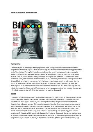
  • 1. Detailed Analysis of Music Magazine Typography The font styles used throughout this page is sans serif. Using a sans serif font connotes that the magazine is modern and gives off a relaxed feeling. The masthead is positioned to be bigger than the rest of the font so it’s easy for the audience to determine what the magazine they’re reading is called. The font and colours used within it also draw attention to it, so that it’s the first thing you look at. They also used the cover story ‘Beyoncé’ in a larger style font so it’s clear that that is the main cover story and exclusive interview for that issue. Under ‘Beyoncé’ there is a pull quote written in bold black font ‘I want to be an icon’ which gives a snippet about what the main, cover story is about. A majority of the text is placed along the left third of the magazine – this is an effective technique used by publishers so readers can determine the coverlines and other articles published within the magazine. It is also an effective use of layout as magazines tend to overlap on the shelves – by placing them on the left third, it allows the stories to be displayed. Layout The layout of this magazine is very ordered and very basic. This connotes that the magazine is aimed at an older target audience and young, pre-teen magazines tend to be very cluttered with lots of celebrities. By having an ordered layout it also signifies that the magazine is sophisticated and targeted towards older people. This magazine also uses lots of different techniques to reach out to its audience and make it a conventional magazine cover. The magazine uses both the ‘route of the eye’ and part of the rules of thirds. The route of the eye is an effective layout technique as it put’s items in order the path that our eye takes when we look at things. The first thing you see is the masthead, ‘Billboard’, which is distinctively placed at the top of the page in the primary optical area. It is very conventional to have the masthead placed at the top of the page as it makes the title of the magazine easy to determine. The eyes then follow a path straight through the middle of the page
  • 2. where the cover story is placed ‘Beyoncé’ along with the pull quote ‘I want to be an icon’ which is supposed to entice the readers to look at the main cover story. The magazine also uses the left/rule of thirds to order the magazine. All of the coverlines are placed alongside the left third which, as I have mentioned before, is an effective technique when the magazines are placed on the shelves. They have placed some of the items on the ‘hotspots’ (cover story, Beyoncé herself and the cover story about Beyoncé) which are the places our eyes tend to stop and look at. Colour The mid-shot of Beyoncé used as the main image on the cover and is coloured black and white. Black and white connotes sophistication and that the magazine could be quite informative, a bit like a newspaper. However, they also use elements of colour to make the magazine appeal to the younger part of their niche audience as it makes it appear more fun and cheerful. A majority of the masthead is coloured black which makes it clear and stand out from the image of the magazine and also connotes that it has a classic and contemporary feel. This is also contrasted with pops of colour within the masthead – the hints of colour connote that the magazine is up-to-date and is quite conversant with the current news and music trends. Using colour also helps attract the magazines target audience. The cover story, ‘Beyoncé’ is coloured white which contrasts with the duller colours in the background. The main image is of a well -known celebrity who has a good reputation from others and toward her fans. The colour white signifies purity which colour also be reflected from Beyoncé’s persona. Finally, all of the coverlines are coloured red which contrasts with the rest of the magazine. The colour red draws attention and when used can immediately focus your attention on a particular part of the magazine. The use of red also connotes energy and excitement so helps appeal to the younger target audience this magazine has. Images inc. Mise-en-scène There is one central, main image on the magazine of ‘Beyoncé’ taken from a medium close-up. The use of a medium close-up displays Beyoncé facial expression and body language. Taking a photo from a medium close up can also show their significance and their importance. Using a medium close up of Beyoncé as the main image could help attract to those who like Beyoncé etc. However, this magazine cover is quite unconventional as it only has one image on it whereas typically there would be quite a few to make it more interesting and appeal to a wider range of people. Nevertheless, having just one image on the front cover makes it appeal to the smaller niche audience this magazine is aiming for. Lighting – This image is taken with high-key lighting. By using high-key lighting and setting the colours to darker, black and white colours allows the image to define Beyoncé’s beauty. This may attract more people to pick up the magazine as the people who read this magazine may have Beyoncé as a role model and want to read the stories within. Editing – There is not too much editing within this main image. The photograph has probably been through several layers of Photoshop beforehand, however, only the tone and contrast have been edited on this main image. Setting – The setting of this photograph is not displayed through the imagery as we see just a black background with Beyoncé placed in front of it. This connotes that the magazine wants all attention to be focused on her and her interview within the magazine. Costume – In this image it isn’t clear what Beyoncé is wearing as the image is taken from a medium-close- up. Despite this, we can see that she’s wearing some sort of black mess dress with some
  • 3. jewellery around her wrist which signifies she is quite classy and quite elegant. This may appeal to others who fall into that category or who are inspired by the way Beyoncé dresses as there may be some more photos of her inside the magazine. Language The language used on this magazine cover clearly portrays this as a music magazine. It is all written in formal English which connotes that this magazine is aimed at older people and is quite sophisticated. They use pull quotes from Beyoncé’s interview to intrigue the readers and make them want to buy the magazine. For example, the use the quote ‘I want to be an icon’ which signifies that there could be some sort of exclusive interview with Beyoncé within the magazine. It also signs a light on Beyoncé’s persona as it connotes that she is a quite strong willed person who wants to be recognised for her work and influence her fans. Conventions This magazine cover is very conventional. It follows the typical form of a magazine including route of the eye and the rule of thirds and conventional features like placing the masthead at the top and using the left third for placing the coverlines on. It is also conventional to have the main image of a famous celebrity so that the magazines can use celebrity endorsement to help sell their magazines. Contents Page
  • 4. Typography The typography on the contents page has a mixture of both serif and sans serif fonts. Having a mixture of fonts opens up the gap wider for a target audience. Serif font is seen as a more feminine style font and appeals more to women as opposed to men. However, this is balanced out with the sans serif fonts which are seen as a more masculine font. Appealing to both male and female readers. The size of the font is a lot smaller on the contents page to allow more information to be printed on the page making the magazine more informative and an interesting read. Billboard specifically choose to list the top albums and songs of different genres on the left of the third page. Layout The layout on the contents page is fairly ordered. It shows what’s in the charts and what page each song/album information is on. It also uses the rule of thirds as the contents is almost split into three different sections. Splitting the information up across the page allows the magazine to be more accessible so that people can navigate their way through the magazine. The main articles are shown under their own individual headings to make them easily portrayed as a significant part of that issue. You could also say that the layout on the contents page follow follows the route of the e ye. Along the primary optical area you see images of famous celebrities featured in this issue, you then see the main stories placed in the centre of the page. Finally when you reach the terminal area, you see the online and exclusive events section which inform people of what’s currently going on. Colour The range of colours on the contents page are quite masculine which will appeal to the male target audience. The colours are also quite plain and neutral which connotes the style of magazine is quite laidback and relaxed. Images The images on the contents page shows that it’s aimed at a broader target audience as they use a mixture of celebrities including both male and female. The first image looks like an album cover which is conventional for a music magazine as they may be informing the readers of a new release/upcoming band that is coming out soon. The second and third images along the top of the page show some more famous artists that feature within the magazine. This may appeal to the target audience as they like the artists and/or are interested in interviews they may have within the magazine. The last image on the page shows a female celebrity, taken from a long-shot. The long shot displays her relaxed and casual body language and the fact that she is smiling and reflects the personality of the magazine. Language The language on the contents page is quite colloquial as the word Brooklyn is abbreviated to ‘BKLYN ROCKS’. This shows that the language is quite informal and appeals to the younger target audience. It is also quite short and snappy making it quick and easy to read. Contractions and ‘text language’ i.e. missing out vowels is quite common with younger people as they tend to adapt to talking and writing like that during their younger, teenage years.
  • 5. Conventions The contents page is very conventional with extra features added in also. For a magazine to have a contents page is very typical as it helps the reader to navigate their way through the issue and pick out something if they specifically want to read something in particular. It has the different sections highlighted and put under headings to make it even easier to find what you’re looking for. Double Page Spread Typography The typography of the double page spread is written in a serif style font. This is because serif font is said to be easier to read than sans serif font is when reading a big chunk of text. The typography is also very conventional for a magazine. It contains a standfirst which is sized bigger than everything else, this is because it acts as a ‘pull quote’ hinting more information about what the article is about and to intrigue people to read the entire article. Midway through the article there is also a ‘kicker’. A kicker is a conventional way to start off an article, it also makes the text look a bit more unique and interesting as well as drawing attention to itself. Layout The layout of the double page spread is very basic, yet typical for a music style magazine. The left page contains all of the text and the information about the interview or whatever it may be that’s written about the artist. Then the right hand page contains a full page, flattering photo of the artist/celebrity. The text is set into vertical columns to make full use of the page and break up the text. It also makes the text look less overwhelming when people want to read quickly. Colour The colour on this make comes from the image. Because the block of text is quite a vast chunk, the full page photo makes the magazine look a bit more balanced. The photo is taken in high key lighting making it appear a lot more bright and fun, also reflecting Katy Perry’s persona.
  • 6. Images The images on this magazine double page spread is a full page photo of Katy Perry. She is wearing tight fitting and very revealing clothes which shows of her body language and makes her look attractive and sensual. Language The language used in the article is quite colloquial and aimed at a younger target audience. The fact that Katy Perry says ‘I took mushrooms at a daft punk show’ shows that she was a bit irresponsible and careless, like the stereotypical teenager is shown to be. This will help reach out to the teenage gap in the niche target audience Billboard has as stereotypically teenagers are seen as mischievous and ill-behaved by people older than them. They also use the pull quote ‘I took mushrooms at a daft punk show’ to attract people to read the article as it’s not something that we would expect from a pop singer who has a lot of younger fans. Conventions This double page spread is very typical for an interview style article. It shows all the story and information on the left hand page. Whereas on the right hand page we see a full scale, full page photo of the celebrity looking quite attractive. This is because i f it’s setup like this, it is easier to determine what or who the article is all about.