Beginners Guide to TikTok for Search - Rachel Pearson - We are Tilt __ Bright...
Nina Nesbitt – Stay Out Digipak Analysis
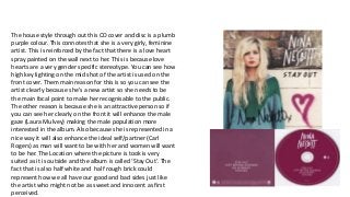
1. The house style through out this CD cover and disc is a plumb
purple colour. This connotes that she is a very girly, feminine
artist. This is reinforced by the fact that there is a love heart
spray painted on the wall next to her. This is because love
hearts are a very gender specific stereotype. You can see how
high key lighting on the mid shot of the artist is used on the
front cover. Them main reason for this is so you can see the
artist clearly because she's a new artist so she needs to be
the main focal point to make her recognisable to the public.
The other reason is because she is an attractive person so if
you can see her clearly on the front it will enhance the male
gaze (Laura Mulvey) making the male population more
interested in the album. Also because she is represented in a
nice way it will also enhance the ideal self/partner (Carl
Rogers) as man will want to be with her and women will want
to be her. The Location where the picture is took is very
suited as it is outside and the album is called ‘Stay Out’. The
fact that is also half white and half rough brick could
represent how we all have our good and bad sides just like
the artist who might not be as sweet and innocent as first
perceived.
2. Her facial expression is very serious. This could
connote that this album might be very serious and
the songs in it might have a lot of depth and
meaning to them and that is why the have chosen a
serious expression and location rather than a much
more fun and light approach. Also because this is
one of her early albums she is the main focus of the
front cover. The reason for this is because this will
then get her image across to her demographic and
make her much more recognisable to an audience.
For this album there isn't anything genre codes that
stand out massively apart from her clothing. Her
clothing is rather stereotypical in terms of her genre
of indie acoustic. She is wearing a baggy alternative
look jumper which her audience will be able to see
and relate to as this will be the same type of
clothing they will wear. This makes the artist seem
more inspirational to her target audience as they will
view her as being similar to them and a reachable
goal. The album name for this one is ‘Stay Out’. The
connotations of especially when you combine it with
the music video is literally just staying out, like on a
night out for example. This will be a very relatable
topic for her target audience as they will all be of a
3. similar age to her (18-25) and they will fully endorse
the staying out lifestyle and it will have been
something they will have done repeatedly in their
lives so they will be able to fully relate to the album
name and song. For the fonts they have used sans
serif fonts that are quite different from normal style
fonts you may see. This connotes that the artist is
going to be a little bit different and quite quirky
compared to normal artist you may come across. But
the font is also quite elegant and flowing at the
same time, this is to represent the girly side of the
artist as well.