SlideShare a Scribd company logo
1 of 188
Download to read offline
RESPONSIVE WEBDESIGN
   FRONTEERS / MECHELEN / NOV 2011


   These slides are the blueprint of a presentation I did at Fronteers recently.
I tried to make them understandable to people that didnā€™t attend the presentation
                  by including these dull looking quick notes.
THOMAS MOM CALLED ME
             BYTTEBIER
   IS HOW MY
my brother is the cute one
as a kid, I wanted to be Maradona
picture says it all
NOW I WORK AS A

 FREELANCE
WEBDESIGNER
  FOCUS ON DESIGN
I realize that looks like quite a fail to the public, but I enjoy doing it
I tweet about all things design and web, follow me @bytte
my old-school website is at thomasbyttebier.com
RESPONSIVE WEBDESIGN
PROBLEMS / SEMI-SOLUTIONS / OWN EXPERIENCES


      hereā€™s what I talked about and what these slides are about
hereā€™s a responsive website I made in 2010: sleepstreet.be
this one I did early 2011
I went to Build a few weeks ago
with a few Belgian freelancers   photo by Jelle Desramaults
I was lucky to see Wilson Miner speak at Build
if you donā€™t know Wilson Miner: he designed this pretty famous website
he talked about how few products had such in impact in our lives as the car in the 20th century
it even drastically changed our environment
at the end of the 20th century the pc was another product that dramatically changed our lives
hereā€™s an office anno 1962
that one is replaced by a hard drive
that one is in the cloud now
type writers are now called Microsoft Word
and sadly sheā€™s replaced by a computer as well
leaving only this boring mofo
mobile is having a huge impact in our lives right now
everywhere
everyone
this dude even sleeps with his phone
there will be 7 billion connected phones in about 3 months from now
SEVEN
BILLION
  FUCKING
last year I went to Indonesia
poor but beautiful country
one of the Indonesian sulfur miners that risk their lives every day just to eek out a living
hereā€™s the Ijen Crater full of poisonous smoke, see the sulfur down there?
this guy goes up and down the crater a few times a day carrying many kilos of sulfur on his shoulders
hereā€™s a few more sulfur miners, they likely wonā€™t live long as their lungs are poisened with sulfur
even these really poor people carry a phone, they get to know the internet through cheap mobile devices
the question is: how can we deliver a great experience to these 7 billion people?
ļ¬rst thought: we need an app! hipness!
oh and one for Android too!
and Windows phones
and letā€™s not discriminate the Blackberry people
hard + expensive to maintain, and frankly kind of silly to have an app mirroring your website
second thought: letā€™s make a mobile version of our website, itā€™ll work on all devices!
some good thinking there, but itā€™s still two versions...
ā€œ90% of all websites are too simple
to justify the time and money it
takes to develop a separate mobile
version.ā€


                              ā€” COMMON SENSE THINKER

             itā€™s hard to argue with that
one guy sat down and thought really hard
he wrote this article on A List Apart about responsive webdesign (Ethan Marcotte)
awesome idea: one website that adapts, looks and works great on all devices!
HTML
STRUCTURE                                              CSSLAYOUT


       based on simple principles we all know and stand behind
simple, but great results emerged from it
   simple, but end products are great
meacuppa.be by chilli.be
antarcticstation.org by jƩrƓme coupƩ
jobat.be, not sure who made this
lalemant.com by gorilla-webdesign.com
handelsbeurs.be by netlash.be
wolfslittlestore.be, freelance web designer
trentwalton.com
thisismadebyhand.com by Mandy Brown & Candi Ligutan
Ethan Marcotte, Scott Jehl ea.


          a new trend setter: bostonglobe.com by Ethan Marcotte, Scott Jehl and others
this is charles darwin
ā€œIt is not the strongest of the
 species that survives, nor the most
 intelligent, but the one
 most responsive to change.ā€


                                                                 ā€” CHARLES DARWIN

we all agree that the best design is to be found in nature and nature is full of responsive design
everyone knows this animal and how it responds to mood changes
this little spider turns yellow when itā€™s on yellow ļ¬‚owers...
...and white when itā€™s on white ļ¬‚owersā€”invisible to predators and insects
Source: webecoist.com


this octopus scares predators by mimicking the color and shape of its predatorsā€™ predators
responsive design may be hip at the moment, itā€™s based on a proven design principle and itā€™s here to stay
HOWCOMPONENTS
    IT WORKS
  2
%
1ā€”fully based on ļ¬‚uid web design
which is logical: this way it kind of automatically ļ¬ts all screens
ā€œdonā€™t get me started on ļ¬‚uid web designā€
itā€™s so nineties and is ugly from a certain viewport size onwards
CSS MEDIA QUERIES


     2ā€”meet css media queries
<link rel="stylesheet"
href="print.css"
media="print" />


       nothing new: we all have used this media query for ages
<link rel="stylesheet"
href="layout.css"
media="screen and (min-width:400px)" />


@media (min-width:400px) {                                              }


 this oneā€™s different: as soon as the browser viewport reaches 400 px, use this stylesheet
thatā€™s awesomeness: load different styles as soon as the ļ¬‚uid layout becomes unreadable or just ugly
hereā€™s a simple example: looking good at 1024x768
but as itā€™s designed ļ¬‚uidly, the text becomes unreadable at larger viewports
thanks to css media queries, we can change the layout at larger screen sizes: text is readable again
similar for smaller screens: default website scaling makes our initial design unreadable
all hail to media queries: this is a readable and usable layout
of course it works on other devices too
even this strange tablet
320
                                          480
                                          768
                                         1024

most responsive designers use media queries to change layout at common sizes, but thatā€™s no necessity
GREATNESS!
  responsive web design is great, donā€™t you agree?
CSS MEDIA QUERIES...
WORKS IN ALL BROWSERS?


       but does it work in all browsers?
no
not in older versions of internet explorer, but thatā€™s ok, right?
1. Write CSS for desktop browsersā€”
             the way you always did.

    2. Use media queries to optimize for
             smaller mobile screens.


           SPOILER: DONā€™T DO IT THIS WAY!


using this workļ¬‚ow, older IEā€™s will always show the desktop version, which is ok as theyā€™re used on desktops
but we need to dig deeper for better mobile browser stats
hereā€™s a more detailed table representing media query support for all common mobile browsers
you know, not all of us browse the web using the latest and hippest mobile devices
thereā€™s lots of older, popular and less capable devices around that donā€™t support media queries
1. Write CSS for desktop browsersā€”
   the way you always did.

2. Use media queries to optimize for
   smaller mobile screens.


    using this workļ¬‚ow means these devices wonā€™t show our mobile layout. argh.
friends who canā€™t afford a desktop computer or expensive mobile phones will have a bad mobile experience
and frankly: thereā€™s lots of themā€”developing countries get to know the internet through mobile devices
Brian Rieger
make sure to check out Brian Riegerā€™s presentation on that matter, itā€™s on Slideshare
DAMN
NOW WHAT?
hereā€™s the solution!
dude even wrote a book about it
HUH?
 whatā€™s mobile ļ¬rst?
1. Start with a ļ¬‚uid mobile layout.

2. Use media queries to optimize for
   bigger screens.


    this is a mobile ļ¬rst approach: all devices are served a mobile layout at ļ¬rst
meaning even devices that donā€™t support media queries will display the mobile version of your website!
YAY!
most desktop browsers understand media queries so theyā€™ll serve the desktop layout
but what about older internet explorer versions?
NOT GREAT, YET NOT CRAZY BROKEN


the layout will be broken but the content will still be readable
unless you use javascript solutions such as respond.js, forcing older ie versions to interpret media queries!
meaning as good as all desktop browsers will show your desktop layout! greatness!
ā€œMobile ļ¬rst forces you to focus.ā€


                                              ā€” LUKE WROBLEWSKI
                                                   the book dude


       thereā€™s even more advantages to a mobile ļ¬rst approach
websites tend to get stuffed with mostly irrelevant information nowadays
thinking about mobile ļ¬rst forces you to focus: thereā€™s less screen real estate to abuse, so relevance ļ¬rst
the design community picked this up earlier with great results
thinking mobile ļ¬rst is an excellent exercise in design, usability and information architecture
pretty obvious, right?
A MOBILE FIRST APPROACH LEADS TO
LESS & CLEANER CSS


 another advantage of mobile ļ¬rst, at least in my experience
about a year ago I designed sleepstreet.be using a desktop ļ¬rst approach
/* CSS for desktop version */


@media
(min-width:320px) and
(max-width:380px) {                /* make it white & 1 column */                           }


@media
(min-width:381px) and
(max-width:480px) {                /* make it white & 2 columns */                              }


@media
(min-width:481px) and
(max-width:800px) {                /* make it black & 2 columns */                              }


/* all the way up... */


DONā€™T DO IT THIS WAY!
               it led to cluttered, repeated, less-readable and hard-to-maintain CSS code
a few months ago I worked on madebywolf.com, using a mobile ļ¬rst approach
/* CSS for mobile version */


@media
(min-width:400px) {            /* from now on white & 2 columns */                         }


@media
(min-width:800px) {            /* from now on 3 columns */                    }


@media
(max-width:1100px) {             /* from now on black & 4 columns */                           }


/* all the way up... */


  the CSS is much cleaner, easier to read, easier to maintain and thereā€™s just less code
HOW CAN WE MAKE
RESPONSIVE IMAGES


   one problem solved, but hereā€™s another one
Use desktop-sized images in your
mobile ļ¬rst design & scale down using
CSS.


SPOILER: DONā€™T DO IT THIS WAY!


                                 the solutionā€™s easy at ļ¬rst thought
img { width:100%; }


hereā€™s a 600px wide image scaled down using CSS to a more appropriate mobile size
They look great on the desktop
 version of your website too.


            thatā€™s a plus!
But their ļ¬lesize looks great on the
mobile version of your website too.


                                    200kb for a
                                 300px wide photo!


               thatā€™s a minus!
ā€œIf I hadnā€™t used media queries, the
user would have seen the desktop
website with desktop-sized images
anyway.ā€


                           ā€” UNCARING WEB DESIGNER

              thereā€™s truth in that
but bandwidth is expensive
and connections are slow
and if we donā€™t care, who will?
Use desktop-sized images in your
mobile ļ¬rst design & scale down using
CSS.


           have a heart: we just canā€™t do it this way
thereā€™s many possible solutions yet not one is ideal
2
if I were you, designing a responsive website, Iā€™d have a look at at least two of them
ļ¬rst one is the one Jason Grigsby is going to write about in his upcoming book on responsive web design
Jason looked at all solutions & made a choice based on a number of factors, most noteably future friendliness
he chooses the sencha.io technique and itā€™s based on device detection. hmmmm....
ā€œHow strange it is to think of device
detection as the most future
friendly technique for responsive
images? I ļ¬nd it hard to argue with
the logic.ā€


                                                         ā€” JASON GRIGSBY

     make sure to read Jasonā€™s blog posts on the topic at cloudfour.com
ā€œAt least thatā€™s how I see it for the
book. For your project and use
case, it depends.ā€


                                                                ā€” JASON GRIGSBY

 as always: make a deliberate choice, because, well, it depends on all kinds of factors
hereā€™s another interesting technique
Iā€™ve used it on sleepstreet.be, it works and Iā€™m more than ok with it
itā€™s also usedā€”in a modiļ¬ed way as I understandā€”on bostonglobe.com
<img src=ā€small.jpg?full=large.jpgā€ />


           hereā€™s how it works, pretty easy huh?
small.jpg                                                 large.jpg


using javascript and url rewrites the appropriate image is served to the appropriate device
small.jpg                                                 large.jpg


an advantage: as the technique requires 2 images, you can create more detailed images for smaller devices
small.jpg                                                  large.jpg


itā€™s written mobile ļ¬rst and browsers that donā€™t support javascript will only download the small image
older ieā€™s (6 & 7) will download both images, but I can live with that
SCALABLE VECTOR GRAPHICS


          letā€™s talk svg
No pixels.
Always crisp at all sizes.
Extremely small ļ¬le sizes.
Scalable in every fucking way.
Pretty epic.


               the best invention since sliced bread
Iā€™ve used svg for the sleepstreet logo
hereā€™s the logo, designed by Ward Heirwegh
itā€™s used proportionally on small screen devices
but scaling it up proportionally on larger screens would render the logo quite big
and it would result in a huge logo on desktop computers (clients would have loved it :)
then again I couldā€™ve used it proportionally but I didnā€™t like the extra whitespace
as itā€™s svg I could use javascript to reposition anchor points based on screen width (thanks @christaanvdp)
resulting in the side banners expanding/contracting as the browser window scales
an improvement if you ask me
So why is not everyone using svg?


       if svg is so great, why is not everyone using it all the time?
frankly: itā€™s a pain in the ass to implement in a cross-browser fashion
thereā€™s a solution: raphaĆ«l is a cross-browser solution I used to implement the svg logo
but it required me to redraw the logo using javascript. and thatā€™s not how you want to spend your day.
but the future is bright! @joggink is working on a solution called willistrator (no joke!)
VIDEO


responsive video will kill the video star
Iā€™ve used responsive video on madebywolf.com
.video {
  width: 100%;
}

                        OK


                                                                 NOT OK!


       you canā€™t use the same css youā€™d use for scaling images
but smart people have written good articles about the matter, such as Thierry Koblentz on a list apart
another great article about responsive video, by Chris Coyier of css-tricks.com
video {
  width: 100%;
  height: auto;
}


basically this is all you have to do if you want responsive video using the html5 video tag
but if you depend on external video hosting services you may need to support different embedding solutions
ļ¬tvids.js takes care of that: it makes video scale responsively with embed, object, iframe tags...
DATA TABLES


weā€™re almost done... letā€™s look at data tables
spoiler: not easy, if you have a site that depends heavily on data tables, better close your browser window
ā€œData tables donā€™t do so well with
responsive design. Just sayinā€™.ā€


                                                     ā€” GARRETT DIMON

          excellent tweet, couldnā€™t have said it any better
Chris Coyier of css-tricks.com came up with a possible solution
Chris takes this table...
...and turns it to this on mobile: itā€™s ok, but not ideal for many reasons...
eg. thereā€™s no way to easily compare rows
Scott Jehl took this data table...
...and made a pie chart of it on mobile! great but works only with numerical data of course
DESIGN


I wrapped up my presentation sharing some thoughts about designing responsively
basically it came down to this: less than ever we have a ļ¬xed canvas to design in
thereā€™s no right tools for the job
I canā€™t design in the browser, itā€™s no design tool whatsoeverā€”still need to ļ¬nd a better workļ¬‚ow
fact is: ļ¬‚uid grids grow more and more important
web design & typography is moving away from print design more than ever (great poster by Wim Crouwel)
THANKS FOR LISTENING
TALK TO ME ON TWITTER: @BYTTE
Thanks to these people for sharing their photos with a creative commons license:

                         http://www.ļ¬‚ickr.com/photos/sashakimel/6189771935/
              http://www.ļ¬‚ickr.com/photos/strebkr/3151902438/sizes/l/in/photostream/
           http://www.ļ¬‚ickr.com/photos/julietbanana/4733245476/sizes/z/in/photostream/
          http://www.ļ¬‚ickr.com/photos/canadianveggie/167924582/sizes/l/in/photostream/
              http://www.ļ¬‚ickr.com/photos/yourdon/3568718036/sizes/l/in/photostream/
           http://www.ļ¬‚ickr.com/photos/missningyou/2679843655/sizes/l/in/photostream/
              http://www.ļ¬‚ickr.com/photos/kiwanja/3169449999/sizes/o/in/photostream/
              http://www.ļ¬‚ickr.com/photos/crfullmoon/22195292/sizes/l/in/photostream/
         http://www.ļ¬‚ickr.com/photos/42244964@N03/4325982802/sizes/l/in/photostream/
              http://www.ļ¬‚ickr.com/photos/frak_tal/2455855855/sizes/l/in/photostream/
            http://www.ļ¬‚ickr.com/photos/dinoowww/4557829098/sizes/z/in/photostream/
             http://www.ļ¬‚ickr.com/photos/kentclark/4720549350/sizes/l/in/photostream/
            http://www.ļ¬‚ickr.com/photos/hanneorla/1439963888/sizes/l/in/photostream/
             http://www.ļ¬‚ickr.com/photos/ter-burg/1405605889/sizes/o/in/photostream/
           http://www.ļ¬‚ickr.com/photos/spyker3292/3721376470/sizes/l/in/photostream/
          http://www.ļ¬‚ickr.com/photos/soylentgreen23/491093601/sizes/l/in/photostream/
             http://www.ļ¬‚ickr.com/photos/danielygo/6209676842/sizes/l/in/photostream/
                         http://www.ļ¬‚ickr.com/photos/extraketchup/459020985
                             http://www.ļ¬‚ickr.com/photos/torek/2266105751
                     http://www.ļ¬‚ickr.com/photos/smokingpermitted/2052869864/

More Related Content

More from Thomas Byttebier (8)

CSS3 kleuren en border-radius
CSS3 kleuren en border-radiusCSS3 kleuren en border-radius
CSS3 kleuren en border-radius
Ā 
Reset normalize CSS
Reset normalize CSSReset normalize CSS
Reset normalize CSS
Ā 
Belangrijke CSS begrippen (2)
Belangrijke CSS begrippen (2)Belangrijke CSS begrippen (2)
Belangrijke CSS begrippen (2)
Ā 
CSS basis
CSS basisCSS basis
CSS basis
Ā 
HTML opfrissing
HTML opfrissingHTML opfrissing
HTML opfrissing
Ā 
Webdesign 2: introductie
Webdesign 2: introductieWebdesign 2: introductie
Webdesign 2: introductie
Ā 
Een introductie tot HTML5
Een introductie tot HTML5Een introductie tot HTML5
Een introductie tot HTML5
Ā 
HTML kort & bondig
HTML kort & bondigHTML kort & bondig
HTML kort & bondig
Ā 

Recently uploaded

Escorts Service Nagavara ā˜Ž 7737669865ā˜Ž Book Your One night Stand (Bangalore)
Escorts Service Nagavara ā˜Ž 7737669865ā˜Ž Book Your One night Stand (Bangalore)Escorts Service Nagavara ā˜Ž 7737669865ā˜Ž Book Your One night Stand (Bangalore)
Escorts Service Nagavara ā˜Ž 7737669865ā˜Ž Book Your One night Stand (Bangalore)
amitlee9823
Ā 
VIP Model Call Girls Kalyani Nagar ( Pune ) Call ON 8005736733 Starting From ...
VIP Model Call Girls Kalyani Nagar ( Pune ) Call ON 8005736733 Starting From ...VIP Model Call Girls Kalyani Nagar ( Pune ) Call ON 8005736733 Starting From ...
VIP Model Call Girls Kalyani Nagar ( Pune ) Call ON 8005736733 Starting From ...
SUHANI PANDEY
Ā 
How to Build a Simple Shopify Website
How to Build a Simple Shopify WebsiteHow to Build a Simple Shopify Website
How to Build a Simple Shopify Website
mark11275
Ā 
RT Nagar Call Girls Service: šŸ“ 7737669865 šŸ“ High Profile Model Escorts | Bang...
RT Nagar Call Girls Service: šŸ“ 7737669865 šŸ“ High Profile Model Escorts | Bang...RT Nagar Call Girls Service: šŸ“ 7737669865 šŸ“ High Profile Model Escorts | Bang...
RT Nagar Call Girls Service: šŸ“ 7737669865 šŸ“ High Profile Model Escorts | Bang...
amitlee9823
Ā 
Call Girls Basavanagudi Just Call šŸ‘— 7737669865 šŸ‘— Top Class Call Girl Service ...
Call Girls Basavanagudi Just Call šŸ‘— 7737669865 šŸ‘— Top Class Call Girl Service ...Call Girls Basavanagudi Just Call šŸ‘— 7737669865 šŸ‘— Top Class Call Girl Service ...
Call Girls Basavanagudi Just Call šŸ‘— 7737669865 šŸ‘— Top Class Call Girl Service ...
amitlee9823
Ā 
Abortion Pills in Oman (+918133066128) Cytotec clinic buy Oman Muscat
Abortion Pills in Oman (+918133066128) Cytotec clinic buy Oman MuscatAbortion Pills in Oman (+918133066128) Cytotec clinic buy Oman Muscat
Abortion Pills in Oman (+918133066128) Cytotec clinic buy Oman Muscat
Abortion pills in Kuwait Cytotec pills in Kuwait
Ā 
Just Call Vip call girls Etawah Escorts ā˜Žļø9352988975 Two shot with one girl (...
Just Call Vip call girls Etawah Escorts ā˜Žļø9352988975 Two shot with one girl (...Just Call Vip call girls Etawah Escorts ā˜Žļø9352988975 Two shot with one girl (...
Just Call Vip call girls Etawah Escorts ā˜Žļø9352988975 Two shot with one girl (...
gajnagarg
Ā 
āž„šŸ” 7737669865 šŸ”ā–» dharamshala Call-girls in Women Seeking Men šŸ”dharamshalašŸ” ...
āž„šŸ” 7737669865 šŸ”ā–» dharamshala Call-girls in Women Seeking Men  šŸ”dharamshalašŸ”  ...āž„šŸ” 7737669865 šŸ”ā–» dharamshala Call-girls in Women Seeking Men  šŸ”dharamshalašŸ”  ...
āž„šŸ” 7737669865 šŸ”ā–» dharamshala Call-girls in Women Seeking Men šŸ”dharamshalašŸ” ...
amitlee9823
Ā 
Vip Mumbai Call Girls Bandra West Call On 9920725232 With Body to body massag...
Vip Mumbai Call Girls Bandra West Call On 9920725232 With Body to body massag...Vip Mumbai Call Girls Bandra West Call On 9920725232 With Body to body massag...
Vip Mumbai Call Girls Bandra West Call On 9920725232 With Body to body massag...
amitlee9823
Ā 
Jigani Call Girls Service: šŸ“ 7737669865 šŸ“ High Profile Model Escorts | Bangal...
Jigani Call Girls Service: šŸ“ 7737669865 šŸ“ High Profile Model Escorts | Bangal...Jigani Call Girls Service: šŸ“ 7737669865 šŸ“ High Profile Model Escorts | Bangal...
Jigani Call Girls Service: šŸ“ 7737669865 šŸ“ High Profile Model Escorts | Bangal...
amitlee9823
Ā 
Brookefield Call Girls: šŸ“ 7737669865 šŸ“ High Profile Model Escorts | Bangalore...
Brookefield Call Girls: šŸ“ 7737669865 šŸ“ High Profile Model Escorts | Bangalore...Brookefield Call Girls: šŸ“ 7737669865 šŸ“ High Profile Model Escorts | Bangalore...
Brookefield Call Girls: šŸ“ 7737669865 šŸ“ High Profile Model Escorts | Bangalore...
amitlee9823
Ā 

Recently uploaded (20)

Sector 105, Noida Call girls :8448380779 Model Escorts | 100% verified
Sector 105, Noida Call girls :8448380779 Model Escorts | 100% verifiedSector 105, Noida Call girls :8448380779 Model Escorts | 100% verified
Sector 105, Noida Call girls :8448380779 Model Escorts | 100% verified
Ā 
Escorts Service Nagavara ā˜Ž 7737669865ā˜Ž Book Your One night Stand (Bangalore)
Escorts Service Nagavara ā˜Ž 7737669865ā˜Ž Book Your One night Stand (Bangalore)Escorts Service Nagavara ā˜Ž 7737669865ā˜Ž Book Your One night Stand (Bangalore)
Escorts Service Nagavara ā˜Ž 7737669865ā˜Ž Book Your One night Stand (Bangalore)
Ā 
VIP Model Call Girls Kalyani Nagar ( Pune ) Call ON 8005736733 Starting From ...
VIP Model Call Girls Kalyani Nagar ( Pune ) Call ON 8005736733 Starting From ...VIP Model Call Girls Kalyani Nagar ( Pune ) Call ON 8005736733 Starting From ...
VIP Model Call Girls Kalyani Nagar ( Pune ) Call ON 8005736733 Starting From ...
Ā 
call girls in Vaishali (Ghaziabad) šŸ” >ą¼’8448380779 šŸ” genuine Escort Service šŸ”āœ”ļøāœ”ļø
call girls in Vaishali (Ghaziabad) šŸ” >ą¼’8448380779 šŸ” genuine Escort Service šŸ”āœ”ļøāœ”ļøcall girls in Vaishali (Ghaziabad) šŸ” >ą¼’8448380779 šŸ” genuine Escort Service šŸ”āœ”ļøāœ”ļø
call girls in Vaishali (Ghaziabad) šŸ” >ą¼’8448380779 šŸ” genuine Escort Service šŸ”āœ”ļøāœ”ļø
Ā 
Pooja 9892124323, Call girls Services and Mumbai Escort Service Near Hotel Hy...
Pooja 9892124323, Call girls Services and Mumbai Escort Service Near Hotel Hy...Pooja 9892124323, Call girls Services and Mumbai Escort Service Near Hotel Hy...
Pooja 9892124323, Call girls Services and Mumbai Escort Service Near Hotel Hy...
Ā 
How to Build a Simple Shopify Website
How to Build a Simple Shopify WebsiteHow to Build a Simple Shopify Website
How to Build a Simple Shopify Website
Ā 
RT Nagar Call Girls Service: šŸ“ 7737669865 šŸ“ High Profile Model Escorts | Bang...
RT Nagar Call Girls Service: šŸ“ 7737669865 šŸ“ High Profile Model Escorts | Bang...RT Nagar Call Girls Service: šŸ“ 7737669865 šŸ“ High Profile Model Escorts | Bang...
RT Nagar Call Girls Service: šŸ“ 7737669865 šŸ“ High Profile Model Escorts | Bang...
Ā 
Call Girls Basavanagudi Just Call šŸ‘— 7737669865 šŸ‘— Top Class Call Girl Service ...
Call Girls Basavanagudi Just Call šŸ‘— 7737669865 šŸ‘— Top Class Call Girl Service ...Call Girls Basavanagudi Just Call šŸ‘— 7737669865 šŸ‘— Top Class Call Girl Service ...
Call Girls Basavanagudi Just Call šŸ‘— 7737669865 šŸ‘— Top Class Call Girl Service ...
Ā 
WhatsApp Chat: šŸ“ž 8617697112 Call Girl Baran is experienced
WhatsApp Chat: šŸ“ž 8617697112 Call Girl Baran is experiencedWhatsApp Chat: šŸ“ž 8617697112 Call Girl Baran is experienced
WhatsApp Chat: šŸ“ž 8617697112 Call Girl Baran is experienced
Ā 
Abortion Pills in Oman (+918133066128) Cytotec clinic buy Oman Muscat
Abortion Pills in Oman (+918133066128) Cytotec clinic buy Oman MuscatAbortion Pills in Oman (+918133066128) Cytotec clinic buy Oman Muscat
Abortion Pills in Oman (+918133066128) Cytotec clinic buy Oman Muscat
Ā 
Lecture 01 Introduction To Multimedia.pptx
Lecture 01 Introduction To Multimedia.pptxLecture 01 Introduction To Multimedia.pptx
Lecture 01 Introduction To Multimedia.pptx
Ā 
Just Call Vip call girls Etawah Escorts ā˜Žļø9352988975 Two shot with one girl (...
Just Call Vip call girls Etawah Escorts ā˜Žļø9352988975 Two shot with one girl (...Just Call Vip call girls Etawah Escorts ā˜Žļø9352988975 Two shot with one girl (...
Just Call Vip call girls Etawah Escorts ā˜Žļø9352988975 Two shot with one girl (...
Ā 
call girls in Vasundhra (Ghaziabad) šŸ” >ą¼’8448380779 šŸ” genuine Escort Service šŸ”...
call girls in Vasundhra (Ghaziabad) šŸ” >ą¼’8448380779 šŸ” genuine Escort Service šŸ”...call girls in Vasundhra (Ghaziabad) šŸ” >ą¼’8448380779 šŸ” genuine Escort Service šŸ”...
call girls in Vasundhra (Ghaziabad) šŸ” >ą¼’8448380779 šŸ” genuine Escort Service šŸ”...
Ā 
Just Call Vip call girls Nagpur Escorts ā˜Žļø8617370543 Starting From 5K to 25K ...
Just Call Vip call girls Nagpur Escorts ā˜Žļø8617370543 Starting From 5K to 25K ...Just Call Vip call girls Nagpur Escorts ā˜Žļø8617370543 Starting From 5K to 25K ...
Just Call Vip call girls Nagpur Escorts ā˜Žļø8617370543 Starting From 5K to 25K ...
Ā 
āž„šŸ” 7737669865 šŸ”ā–» dharamshala Call-girls in Women Seeking Men šŸ”dharamshalašŸ” ...
āž„šŸ” 7737669865 šŸ”ā–» dharamshala Call-girls in Women Seeking Men  šŸ”dharamshalašŸ”  ...āž„šŸ” 7737669865 šŸ”ā–» dharamshala Call-girls in Women Seeking Men  šŸ”dharamshalašŸ”  ...
āž„šŸ” 7737669865 šŸ”ā–» dharamshala Call-girls in Women Seeking Men šŸ”dharamshalašŸ” ...
Ā 
Hire šŸ’• 8617697112 Meerut Call Girls Service Call Girls Agency
Hire šŸ’• 8617697112 Meerut Call Girls Service Call Girls AgencyHire šŸ’• 8617697112 Meerut Call Girls Service Call Girls Agency
Hire šŸ’• 8617697112 Meerut Call Girls Service Call Girls Agency
Ā 
Vip Mumbai Call Girls Bandra West Call On 9920725232 With Body to body massag...
Vip Mumbai Call Girls Bandra West Call On 9920725232 With Body to body massag...Vip Mumbai Call Girls Bandra West Call On 9920725232 With Body to body massag...
Vip Mumbai Call Girls Bandra West Call On 9920725232 With Body to body massag...
Ā 
Jigani Call Girls Service: šŸ“ 7737669865 šŸ“ High Profile Model Escorts | Bangal...
Jigani Call Girls Service: šŸ“ 7737669865 šŸ“ High Profile Model Escorts | Bangal...Jigani Call Girls Service: šŸ“ 7737669865 šŸ“ High Profile Model Escorts | Bangal...
Jigani Call Girls Service: šŸ“ 7737669865 šŸ“ High Profile Model Escorts | Bangal...
Ā 
The hottest UI and UX Design Trends 2024
The hottest UI and UX Design Trends 2024The hottest UI and UX Design Trends 2024
The hottest UI and UX Design Trends 2024
Ā 
Brookefield Call Girls: šŸ“ 7737669865 šŸ“ High Profile Model Escorts | Bangalore...
Brookefield Call Girls: šŸ“ 7737669865 šŸ“ High Profile Model Escorts | Bangalore...Brookefield Call Girls: šŸ“ 7737669865 šŸ“ High Profile Model Escorts | Bangalore...
Brookefield Call Girls: šŸ“ 7737669865 šŸ“ High Profile Model Escorts | Bangalore...
Ā 

Responsive web design

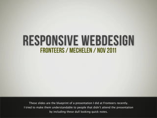
  • 1. RESPONSIVE WEBDESIGN FRONTEERS / MECHELEN / NOV 2011 These slides are the blueprint of a presentation I did at Fronteers recently. I tried to make them understandable to people that didnā€™t attend the presentation by including these dull looking quick notes.
  • 2. THOMAS MOM CALLED ME BYTTEBIER IS HOW MY
  • 3. my brother is the cute one
  • 4. as a kid, I wanted to be Maradona
  • 6. NOW I WORK AS A FREELANCE WEBDESIGNER FOCUS ON DESIGN
  • 7. I realize that looks like quite a fail to the public, but I enjoy doing it
  • 8. I tweet about all things design and web, follow me @bytte
  • 9. my old-school website is at thomasbyttebier.com
  • 10. RESPONSIVE WEBDESIGN PROBLEMS / SEMI-SOLUTIONS / OWN EXPERIENCES hereā€™s what I talked about and what these slides are about
  • 11. hereā€™s a responsive website I made in 2010: sleepstreet.be
  • 12. this one I did early 2011
  • 13. I went to Build a few weeks ago
  • 14. with a few Belgian freelancers photo by Jelle Desramaults
  • 15. I was lucky to see Wilson Miner speak at Build
  • 16. if you donā€™t know Wilson Miner: he designed this pretty famous website
  • 17. he talked about how few products had such in impact in our lives as the car in the 20th century
  • 18. it even drastically changed our environment
  • 19. at the end of the 20th century the pc was another product that dramatically changed our lives
  • 21. that one is replaced by a hard drive
  • 22. that one is in the cloud now
  • 23. type writers are now called Microsoft Word
  • 24. and sadly sheā€™s replaced by a computer as well
  • 25. leaving only this boring mofo
  • 26. mobile is having a huge impact in our lives right now
  • 29. this dude even sleeps with his phone
  • 30. there will be 7 billion connected phones in about 3 months from now
  • 32. last year I went to Indonesia
  • 34. one of the Indonesian sulfur miners that risk their lives every day just to eek out a living
  • 35. hereā€™s the Ijen Crater full of poisonous smoke, see the sulfur down there?
  • 36. this guy goes up and down the crater a few times a day carrying many kilos of sulfur on his shoulders
  • 37. hereā€™s a few more sulfur miners, they likely wonā€™t live long as their lungs are poisened with sulfur
  • 38. even these really poor people carry a phone, they get to know the internet through cheap mobile devices
  • 39. the question is: how can we deliver a great experience to these 7 billion people?
  • 40. ļ¬rst thought: we need an app! hipness!
  • 41. oh and one for Android too!
  • 43. and letā€™s not discriminate the Blackberry people
  • 44. hard + expensive to maintain, and frankly kind of silly to have an app mirroring your website
  • 45. second thought: letā€™s make a mobile version of our website, itā€™ll work on all devices!
  • 46. some good thinking there, but itā€™s still two versions...
  • 47. ā€œ90% of all websites are too simple to justify the time and money it takes to develop a separate mobile version.ā€ ā€” COMMON SENSE THINKER itā€™s hard to argue with that
  • 48. one guy sat down and thought really hard
  • 49. he wrote this article on A List Apart about responsive webdesign (Ethan Marcotte)
  • 50. awesome idea: one website that adapts, looks and works great on all devices!
  • 51. HTML STRUCTURE CSSLAYOUT based on simple principles we all know and stand behind
  • 52. simple, but great results emerged from it simple, but end products are great
  • 55. jobat.be, not sure who made this
  • 60. thisismadebyhand.com by Mandy Brown & Candi Ligutan
  • 61. Ethan Marcotte, Scott Jehl ea. a new trend setter: bostonglobe.com by Ethan Marcotte, Scott Jehl and others
  • 62. this is charles darwin
  • 63. ā€œIt is not the strongest of the species that survives, nor the most intelligent, but the one most responsive to change.ā€ ā€” CHARLES DARWIN we all agree that the best design is to be found in nature and nature is full of responsive design
  • 64. everyone knows this animal and how it responds to mood changes
  • 65. this little spider turns yellow when itā€™s on yellow ļ¬‚owers...
  • 66. ...and white when itā€™s on white ļ¬‚owersā€”invisible to predators and insects
  • 67. Source: webecoist.com this octopus scares predators by mimicking the color and shape of its predatorsā€™ predators
  • 68. responsive design may be hip at the moment, itā€™s based on a proven design principle and itā€™s here to stay
  • 69. HOWCOMPONENTS IT WORKS 2
  • 70. % 1ā€”fully based on ļ¬‚uid web design
  • 71. which is logical: this way it kind of automatically ļ¬ts all screens
  • 72. ā€œdonā€™t get me started on ļ¬‚uid web designā€
  • 73. itā€™s so nineties and is ugly from a certain viewport size onwards
  • 74. CSS MEDIA QUERIES 2ā€”meet css media queries
  • 75. <link rel="stylesheet" href="print.css" media="print" /> nothing new: we all have used this media query for ages
  • 76. <link rel="stylesheet" href="layout.css" media="screen and (min-width:400px)" /> @media (min-width:400px) { } this oneā€™s different: as soon as the browser viewport reaches 400 px, use this stylesheet
  • 77. thatā€™s awesomeness: load different styles as soon as the ļ¬‚uid layout becomes unreadable or just ugly
  • 78. hereā€™s a simple example: looking good at 1024x768
  • 79. but as itā€™s designed ļ¬‚uidly, the text becomes unreadable at larger viewports
  • 80. thanks to css media queries, we can change the layout at larger screen sizes: text is readable again
  • 81. similar for smaller screens: default website scaling makes our initial design unreadable
  • 82. all hail to media queries: this is a readable and usable layout
  • 83. of course it works on other devices too
  • 85. 320 480 768 1024 most responsive designers use media queries to change layout at common sizes, but thatā€™s no necessity
  • 86. GREATNESS! responsive web design is great, donā€™t you agree?
  • 87. CSS MEDIA QUERIES... WORKS IN ALL BROWSERS? but does it work in all browsers?
  • 88. no
  • 89. not in older versions of internet explorer, but thatā€™s ok, right?
  • 90. 1. Write CSS for desktop browsersā€” the way you always did. 2. Use media queries to optimize for smaller mobile screens. SPOILER: DONā€™T DO IT THIS WAY! using this workļ¬‚ow, older IEā€™s will always show the desktop version, which is ok as theyā€™re used on desktops
  • 91. but we need to dig deeper for better mobile browser stats
  • 92. hereā€™s a more detailed table representing media query support for all common mobile browsers
  • 93. you know, not all of us browse the web using the latest and hippest mobile devices
  • 94. thereā€™s lots of older, popular and less capable devices around that donā€™t support media queries
  • 95. 1. Write CSS for desktop browsersā€” the way you always did. 2. Use media queries to optimize for smaller mobile screens. using this workļ¬‚ow means these devices wonā€™t show our mobile layout. argh.
  • 96. friends who canā€™t afford a desktop computer or expensive mobile phones will have a bad mobile experience
  • 97. and frankly: thereā€™s lots of themā€”developing countries get to know the internet through mobile devices
  • 98. Brian Rieger make sure to check out Brian Riegerā€™s presentation on that matter, itā€™s on Slideshare
  • 99. DAMN
  • 102. dude even wrote a book about it
  • 103. HUH? whatā€™s mobile ļ¬rst?
  • 104. 1. Start with a ļ¬‚uid mobile layout. 2. Use media queries to optimize for bigger screens. this is a mobile ļ¬rst approach: all devices are served a mobile layout at ļ¬rst
  • 105. meaning even devices that donā€™t support media queries will display the mobile version of your website!
  • 106. YAY!
  • 107. most desktop browsers understand media queries so theyā€™ll serve the desktop layout
  • 108. but what about older internet explorer versions?
  • 109. NOT GREAT, YET NOT CRAZY BROKEN the layout will be broken but the content will still be readable
  • 110. unless you use javascript solutions such as respond.js, forcing older ie versions to interpret media queries!
  • 111. meaning as good as all desktop browsers will show your desktop layout! greatness!
  • 112. ā€œMobile ļ¬rst forces you to focus.ā€ ā€” LUKE WROBLEWSKI the book dude thereā€™s even more advantages to a mobile ļ¬rst approach
  • 113. websites tend to get stuffed with mostly irrelevant information nowadays
  • 114. thinking about mobile ļ¬rst forces you to focus: thereā€™s less screen real estate to abuse, so relevance ļ¬rst
  • 115. the design community picked this up earlier with great results
  • 116. thinking mobile ļ¬rst is an excellent exercise in design, usability and information architecture
  • 118. A MOBILE FIRST APPROACH LEADS TO LESS & CLEANER CSS another advantage of mobile ļ¬rst, at least in my experience
  • 119. about a year ago I designed sleepstreet.be using a desktop ļ¬rst approach
  • 120. /* CSS for desktop version */ @media (min-width:320px) and (max-width:380px) { /* make it white & 1 column */ } @media (min-width:381px) and (max-width:480px) { /* make it white & 2 columns */ } @media (min-width:481px) and (max-width:800px) { /* make it black & 2 columns */ } /* all the way up... */ DONā€™T DO IT THIS WAY! it led to cluttered, repeated, less-readable and hard-to-maintain CSS code
  • 121. a few months ago I worked on madebywolf.com, using a mobile ļ¬rst approach
  • 122. /* CSS for mobile version */ @media (min-width:400px) { /* from now on white & 2 columns */ } @media (min-width:800px) { /* from now on 3 columns */ } @media (max-width:1100px) { /* from now on black & 4 columns */ } /* all the way up... */ the CSS is much cleaner, easier to read, easier to maintain and thereā€™s just less code
  • 123. HOW CAN WE MAKE RESPONSIVE IMAGES one problem solved, but hereā€™s another one
  • 124. Use desktop-sized images in your mobile ļ¬rst design & scale down using CSS. SPOILER: DONā€™T DO IT THIS WAY! the solutionā€™s easy at ļ¬rst thought
  • 125. img { width:100%; } hereā€™s a 600px wide image scaled down using CSS to a more appropriate mobile size
  • 126. They look great on the desktop version of your website too. thatā€™s a plus!
  • 127. But their ļ¬lesize looks great on the mobile version of your website too. 200kb for a 300px wide photo! thatā€™s a minus!
  • 128. ā€œIf I hadnā€™t used media queries, the user would have seen the desktop website with desktop-sized images anyway.ā€ ā€” UNCARING WEB DESIGNER thereā€™s truth in that
  • 129. but bandwidth is expensive
  • 131. and if we donā€™t care, who will?
  • 132. Use desktop-sized images in your mobile ļ¬rst design & scale down using CSS. have a heart: we just canā€™t do it this way
  • 133. thereā€™s many possible solutions yet not one is ideal
  • 134. 2 if I were you, designing a responsive website, Iā€™d have a look at at least two of them
  • 135. ļ¬rst one is the one Jason Grigsby is going to write about in his upcoming book on responsive web design
  • 136. Jason looked at all solutions & made a choice based on a number of factors, most noteably future friendliness
  • 137. he chooses the sencha.io technique and itā€™s based on device detection. hmmmm....
  • 138. ā€œHow strange it is to think of device detection as the most future friendly technique for responsive images? I ļ¬nd it hard to argue with the logic.ā€ ā€” JASON GRIGSBY make sure to read Jasonā€™s blog posts on the topic at cloudfour.com
  • 139. ā€œAt least thatā€™s how I see it for the book. For your project and use case, it depends.ā€ ā€” JASON GRIGSBY as always: make a deliberate choice, because, well, it depends on all kinds of factors
  • 141. Iā€™ve used it on sleepstreet.be, it works and Iā€™m more than ok with it
  • 142. itā€™s also usedā€”in a modiļ¬ed way as I understandā€”on bostonglobe.com
  • 143. <img src=ā€small.jpg?full=large.jpgā€ /> hereā€™s how it works, pretty easy huh?
  • 144. small.jpg large.jpg using javascript and url rewrites the appropriate image is served to the appropriate device
  • 145. small.jpg large.jpg an advantage: as the technique requires 2 images, you can create more detailed images for smaller devices
  • 146. small.jpg large.jpg itā€™s written mobile ļ¬rst and browsers that donā€™t support javascript will only download the small image
  • 147. older ieā€™s (6 & 7) will download both images, but I can live with that
  • 148. SCALABLE VECTOR GRAPHICS letā€™s talk svg
  • 149. No pixels. Always crisp at all sizes. Extremely small ļ¬le sizes. Scalable in every fucking way. Pretty epic. the best invention since sliced bread
  • 150. Iā€™ve used svg for the sleepstreet logo
  • 151. hereā€™s the logo, designed by Ward Heirwegh
  • 152. itā€™s used proportionally on small screen devices
  • 153. but scaling it up proportionally on larger screens would render the logo quite big
  • 154. and it would result in a huge logo on desktop computers (clients would have loved it :)
  • 155. then again I couldā€™ve used it proportionally but I didnā€™t like the extra whitespace
  • 156. as itā€™s svg I could use javascript to reposition anchor points based on screen width (thanks @christaanvdp)
  • 157. resulting in the side banners expanding/contracting as the browser window scales
  • 158. an improvement if you ask me
  • 159. So why is not everyone using svg? if svg is so great, why is not everyone using it all the time?
  • 160. frankly: itā€™s a pain in the ass to implement in a cross-browser fashion
  • 161. thereā€™s a solution: raphaĆ«l is a cross-browser solution I used to implement the svg logo
  • 162. but it required me to redraw the logo using javascript. and thatā€™s not how you want to spend your day.
  • 163. but the future is bright! @joggink is working on a solution called willistrator (no joke!)
  • 164. VIDEO responsive video will kill the video star
  • 165. Iā€™ve used responsive video on madebywolf.com
  • 166. .video { width: 100%; } OK NOT OK! you canā€™t use the same css youā€™d use for scaling images
  • 167. but smart people have written good articles about the matter, such as Thierry Koblentz on a list apart
  • 168. another great article about responsive video, by Chris Coyier of css-tricks.com
  • 169. video { width: 100%; height: auto; } basically this is all you have to do if you want responsive video using the html5 video tag
  • 170. but if you depend on external video hosting services you may need to support different embedding solutions
  • 171. ļ¬tvids.js takes care of that: it makes video scale responsively with embed, object, iframe tags...
  • 172. DATA TABLES weā€™re almost done... letā€™s look at data tables
  • 173. spoiler: not easy, if you have a site that depends heavily on data tables, better close your browser window
  • 174. ā€œData tables donā€™t do so well with responsive design. Just sayinā€™.ā€ ā€” GARRETT DIMON excellent tweet, couldnā€™t have said it any better
  • 175. Chris Coyier of css-tricks.com came up with a possible solution
  • 176. Chris takes this table...
  • 177. ...and turns it to this on mobile: itā€™s ok, but not ideal for many reasons...
  • 178. eg. thereā€™s no way to easily compare rows
  • 179. Scott Jehl took this data table...
  • 180. ...and made a pie chart of it on mobile! great but works only with numerical data of course
  • 181. DESIGN I wrapped up my presentation sharing some thoughts about designing responsively
  • 182. basically it came down to this: less than ever we have a ļ¬xed canvas to design in
  • 183. thereā€™s no right tools for the job
  • 184. I canā€™t design in the browser, itā€™s no design tool whatsoeverā€”still need to ļ¬nd a better workļ¬‚ow
  • 185. fact is: ļ¬‚uid grids grow more and more important
  • 186. web design & typography is moving away from print design more than ever (great poster by Wim Crouwel)
  • 187. THANKS FOR LISTENING TALK TO ME ON TWITTER: @BYTTE
  • 188. Thanks to these people for sharing their photos with a creative commons license: http://www.ļ¬‚ickr.com/photos/sashakimel/6189771935/ http://www.ļ¬‚ickr.com/photos/strebkr/3151902438/sizes/l/in/photostream/ http://www.ļ¬‚ickr.com/photos/julietbanana/4733245476/sizes/z/in/photostream/ http://www.ļ¬‚ickr.com/photos/canadianveggie/167924582/sizes/l/in/photostream/ http://www.ļ¬‚ickr.com/photos/yourdon/3568718036/sizes/l/in/photostream/ http://www.ļ¬‚ickr.com/photos/missningyou/2679843655/sizes/l/in/photostream/ http://www.ļ¬‚ickr.com/photos/kiwanja/3169449999/sizes/o/in/photostream/ http://www.ļ¬‚ickr.com/photos/crfullmoon/22195292/sizes/l/in/photostream/ http://www.ļ¬‚ickr.com/photos/42244964@N03/4325982802/sizes/l/in/photostream/ http://www.ļ¬‚ickr.com/photos/frak_tal/2455855855/sizes/l/in/photostream/ http://www.ļ¬‚ickr.com/photos/dinoowww/4557829098/sizes/z/in/photostream/ http://www.ļ¬‚ickr.com/photos/kentclark/4720549350/sizes/l/in/photostream/ http://www.ļ¬‚ickr.com/photos/hanneorla/1439963888/sizes/l/in/photostream/ http://www.ļ¬‚ickr.com/photos/ter-burg/1405605889/sizes/o/in/photostream/ http://www.ļ¬‚ickr.com/photos/spyker3292/3721376470/sizes/l/in/photostream/ http://www.ļ¬‚ickr.com/photos/soylentgreen23/491093601/sizes/l/in/photostream/ http://www.ļ¬‚ickr.com/photos/danielygo/6209676842/sizes/l/in/photostream/ http://www.ļ¬‚ickr.com/photos/extraketchup/459020985 http://www.ļ¬‚ickr.com/photos/torek/2266105751 http://www.ļ¬‚ickr.com/photos/smokingpermitted/2052869864/